Conditional formatting is an Excel feature that allows users to customize the formatting of a single cell or group of cells based on whether a certain rule is satisfied. This feature is extremely useful in terms of automation, because the formatting of the selected cells changes automatically if the chosen condition is no longer satisfied (or becomes satisfied where it wasn’t satisfied before); otherwise, you would have to change the formatting by hand each time the condition is affected. For example, you may want to highlight cells with positive values green and cells with negative values red. If you use conditional formatting to do this, the highlight color automatically changes from green to red if a positive value then becomes negative, and vice versa:
Figure 1
There are seemingly countless options to choose from when setting up your conditional formatting; you aren’t just limited to the basic type of formatting shown in this brief example. This blog post provides an overview of the many, many different possibilities that exist within Excel’s conditional formatting module.
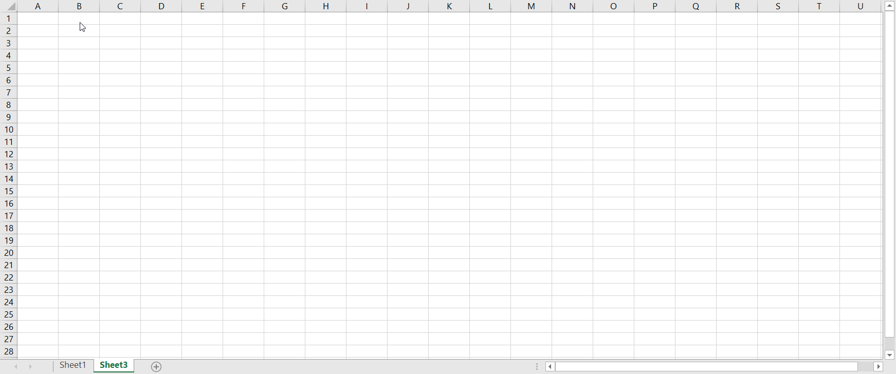
Accessing The Conditional Formatting Options
To access the conditional formatting menu, go to Home on the Excel ribbon, and then click on Conditional Formatting:
Figure 2
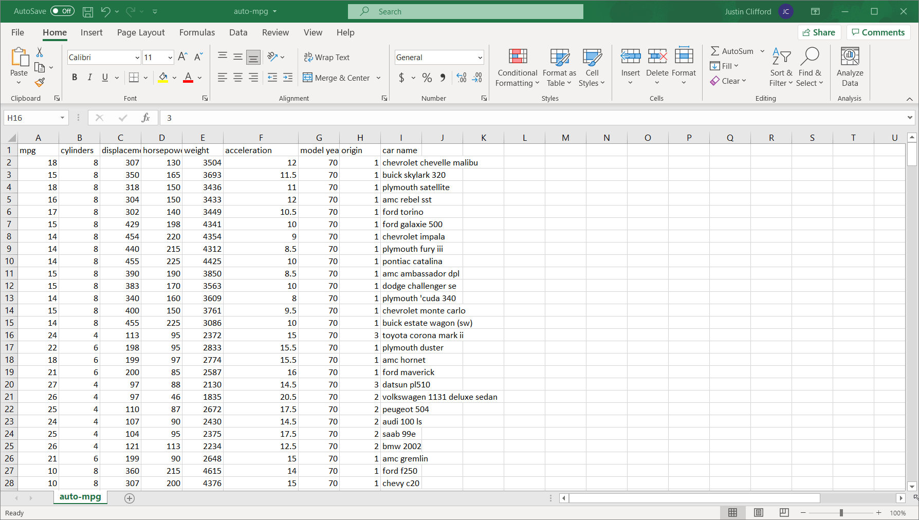
By doing so, the eight basic categories of options for conditional formatting appear: Highlight Cells Rules, Top/Bottom Rules, Data Bars, Color Scales, Icon Sets, New Rule, Clear Rules, and Manage Rules. As you’ll see, there’s a lot of overlap in terms of the capabilities offered by each option; in most circumstances, there’s more than one way of doing things with conditional formatting. Let’s dive into an in-depth review of each of those options. If you want to follow along, download an Excel version of UCI’s Auto-mpg dataset ―which is the dataset I’m using― from the UCI website or from Kaggle.
Highlight Cells Rules
Highlight Cells Rules has seven sub-options: Greater Than, Less Than, Between, Equal To, Text that Contains, A Date Occurring, and Duplicate Values (there’s also the More Rules button, but that brings up the same screen as the New Rule option which we’ll explore later).
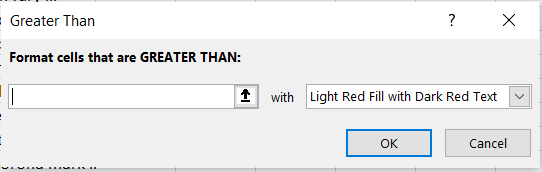
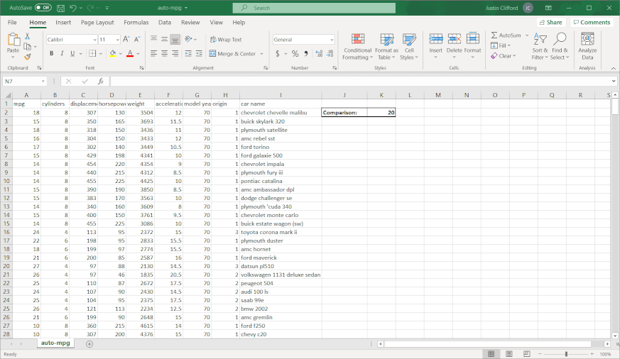
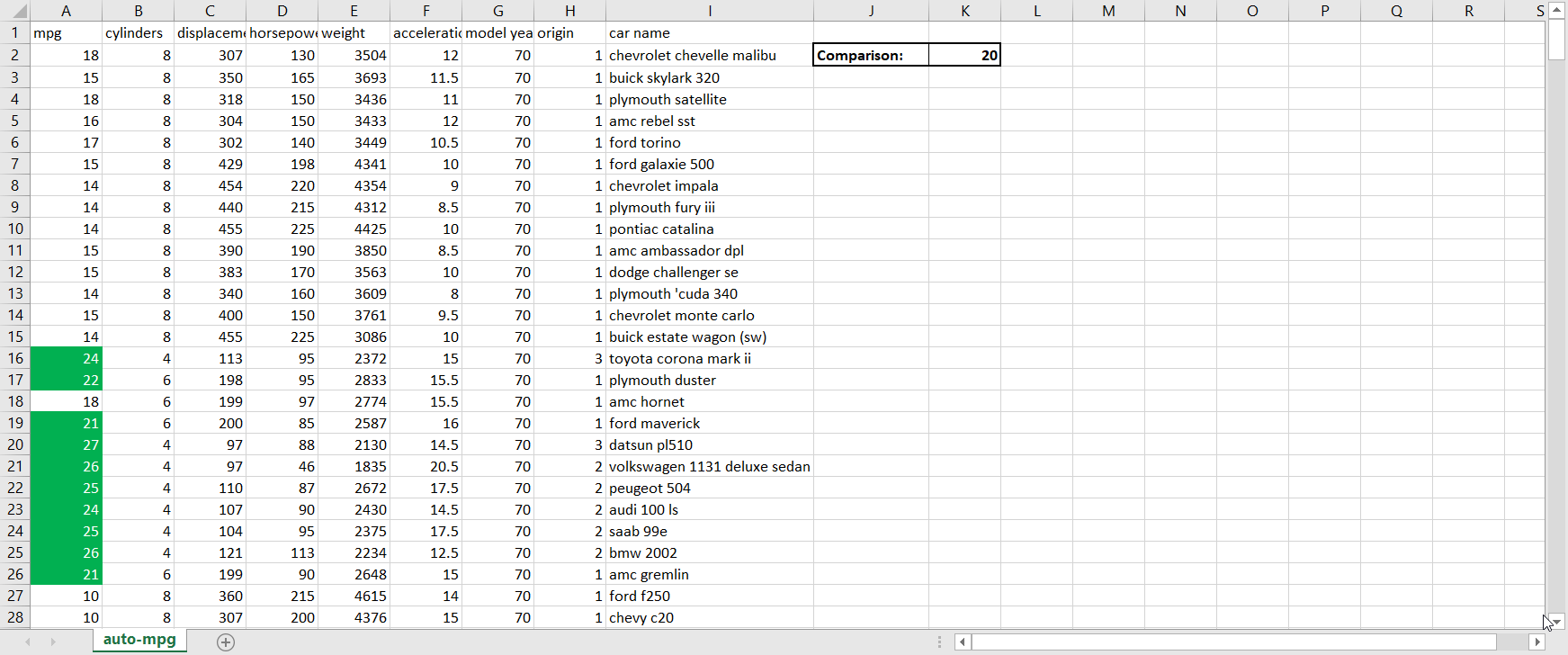
Greater Than. This sub-option allows you to highlight in a customizable way cell(s) that contain values greater than some other value. The value that you’re comparing to can either be a hard-coded value (such as simply “9”) or the value in another cell accessed via a cell reference (when in doubt, it’s always better to cell reference than to hardcode because cell referencing will allow the conditional formatting to update itself automatically when the value in the cell you’re referencing changes). When clicking on Greater Than, the following window appears:Figure 3.1.1The box on the left-hand side is where I fill in the value I’m comparing to; the dropdown menu on the right-hand side is where I choose how I want the cells that meet the greater than condition to be formatted. Explore the pre-set options available to you in the dropdown menu. If none of them appeal to you, you can also select Custom Format. By selecting Custom Format, you allow yourself access to all of the standard cell formatting options that would be available to you for regular (non-conditional) formatting:Figure 3.1.2 Let’s say I want to highlight values in the mpg column green and show values in white writing if the car gets over 20 miles per gallon. To do that, I would first enter in 20 to another cell so that I could cell reference the comparison value; remember that it is better to cell reference than hardcode. Then, I would highlight the column’s values so that the conditional formatting applies to the whole column, and then go to Conditional Formatting → Highlight Cells Rules → Greater Than. Next, I would cell reference the comparison cell in the left-hand box, and select Custom Format in the right-hand dropdown. Finally, I would customize according to the options available to finish my conditional formatting:Figure 3.1.3Now we can observe the benefits of cell referencing the comparison cell in action. Try changing the value in the comparison cell from 20 to something else, and watch the conditional formatting in the mpg column update automatically:Figure 3.1.4See how the highlighting disappears when I change the comparison value from 20 to 22?
Less Than. Less Than is a similar option to Greater Than, but as the name suggests, it applies to conditions where cells are less than a certain value. If you want to try it out, do the same exercise we just did for Greater Than, but conditionally format all of the cells which are less than 20 instead.
Between. Again, Between works the same way as Greater Than and Less Than, but applies to conditions where cells fall between two values.
Equal To. Same idea as what we’ve been looking at, but it’s used to conditionally format cells that are exactly equal to a certain value, whether it’s hard-coded or in another cell.
Text that Contains. This sub-option is the only one within the Highlight Cells Rules that applies primarily to text data instead of numerical data. To demonstrate this sub-option, let’s say I’m trying to highlight the car names of Buicks. Similar steps are involved again; note that by default, the condition satisfaction is not case sensitive, so I can use “Buick” as the comparison cell value even though it shows up lowercase in the data column:Figure 3.5.1
A Date Occurring. This sub-option is used to format cells in the selected range of cells containing dates that meet the chosen criterion from a set list of criteria. The criteria are (occurring) Yesterday, Today, Tomorrow, In the last 7 days, Last week, This week, Next week, Last month, This Month, and Next month. For example, if today is Wednesday 4/14/2021 and I highlighted a cell containing 4/12/2021, choosing the “In the last 7 days”, “This Week”, and “This Month” criteria would highlight the cell but none of the others would. Unfortunately, cell referencing is not possible for selecting condition criteria, nor are the criteria customizable; you are limited to the pre-set criteria.
Duplicate Values. This sub-option allows you to highlight duplicate values or unique values within a selected range of cells. If you want to try it out, try highlighting unique values in the acceleration column; you’ll see that the Ford Torino’s acceleration of 10.5 in row 6 is a unique value in that column. Using the Duplicate Values sub-option works the same general way as the other sub-options we’ve explored so far.
Top/Bottom Rules
The second conditional formatting option is Top/Bottom Rules, which allows you to conditionally format cells whose values meet a ranking criterion within the selected range of cells (e.g., if you want cells whose values fall within the top 10 values in a column to be automatically formatted in a certain way, you would use the Top/Bottom Rules option). The sub-options within Top/Bottom Rules are Top 10 Items, Top 10%, Bottom 10 Items, Bottom 10%, Above Average, and Below Average.
Top 10 Items. As you’ll also see with the Top 10%, Bottom 10 Items, and Bottom 10% sub-options, the Top 10 Items sub-option is somewhat of a misnomer, because you can choose the number of items to fit the condition; hence, a better way to think about these sub-options is the Top X Items, The Top X%, and so on. Here’s a quick example: if I wanted to highlight the top 25 heaviest vehicles (in the weight column), I would select that column, go to Conditional Formatting → Top/Bottom Rules → Top 10 Items, fill in 25 in the box on the left-hand side of the resulting screen, and then select my formatting:Figure 4You should see straight off the bat that the Pontiac Catalina and Ford F250 both fall into the top 25 heaviest cars in the dataset. Note that this sub-option only works for numeric data, not text data; if you try to apply it to a text column, it won’t highlight the top X cells based on alphabetical order. I will not go into great detail on the Top 10%, Bottom 10 Items, and Bottom 10% sub-options because they all work essentially the same way as the Top 10 Items sub-option.
Above Average and Below Average. These two sub-options conditionally format cells that, as the names would suggest, fall above and below the average respectively within the selected range of cells. There is only one customization available for each of these sub-options, and that is how the cells meeting the criterion should be formatted; there is no way to specify how much above/below the average a cell has to be to meet the criterion. Another limitation is that as with the four other sub-options within the Top/Bottom Rules, Above Average and Below Average can only be applied to numeric data.
Data Bars
Data Bars are a relatively straightforward conditional formatting option. They are used to highlight some portion of cells containing numerical values to express those values in relation to all other values in the selected range; the greater the value, the longer the highlight bar. For example, if I use Data Bars to conditionally format a range of five cells of values 1-5, 20% of the cell with value 1 will be highlighted, 40% of the cell with value 2 will be highlighted, and so on. Data Bars do not apply to text cells.
There’s the option to show a gradient highlight or solid highlight using the Data Bars option. Play around with the different highlights available to find the one you like; remember that hovering over each highlight format shows you what the selected range of cells will look like if you select that format. Additionally, hovering over the various highlights displays a text overview of what each one looks like when applied.
Here’s an example of what applying the Data Bars option to the acceleration column looks like:
Figure 5
Color Scales
Color Scales is a similar option to Data Bars, but it conditionally formats the selected range of cells as a color gradient instead of a quantity bar. If I apply Color Scales to the example from the Data Bars section, it would fill in the 1 at one end of the chosen color spectrum and 5 at the opposite end of that spectrum, with the intermediate values colored in according to their position on the 1-5 scale.
Icon Sets
The Icon Sets option is similar to Color Scales and Data Bars in that it formats cells according to their values relationally to other values within the selected range. However, Icon Sets display an icon in each cell to indicate its comparative value instead of coloring it in. There are four groupings of icons within the Icon Sets option: Directional, Shapes, Indicators, and Ratings. Each grouping pertains to a slightly different way of indicating comparative value via icons, but the application of each grouping works the same. Hover over/play around with the different icons to select the one that makes the most sense given the context of your needs; for example, I might use one of the icon sets in the Ratings grouping if I were trying to format the mpg column, because cars with higher gas mileage would have a higher “rating” in that regard.
New Rule
The New Rule option is obviously accessible by clicking on New Rule, but it is also accessible under the other options by clicking More Rules.
New Rule is the most customizable option within Excel’s conditional formatting package. There are six sub-options:
Format all cells based on their values. Using this sub-option formats all cells within the selected range a certain way. In the bottom box, the Format Style dropdown lets you format selected cells as a 2- or 3-color scale (similar to the Highlight Cells Rules and Top/Bottom Rules options), as a Data Bar, or as an Icon Set, based on the values of the cells. Then, you choose the way you want minimum and maximum values to be selected (either automatic, the lowest value, a specific number, a percentage, a formula, or a percentile). If you select the specific number or percentage options, all cells that fall below the selected minimum are formatted the same way as the minimum value; the same thing applies for values above the selected maximum value. Lastly, you can customize the color used for the shading within this sub-option. Here’s an example of applying the same conditional formatting shown in the Data Bars section using this option:Figure 6.1.1
Format only cells that contain. The name of this option is self-explanatory in terms of how it differs from the previous option. There are seven sub-options, which determine the type of data that get conditionally formatted via the rule you’re setting up: Cell Value, Specific Text, Dates Occurring, Blanks, No Blanks, Errors, and No Errors. If you’re using Cell Value, you can then select whether you want to conditionally format cells that fall between two values, not between two values, equal to a certain value, not equal to a certain value, greater than a certain value, less than a certain value, greater than or equal to certain value, and less than or equal to a certain value. For the Specific Text sub-option, you can conditionally format cells containing, not containing, beginning with, or ending with, a certain segment of text. The Dates Occurring sub-option has the same customizable features as the Dates Occurring. And the rest of the sub-options feature dropdown menus to determine which cells are formatted. Once that’s established, you can format the cells that fit the selected condition by clicking the Format button; all options available to you in Excel’s regular formatting package are available by doing so.
I won’t go through the rest of the New Rule options in detail because they are all straightforward to use; take some time to play around with the other options on your own.
Clear Rules
This is a pretty self-explanatory option. You can use it to clear rules only from selected cells or from the entire sheet; if you’re using tables and/or pivot tables, you also have the ability to remove conditional formatting rules from each individual table/pivot table.
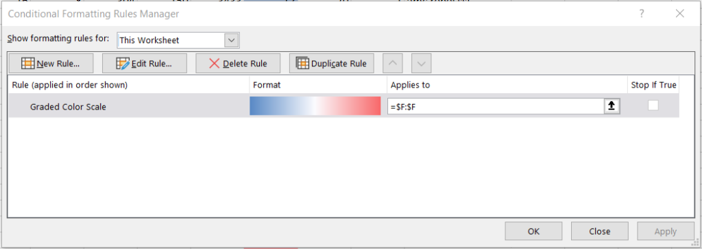
Manage Rules
Selecting this option brings up a window that can be used to adjust the functionality of the rules you’ve already created:
Figure 7
First, next to the “Show formatting rules for” header, you can choose whether to display the already-created rules for the currently selected cells or for the entire worksheet.
There are six buttons on this window’s header: New Rule, Edit Rule, Delete Rule, Duplicate Rule, Move Up, and Move Down. New Rule brings up the same window we explored in the New Rule section. Edit Rule also brings up this same window, but with the selected existing rule already pre-populated; to use this button, first select a rule in the bottom section of the window, and then click Edit Rule. Delete Rule and Duplicate Rule are self-explanatory. Finally, Move Up and Move Down are used to alter the prioritization the rules you’ve created; you may have noticed that the leftmost column of the bottom section of the window is titled “Rule (applied in order shown)” and this is because it’s showing you the prioritization order of all created rules in the event that more than one rule applies to the same cell.
Lastly, we have the bottom section of the window, which shows each rule that’s been created, each rule’s format, the range of cells each rule applies to, and the Stop If True button, which if selected ensures that rules that fall below it won’t be executed if the former rule’s condition(s) is/are satisfied.
Whenever you make an alteration using the Manage Rules option, always click the Apply button in the lower right-hand corner before closing the window.
This blog post has been a very in-depth look into conditional formatting in Excel (most of what’s been covered is also available in Google Sheets). If you’re struggling to implement Conditional Formatting or any other features of Excel or another BI program at your workplace, contact us.
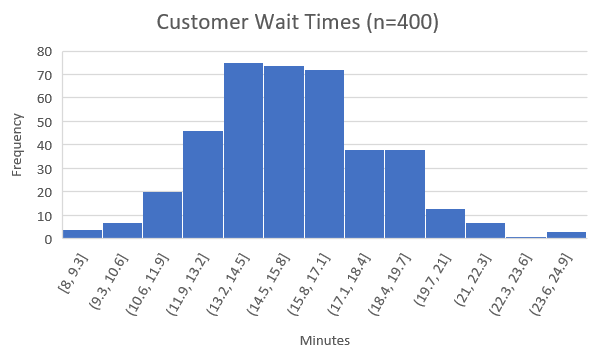
A histogram is a type of bar chart that shows the distribution ―i.e., the probability of a variable being within a certain range of values, out of all possible values― of a certain variable. For example, we can use a histogram to show customer wait times at a restaurant:
This histogram indicates that approximately 4 customers waited between 8 and 9.3 minutes, approximately 6 customers waited between 9.3 and 10.6 minutes, and so on. We can then estimate that because there are 400 total customers in the sample, that the probability of waiting between 8 and 9.3 minutes is 4/400 = 1%, the probability of waiting between 9.3 and 10.6 minutes is 6/400 = 1.5%, and so on for every possible waiting time. Clearly, there is a ton of information that can be inferred from this one simple chart, which is why statisticians find histograms so helpful.
Note that histograms are usually used for continuous variables ―variables that have infinite possible values― and so we divide the set of possible values into equally-spaced ranges, such as between 8 and 9.3, between 9.3 and 10.6, and so on; in our example, it would be impossible to show every possible value for minutes waited because 8 minutes of waiting would be distinct from 8.00001 minutes, which would be distinct from 8.00000000000001 minutes, and so on, so we split up the variable into ranges.
Fun fact For those of you familiar with Bell Curves (also known as a Normal Distribution): “Bell Curves” got their name because they are essentially histograms that are shaped like bells! In fact, if we create a histogram of most random variables, including the one from our example, it comes out looking somewhat like a bell curve.
Creating Histograms In Excel And Google Sheets
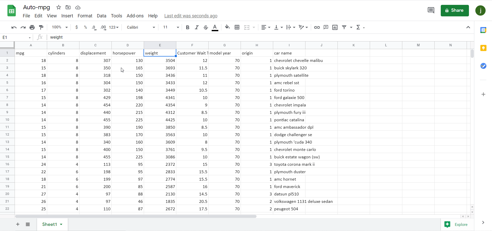
The process to create a histogram in Excel is very similar to the process in Google Sheets, so we’ll show them side-by-side in this tutorial. We’ll be using the famous Auto-mpg dataset for this demonstration; if you want to follow along, the dataset is accessible on the UCI website and Kaggle. Feel free to follow along using your own dataset, however.
To start off, remember that histograms are used to visualize a single continuous variable, and so make sure the data you’re trying to build a histogram off of is organized into a single column or row. In the Auto-mpg dataset, the goal would be to build a histogram based off of just one attribute at a time, which would correspond to one column of data; for example, you could build a histogram to display the distribution of mpg, or of cylinders, or of displacement, and so on, but you would almost never build a histogram that involved more than one of these at a time.
Figure 2
Also remember that histograms are used to analyze continuous variables, and thus it would not make sense to build a histogram for the car name attribute (a “histogram” for a discrete attribute like this one would just be a regular bar chart).
Let’s make a histogram!
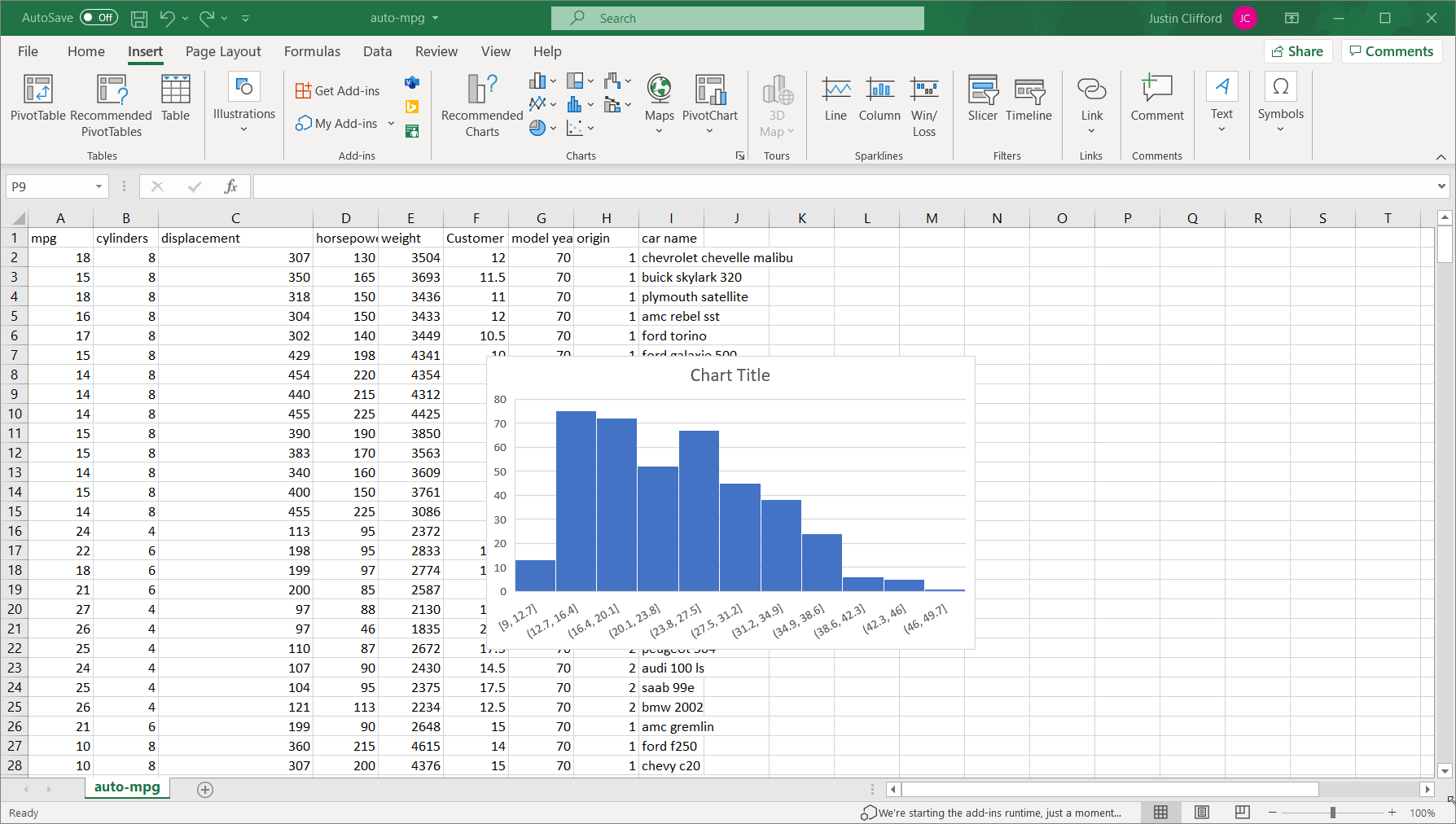
The process is slightly different for Excel than for Google Sheets, so I’ll show the former and then the latter. In Excel, select the entire column of data you want to analyze (I’ll do the mpg attribute) and then go to Insert on the Excel ribbon, and click on the blue bar-chart-looking logo, two buttons to the right of the Recommended Charts button; this button, labeled “Insert Statistic Chart” is used to insert histograms. Finally, click on the option in the top left of the resulting box, labeled “Histogram”:
Figure 3. *Note – animation has a 2-3 second delay.
We can see that unlike the previous example, this particular attribute’s histogram is abnormally distributed; that is, the distribution does not follow the symmetric bell curve shape that we saw earlier. In fact, mpg looks to be what we call “right-skewed”, which means it is much more likely for the value of the variable to be towards the lower end of the overall range than towards the higher end.
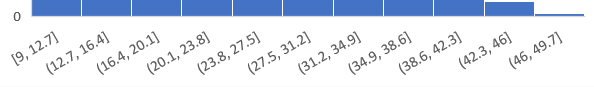
It’s also worth going over how to adjust what we call the “binning” of the data, which is the way values are grouped into ranges on the histogram; each group is referred to as a “bin”. By default, we have 11 bins in this histogram on intervals of 3.7: (1) between 9 and 12.7, (2) between 12.7 and 16.4, (3) between 16.4 and 20.1, and so on:
Figure 4
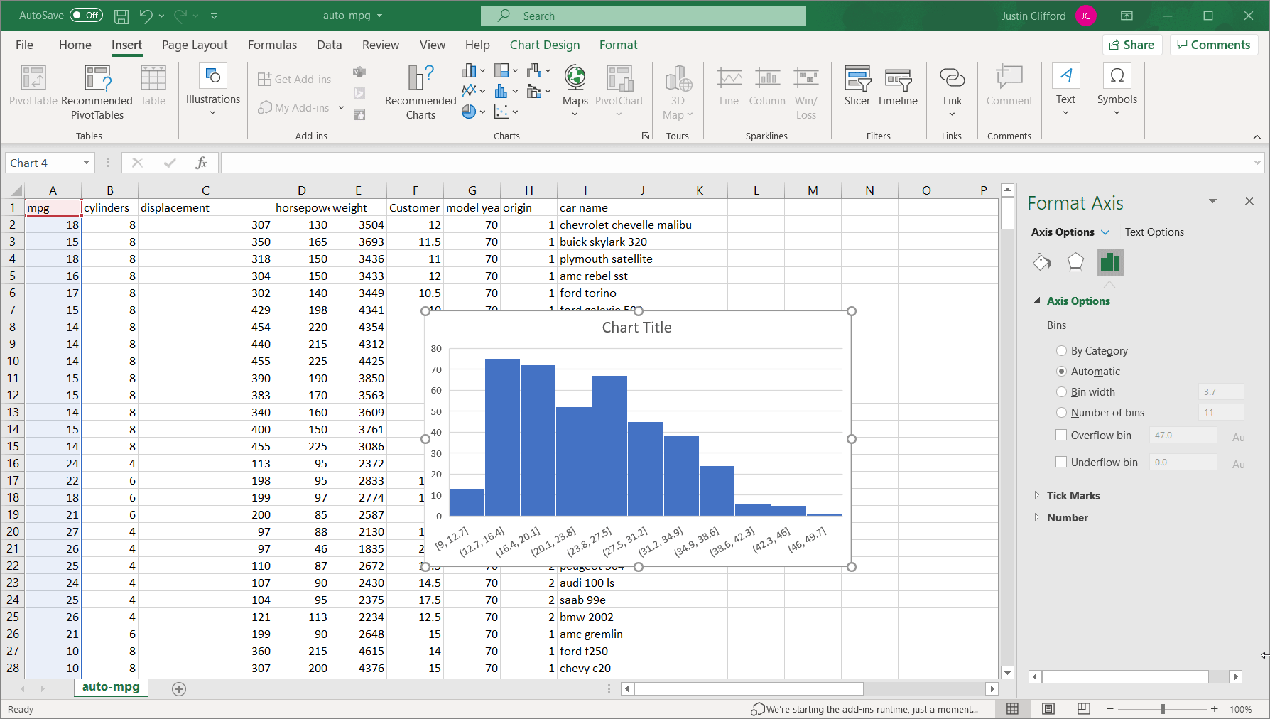
By right-clicking on the values across the x-axis and then clicking Format Axis, we open up the side-bar that can be used to alter the binning of the data:
Figure 5 *Note – animation has a 2-3 second delay.
Under Axis Options on that toolbar, we have several options for binning. By default, the binning is set to Automatic, but we can also set it to:
By category. This option is not relevant to single continuous variables such as mpg.
Bin width. This option allows us to customize how wide each bin is. It is set to 3.7 by default, but if we were to set it to 7.4 for example, we would only have half as many bins. In general, the larger a bin width you choose, the fewer bars there will be in the histogram, and vice versa. (Figure 6 *Note – animation has a 2-3 second delay.)
Number of bins. This option allows us to customize the binning based on the total number of bins. It is set to 11 by default, but if we were to set it to 22, the range for each bin would decrease by half. The same process for using the Bin width option also applies to this option.
There are also the overflow and underflow bin options, which allow us to group all observations above and below a specific value, respectively, into a single bin. Take some time to play around with the optioning on your own until you are satisfied with the result.
To create the same histogram in Google Sheets, again select the column of data and go to Insert on the ribbon, but then click on Chart. A scatter plot will then appear by default; change this chart to a histogram by changing Chart type to “Histogram chart”:
Figure 7 *Note – animation has a 2-3 second delay.
The binning is editable by clicking on the three dots in the upper right-hand corner of the chart, and then clicking Edit chart. The chart editing toolbar appears, and then go to Customize and click into the Histogram section:
Figure 8 *Note – animation has a 2-3 second delay.
There aren’t as many binning options in Google Sheets as there are in Excel as you can see, but there are two:
Bucket size. This option is similar to the Bin width option in Excel, although it only lets us choose the sizes from a dropdown instead of letting us customize it fully (as it does in Excel).
Outlier percentile. This option allows us to determine the percentage of overall values that are grouped into the two outermost bins. In that sense, it is similar to the overflow/underflow options in Excel; however, Google Sheets only lets us group values into these outermost bins at preset percentiles (unlike Excel), and we are forced to use both an overflow and underflow bin, but we can’t use one or the other exclusively as we can in Excel.
Histograms can be made in Excel, Tableau, Power BI, and any major analytics program or language. If your organization could use help harnessing the power of its data, contact us.
Boxplot is a data analytics consulting firm. We help organizations use their data to make smarter business decisions and solve pressing problems.
Our primary service is producing data-driven reports and dashboards. We can work with nearly any data source, in any format – CRM, financial/accounting, POS, IT/ticketing, Sales, HR, Marketing, Inventory, mobile/web app data, geographic/GIS data, social media, government data sources, surveys, and more. We’ll then turn that organizational data into dashboards and reports with actionable insights. We also are excellent at explaining the analyses – we’ll make sure your team can use the business intelligence to enact meaningful change that will help your business reach its goals.
What sets us apart is our deep data expertise – working with data is all we do, and all of our team members are highly vetted to ensure expert-level understanding of the concepts needed to complete projects. Many of our team members have direct degrees in math or statistics, and all work is reviewed by a statistician with a degree in the field. The Boxplot team is well-versed in all major analytics programs including Excel, SQL, Tableau, Qlik, JavaScript, Python and R just to name a few. We’ve also worked with data from a variety of industries including marketing, human resources, law, finance, telecommunications, customer support, and sales.
In June 2021, Barb was a guest speaker for the WBENC webinar series: From Pandemic to Progress.
This webinar is geared towards small business owners who want to analyze their company’s social media data to use it for their advantage.
The webinar goes into detail from where to find your social media’s data, to why you may want that data, to how to effectively analyze it.
Barb explains the value and uses of Google Analytics and shows the viewers what information on their website they will expect to see with the platform.
Afterwards, she answers some common analytics questions for Facebook, LinkedIn, and Twitter such as, “who do my posts reach” and “which hashtags perform best?”.
To end the webinar, Barb compares pros and cons between using apps, outsourcing, and DIY social media analytics and answers some live questions from the audience.
View the Slide Deck
(Use the arrows in the bottom left corner to navigate the slides)
Post-Webinar Follow-up Emails
Here are the items sent out in the emails after Barb’s webinars (grouped by type of webinar, and general resources).
Resources to keep learning & staying connected:
If you would like to join Boxplot’s mailing list, you can do so here!
Feel free to connect with me on LinkedIn. I post news, classes and other data analytics resources regularly. Boxplot’s accounts also post the same type of data analytics resources regularly: Twitter, LinkedIn, Facebook
General Data Analysis Resources
HighCharts(Barb’s recommended library for creating web-ready visualizations).
What’s the difference between PostgreSQL and pgAdmin?
PostgreSQL is a free-to-use relational database management system (DBMS); pgAdmin is a graphical user interface (GUI) tool that lets users interact with their PostgreSQL database(s). In other words, PostgreSQL is the actual database system, and pgAdmin is a tool that lets users use that system.
How do I know if I already have PostgreSQL installed?
If you’re a Windows user, verify that PostgreSQL is installed by using SQL Shell. In the search bar in the bottom left-hand corner of your desktop:
type in SQL Shell and this will enable you to open SQL Shell. Hit enter four times, and it will automatically apply the credentials you set when you installed PostgreSQL. Finally, type in SELECT version(); and hit enter, and if it displays the PostgreSQL version you’re using, that means that you have PostgreSQL installed:
If you’re using a Mac, open the terminal. Once in the terminal, type the command “postgres –version”, which will show you the version of PostgreSQL you’ve installed on your machine, or it’ll give you an error if you haven’t installed PostgreSQL.
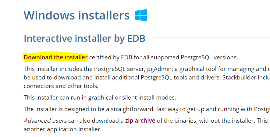
How do I install PostgreSQL?
Visit the PostgreSQL download page and select your operating system from the options it gives you. Then, click on Download the installer:
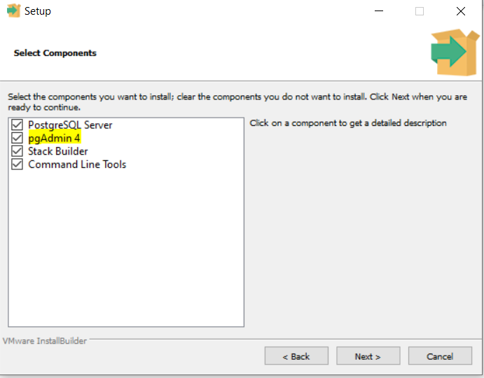
On the page it brings you to, select the most up-to-date version of PostgreSQL available for your OS. The rest of the installation should be fairly convenient. In fact, it will even install pgAdmin alongside PostgreSQL by default:
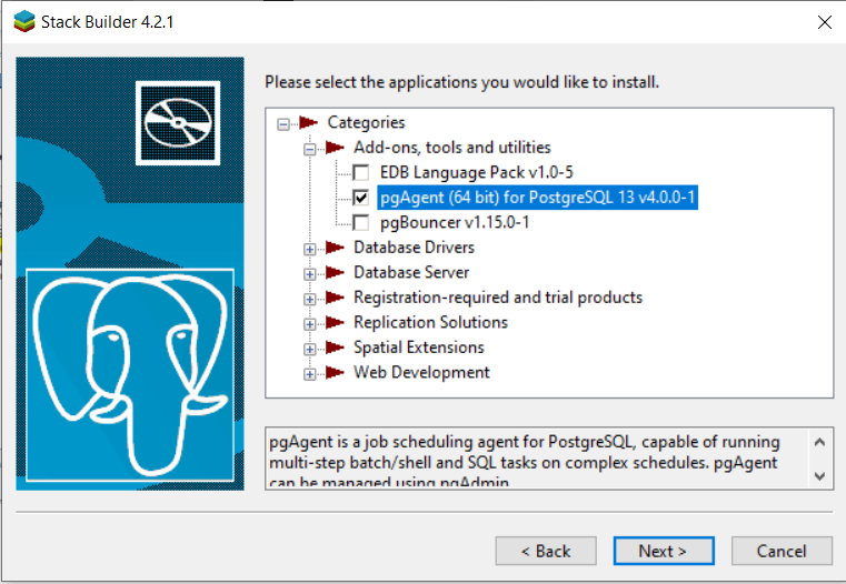
If you want to install pgAdmin as well, make sure to check it off when you get to this screen:
How do I install pgAdmin?
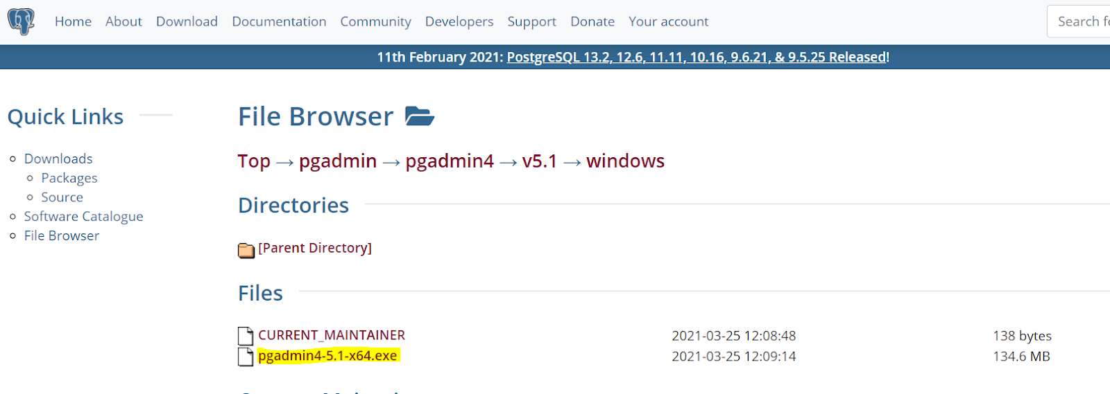
If you didn’t choose to install pgAdmin alongside PostgreSQL, you’ll have to install pgAdmin separately. Fortunately, installing pgAdmin is also very straightforward. First, navigate to https://www.pgadmin.org/download/. Then, select your OS from the list of choices, and that’ll bring you to the download screen. Select the most recently updated version. Finally, click the file with the .exe extension:
From there, the installation is very straightforward.
How do I launch pgAdmin once I have it installed?
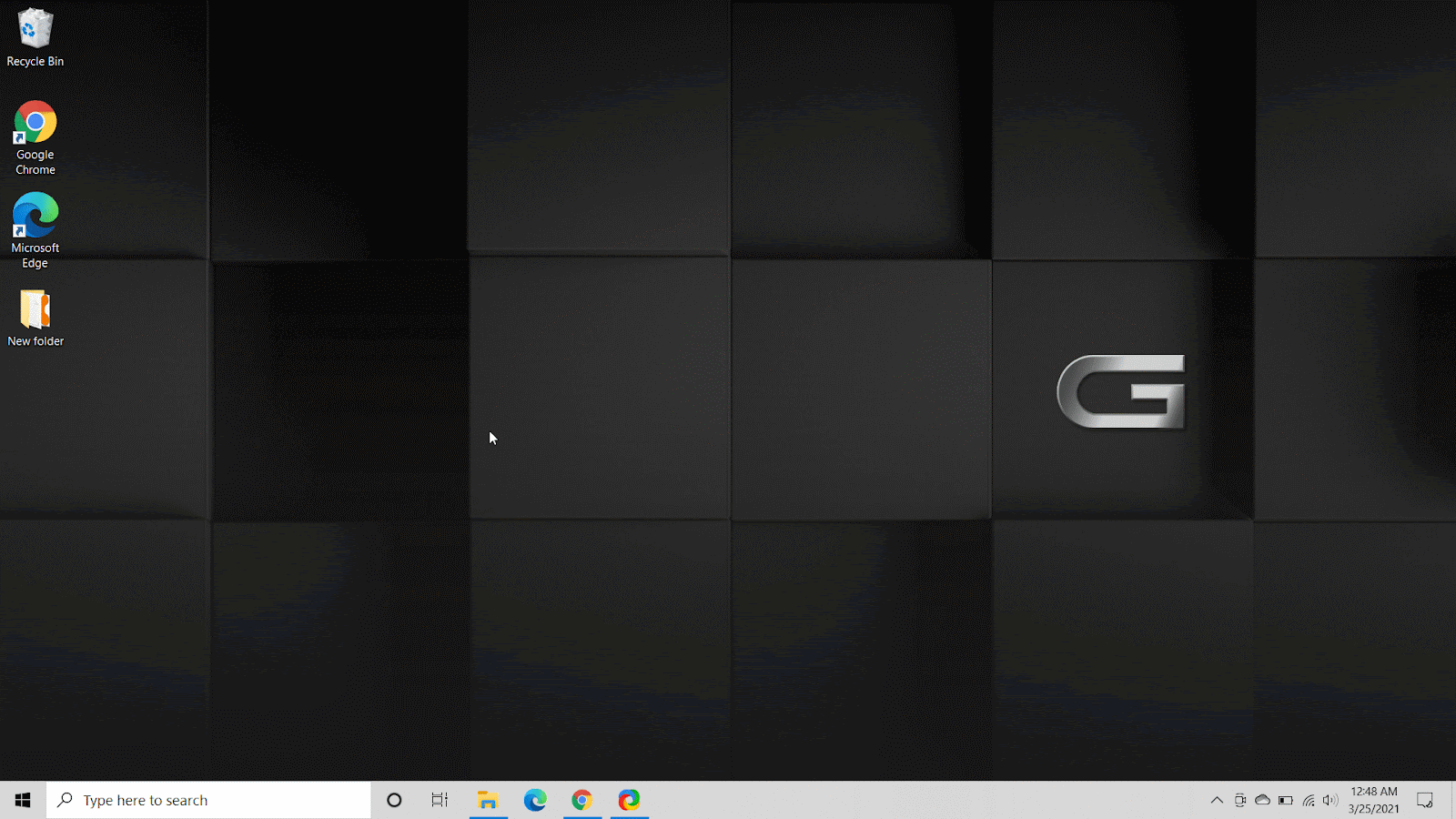
For Windows users, go to the search bar in the bottom left-hand side of your desktop, and click on Apps on the top ribbon of the window that appears. Then type in pgAdmin, and it should come right up. Hit enter to launch the pgAdmin application:
For Mac users, pgAdmin is accessible in your Applications folder:
Barb returns to PowerToFly as a guest speaker in the “Data Hour” webinar. The first half of this “Data Hour” webinar consists of answers that Barb has for some general and more specific data analysis-related questions that the audience has.
Some of the audience questions in this webinar include: “What is the best data programming tool for beginners?”, “What pathway can I take to begin a career in data?”, and “How can I translate data for non-data teams?”. Barb goes into great detail to answer these questions along with visualizations. More specifically, Barb provides examples and explanations for data in AB testing and how one can determine if their data is statistically significant.
Barb gives some advice and insight for various data-related topics such as how to develop quantitative skills and which MOOC or ‘bootcamp’ she recommends along with numerous resources.
The webinar ends with a live Q&A between Barb and the audience and a live demonstration in R.
View the Slide Deck
(Use the arrows in the bottom left corner to navigate the slides)
Post-Webinar Follow-up Emails
Here are the items sent out in the emails after Barb’s webinars (grouped by type of webinar, and general resources).
Resources to keep learning & staying connected:
If you would like to join Boxplot’s mailing list, you can do so here!
Feel free to connect with me on LinkedIn. I post news, classes and other data analytics resources regularly. Boxplot’s accounts also post the same type of data analytics resources regularly: Twitter, LinkedIn, Facebook
General Data Analysis Resources
HighCharts(Barb’s recommended library for creating web-ready visualizations).
A Pivot Table is an analytics tool that can quickly answer key business questions. They are excellent at extracting insights from a vast dataset quickly. PivotTables are one of the most efficient and effective ways to evaluate large quantities of data in Excel. By “pivoting” or aggregating a large data table into a condensed, visually appealing format, PivotTables reveal key information that would not be visible by looking at the raw data.
Example
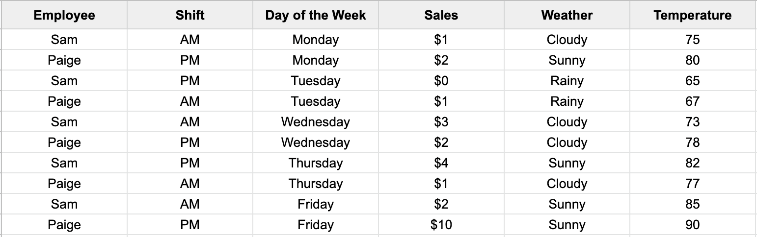
The Lemonade Stand is a timeless example of operating a successful business-illuminating the importance of intelligent marketing, pricing, and financial decisions. It doesn’t matter if you are the CEO or just started yesterday; we’re going to highlight what a Pivot Table can do for your business.
Fortunately, the lemonade data above is formatted correctly. In this case, select your preference for either Excel or Google Sheets, and follow the video to create a Pivot Table.
The 4 Areas of a Pivot Table:
You should see an empty Pivot Table. Your business question will determine which fields (Employee, Shift, Day of the Week, Sales, Weather, Temperature) you want to include. To help decide, we also need to understand the four areas of a Pivot Table.
The 4 areas are Columns, Rows, Values, and Filters:
Columns – This will create a list of all of the unique values in the field you choose, going horizontally across the page.
Rows – This will create a list of all of the unique values in the field you choose, going vertically down the page.
Values – The field that you want to measure in your Pivot Table, aggregated based on what is in the Rows and Columns boxes. For example, sum of Sales, count of Employees, average of Temperature. Typically a numeric field, but not always.
Filters – You can filter the entire PivotTable using whatever fields you put in here. For example, a filter on Weather allows you to display sales of only the sunny days.
Examples:
Let’s say our lemonade venture wants to see our sum of Sales across the Day of the Week for each Employee. Select your preference for either Excel or Google Sheets, and follow the video to create this Pivot Table.
Furthermore, let’s say our lemonade venture wants to filter these Sales for when the Temperature is over 70 degrees. The filter area allows us to do this. For a bonus, we will add some conditional formatting.
A Pivot Table is a great quick visual tool to answer these types of questions. These types of questions fall in the category of observational such as head counts or total sales. From the example, we observe Paige had more sales than Sam. But does that mean Paige is a better employee than Sam? Now on questions like these, we have to be careful. Paige worked a Sunny Friday shift, which contributed to the majority of her sales. A Pivot Table is not always a great tool to prove causation and answer these types of questions. To answer this, we would employ a suite of statistical algorithms.
Data Formatting for a Pivot Table
If the tutorial above was a walk in the park, but you still haven’t created a pivot table, the problem is most likely the formatting of your data. This section will discuss data formatting and data cleaning issues that may prevent you from creating a Pivot Table.
Multiple Data Sources:
Sometimes it is the case that data is collected separately in different sheets or workbooks. Referring to the example above, it could be the case that the data was collected independently for each employee. Following the general rule that all values of the same type need to be in one column would solve this issue. A little copy and paste would accomplish this.
Data Structure:
Separately, there is the issue that the weather data (Sunny, Cloudy, Rainy) was collected such that each type of Weather is a column. This column structure is also known as unstacked data or wide data, which can be preferred when modeling. However, for visualizations such as Pivot Tables, it is best to move these (Sunny, Cloudy, Rainy) under one column, so it is stacked data or long data.
Dirty Data:
So far, we have assumed that each cell’s data has been correctly filled out. In other words, the focus has been on the overall structure of the data or the columns. However, when working on real-world problems, it is most often the case that you have some dirty data. For example, the dates are spelled differently. For this example, it is quite trivial to fix this issue, but when your spreadsheet contains thousands or millions of rows, data cleaning can be tremendously time-consuming. Additionally, we have not covered the importance of number of formats in Excel and Google Sheets. In the video examples above, the Days of Weeks are ordered correctly. Depending on the spreadsheet, sometimes this happens automatically, but sometimes the number format of your data can cause Pivot Table display issues.
Final Remarks
Hopefully, you found this post useful. If you have questions on pivot tables or drawing conclusions based on the observations from a pivot table you have already created, Boxplot is well versed in data visualizations and statistics. Furthermore, if you are spending valuable time trying to structure, clean, or format your data, please don’t hesitate to contact us. Data cleaning is one of the many services Boxplot can provide for your business.
Many winter moons ago, I (virtually) attended Future Data 2020, a conference about the next generation of data systems. During the conference, I watched an interesting talk given by Tristan Handy, founder and CEO of Fishtown Analytics, called The Modern Data Stack: Past, Present, and Future. During the talk, Tristan discussed a so-called Cambrian explosion of data products built upon data warehouses, such as Amazon Redshift, between 2012 and 2016, as well as his opinion that we are on the precipice of a similar paradigm shift, which he referred to as “the second Cambrian explosion.”
Tristan’s perspective on the modern data stack provided much food for thought; however, the topic I want to explore here stems from a brief comment made about the future of self-service in data-driven decision-making: How those who are not necessarily on the cutting-edge of data science can best leverage their data to make informed decisions.
Office Space
To start this exploration, I will first give a simplified version of a past during which I was not of working age and with which I therefore have no direct experience: Prior to the aforementioned (first) Cambrian explosion, data analysis was primarily carried out using spreadsheets, such as (of course) Microsoft Excel. In many theoretical offices in the 90s and 00s, countless nameless and faceless theoretical analyst/decision-makers spent their Mondays through Fridays bouncing among tens of tens of Excel spreadsheets, adding calculated fields in two-lettered columns and introducing errors for which there would be no record; it was a laugh riot, the analyst/decision-makers earned decent theoretical wages for their time spent, and everyone watched Friends in the evenings without feeling obligated to discuss how problematic it was.
In more recent times, with the advent of modern data warehouses, data storage was able to be better separated from data analysis, and many, many SaaS companies profited off this division on scales not easily understood by humans. So rather than the happy-go-lucky Friends’ era paradigm, with data tabulated in one program with nice little cells and able to be analyzed in that same program by analyst/decision-makers, a number of new business intelligence platforms began to make their way into offices, raining on everyone’s parade, and just because the new guy attended a “conference” about the “future” in “Des Moines.”
The Modern Data Racket
Let me take a step back: In or around his talk (source), Tristan made the following comments:
“How do you democratize self-service? Controversial, but I believe the Modern Data Stack disempowered many decision-makers. Those comfortable w/ Excel feel cut off from the source of truth. What if the spreadsheet interface is actually the correct way?”
Tristan prefaces his claim that the modern data stack has disempowered decision-makers with the warning that his opinion may be controversial, but I would argue that his statement is not controversial at all, mostly because it is unarguably true. With the shift of data storage and analysis away from the flexible and easy-to-use spreadsheet and toward ecosystems such as data lakes, data rivers, data abysses, and data Charybdises, end-users (i.e., the analyst/decision-makers of yore), many of whom primarily use data tools as a means to an end, have likely lost their way.
Put simply, it is not as simple to navigate the modern data stack as it was to navigate acres of spreadsheets. Spreadsheets, with all of their flaws, have almost no learning curve: if you can turn on a computer and open a file, you can navigate a spreadsheet. Furthermore, from the start, you are only a few clicks, keystrokes, and neural connections away from mastering formulas, pivot tables, and visualizations. I hate spreadsheets! — but they are a near-perfect balance of usability and flexibility.
In contrast, while modern business intelligence tools may be built with end-users with varying levels of technical expertise in mind, they tend to have a steeper learning curve. For example, while today’s decision-maker, now stripped of his or her ‘analyst’ status, can likely navigate a dashboard and make decisions based on the information presented, he or she has lost the almost-tactile experience of sifting through the data with his or her own hands.
The Second Law
I know what you are thinking—literal metric tons of decisions were made based on little more than a pie chart from an hours-long presentation that was not put together by the person who had final say in the decision-making process—but please allow me to employ the above generalization to support my next point: Every new data technology moves the decision-maker further downstream from the data source.
Today, the data required by a decision-maker may be located in a neatly designed dashboard, on physical servers, somewhere in the cloud, and/or on the backs of napkins, they may have underwent various transformations and exist in several slightly different forms of varying accuracy and transparency, and most likely, that decision-maker does not know which of these sources contains the data he or she needs to make an optimal decision, nor the processing those data underwent; it is complete chaos, and not the fun and festive Bacchian kind (and I haven’t even spoken of the inherent fuzziness of data).
The more technologies a company implements in its data stack, the more points there are for potential misunderstandings, and the more training individual decision-makers have to undergo to become fluent in the data stack on which they rely. In other words, decision-makers are being disempowered by the increasing complexity of the modern data stack.
So… What now?
I see three possible solutions to the problem of disempowerment:
Stop trying to reinvent the wheel and keep spreadsheets around for the long haul;
Hire decision-makers who are prepared to use and keep up with the modern data stack; or
Promote close collaboration between data experts and decision-makers to support decision-making.
All three options have pros and cons, but I am personally a fan of the third. In the last decade or so, there has been a rapid increase in our ability to store and manipulate data, and spreadsheets alone cannot be expected to fulfill all modern data needs. Similarly, in many industries, decision-makers alone cannot be expected to stay on the cutting-edge of data science. Therefore, it follows that close collaboration between data experts and decision-makers is becoming increasingly necessary in the modern office.
Alternatively, perhaps in time an easy-to-use tool will come along that can be used to both store and analyze data… Oh… wait… that’s the spreadsheet.
You toggled code blocks on! Code blocks will appear in gray below. Click the button again to turn them off.
Introduction
It seems as if people are split on pie charts: either you passionately hate them, or you are indifferent. In this article, we are going to explain why pie charts are problematic and, if you fall into the latter category, what you can do when creating pie charts to avoid upsetting those in the former.
Why are pie charts problematic?
They use size to convey information
A pie chart uses the size of a portion (slice) of a circle (pie) to display a numerical variable. This factor is not an issue in and of itself, as many chart types use size to convey information, including bubble charts and bar charts; however, while bubble charts and bar charts use diameter and height, respectively, to convey information, pie charts rely on the angle describing a slice---and the human eye is not very good at recognizing differences in angles.
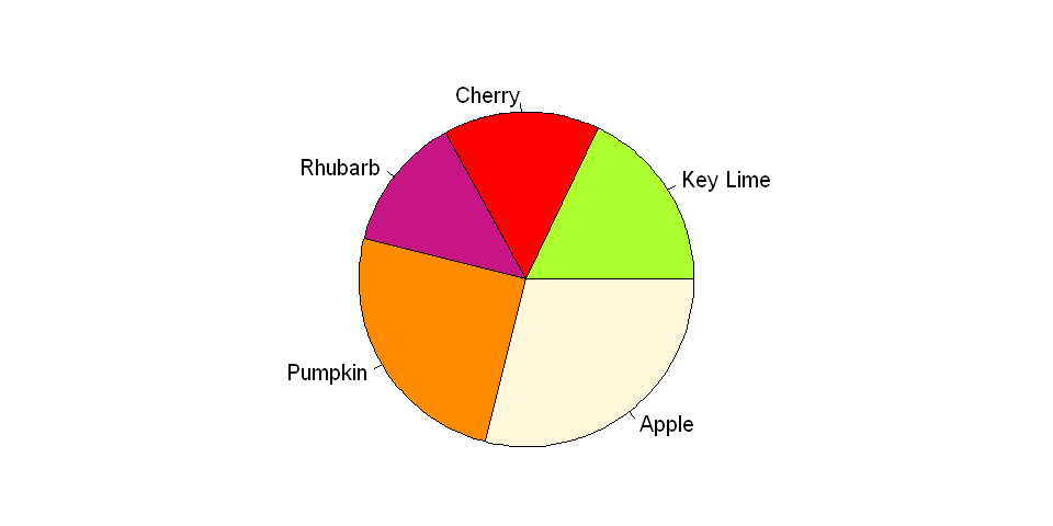
Suppose we took a survey on people's favorite kinds of pie. In the chart below, it is difficult to see how the categories relate to each other; individually, Cherry and Rhubarb seem to comprise a smaller portion of the pie than either Apple or Pumpkin, but it may not be obvious (without looking at the data) which is the smaller slice.
#Adjusting plot size and margins
options(repr.plot.width=8, repr.plot.height=4)
par(mfrow=c(1,1), mai = c(0.5, 0, 0.75, 0))

#Data for pie chart
x = c(18, 15, 13, 25, 29)
labels = c("Key Lime", "Cherry", "Rhubarb", "Pumpkin", "Apple")
cols = c("greenyellow", "red", "mediumvioletred", "darkorange", "cornsilk")

#Build the pie chart
pie(x, labels, radius = 1, col=cols)
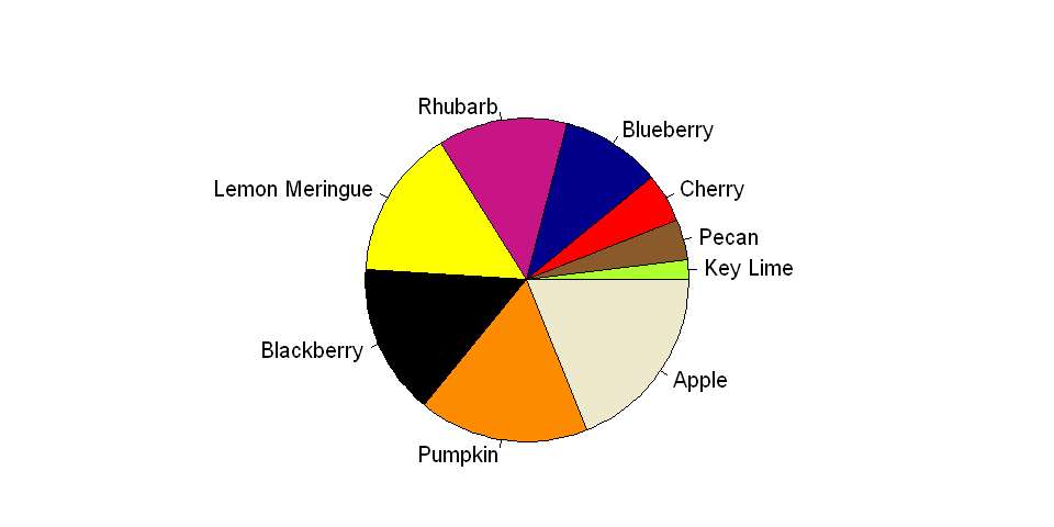
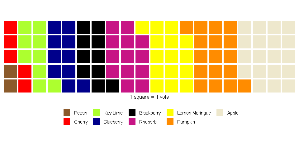
They cannot display many categories well
This issue of conveying size via angle is even more pronounced when many categories are shown in a single pie chart. Furthermore, unlike some charts that are used to display several categories at once, such as bar charts, pie charts depend on differences in color to denote category; therefore, a large palette of colors is necessary, and without proper selection of the palette, the results could be either garish or ambiguous.
#Adjusting plot size and margins
options(repr.plot.width=8, repr.plot.height=4)
par(mfrow=c(1,1), mai = c(0.55, 0, 0.8, 0))

#Data for pie chart
x = c(2, 4, 5, 10, 13, 15, 15, 17, 19)
labels = c("Key Lime", "Pecan", "Cherry", "Blueberry", "Rhubarb", "Lemon Meringue", "Blackberry", "Pumpkin", "Apple")
cols = c("greenyellow", "tan4", "red", "darkblue", "mediumvioletred", "yellow", "black", "darkorange", "cornsilk2")

#Build the pie chart
pie(x, labels, radius = 1, col=cols)
They show parts of a whole
Pie charts represent a whole as its components. Therefore, if your dataset is a subset of a larger dataset (and thus does not represent the whole) or if your dataset consists of independent categories (and thus represents multiple wholes), then a pie chart may not be appropriate.
Pie charts in popular packages
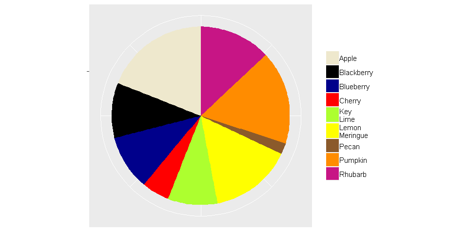
We wouldn't want to assume anyone's opinion on as divisive a topic as the pie chart, but perhaps the disdain for this chart type is best exhibited by the lack of built-in functions for creating them in two very popular data visualization packages: ggplot2 (R) and seaborn (Python). With both packages, a pie chart can be created only through trickery.
Trickery
It is convenient---perhaps a little too convenient---that a pie chart is no more than a single stacked bar displayed in polar coordinates. The code below builds the pie chart shown above, but using ggplot2.
#Adjusting plot size and margins
options(repr.plot.width=8, repr.plot.height=4)
par(mfrow=c(1,1), mai = c(0.55, 0, 0.8, 0))

#Data for the pie chart
values = c(9, 2, 5, 10, 13, 15, 10, 17, 19)
labels = c("Key \nLime", "Pecan", "Cherry", "Blueberry", "Rhubarb",
           "Lemon \nMeringue", "Blackberry", "Pumpkin", "Apple")
cols = c("Key \nLime"="greenyellow", "Pecan"="tan4", "Cherry"="red", "Blueberry"="darkblue",
         "Rhubarb"="mediumvioletred", "Lemon \nMeringue"="yellow", "Blackberry"="black",
         "Pumpkin"="darkorange", "Apple"="cornsilk2")

data = data.frame(labels, values)

#Build the pie chart
ggplot(data, aes(x="", y=values, fill=labels))+
    geom_bar(width = 1, stat = "identity") +
    scale_fill_manual(values=cols) +
    coord_polar("y", start=0) +  #Use polar coordinates
    theme(axis.title=element_blank(),
          axis.text=element_blank(),
          legend.title=element_blank())
What chart types can be used to replace pie charts?
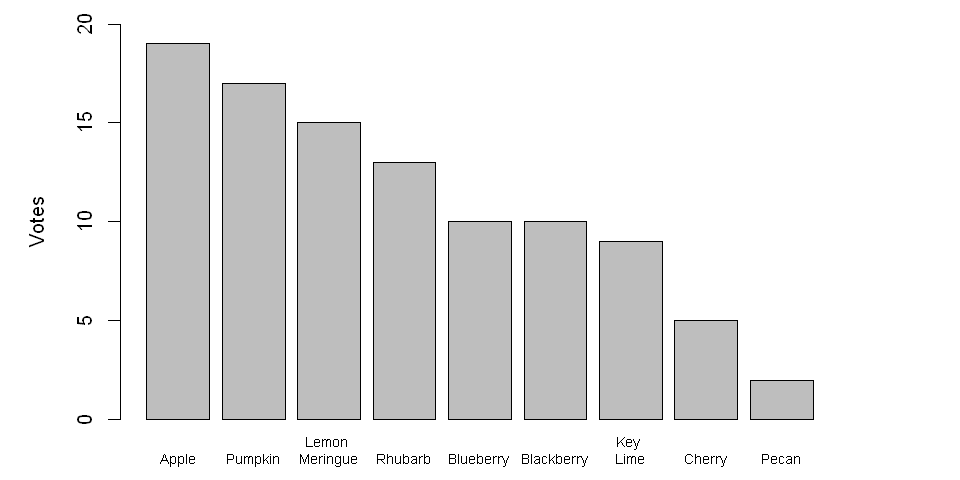
Bar charts
Similar to pie charts, bar charts use size to convey information; however, for bar charts, the height of a rectangle varies, and differences between the heights of bars are easier to recognize than the differences between the angles of portions of a circle. Furthermore, bar charts can be configured to show absolute numbers, percentages, or both!
#Adjusting plot size and margins
options(repr.plot.width=8, repr.plot.height=4)
par(mfrow=c(1,1), mai = c(0.5, 1, 0.2, 1))

#Data for bar chart
values = c(9, 2, 5, 10, 13, 15, 10, 17, 19)
labels = c("Key \nLime", "Pecan", "Cherry", "Blueberry", "Rhubarb",
           "Lemon \nMeringue", "Blackberry", "Pumpkin", "Apple")

data = data.frame(labels, values)
data = data[order(-values),]

#Build the bar chart
barplot(height=data$values,
        names.arg=data$labels,
        ylab="Votes",
        ylim = c(0, 20),
        cex.names=0.7)
Waffle Charts
Waffle charts, which are growing in popularity, use number rather than size to visualize a numerical dimension. The resulting graph is similar to a stacked bar or tree map; however, because each square is a unit, compared to alternatives that rely solely on size, it is easier for a person to confirm if a perceived difference between categories is real without relying on text.
Even though there are many alternatives (e.g., bar charts, stacked bars, waffle charts, lollipop charts, tree maps), pie charts are a familiar chart type to most people, and depending on the audience, familiarity may be an important factor that affects interpretability. So if you want to stick with pie charts, consider taking the following advice.
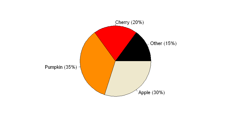
Limit the number of categories via grouping
To avoid visual clutter and to ensure your pie chart is readable, the number of categories should be small. Therefore, it may be useful to group categories that individually comprise a small proportion of the pie into a single category. Note that, when using this approach, it may be helpful to list the items contained in the derived category. Furthermore, it is best to ensure that the new category does not form the majority of the resulting pie.
Show percentages or absolute numbers (or both) as text
Text can be used to prevent misunderstandings due to ambiguity. By including text information, a person can see if there are differences among the categories. However, if it is necessary to include text, then one can argue that the visualization itself is ineffective (so be prepared to defend your choice of chart type).
#Adjusting plot size and margins
options(repr.plot.width=8, repr.plot.height=4)
par(mfrow=c(1,1), mai = c(0.55, 0, 0.8, 0))

#Data for pie chart
x = c(15, 20, 35, 30)
labels = c("Other (15%)", "Cherry (20%)", "Pumpkin (35%)", "Apple (30%)")
cols = c("black", "red", "darkorange", "cornsilk2")

#Build the pie chart
pie(x, labels, radius = 1, col=cols)
Conclusions
We hope you found our discussion of pie charts informative. While pie charts can be avoided in most cases, they remain a pithy little chart on which many, many people have little to no opinion. However, to avoid a mass uptake of pitchforks and torches, please remember to employ pie charts responsibly and to use caution when including any controversial chart type in your next presentation.
Required libraries
Click the Show/Hide Code button to view the libraries.