What Is Python, And Why Is It Awesome?

What is Python?

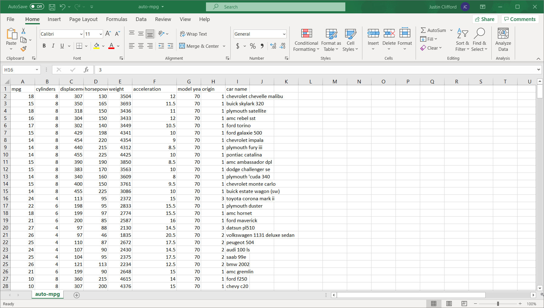
Python is a relatively intuitive, general-purpose programming language that allows users to do anything from analyzing data to building websites. In the context of data, it allows for complete flexibility and customizability when performing analyses. Here are some good resources that dive deeper into what Python is if you are interested:

https://www.coursera.org/articles/what-is-python-used-for-a-beginners-guide-to-using-python

https://www.geeksforgeeks.org/history-of-python/

Check out this nifty guide as well:

https://media-exp1.licdn.com/dms/document/C4E1FAQGiHsf7Wgn1rA/feedshare-document-pdf-analyzed/0/1652795096567?e=1654128000&v=beta&t=h8fHewNT4r0ESBAk3k6l9SRQEDntIan6ITVokm3yj_Y

Why is it great?

When a client lets us choose our tools, we always choose Python. It’s the best in three main areas:

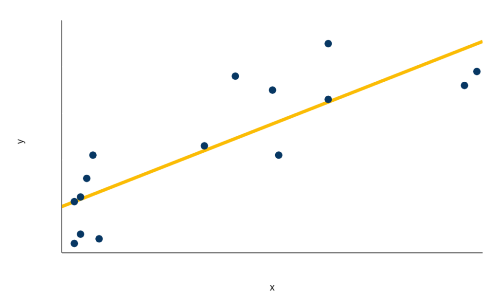
  1. Flexibility/Customizability. If an analysis is possible in a general sense, it’s possible to conduct that analysis in Python. In other words, in the data analytics world, if you can’t do it in Python, you can’t do it. Python offers countless libraries in data visualization, data processing, statistics, and more, allowing users to optimize any analysis for speed, storage, and accuracy.
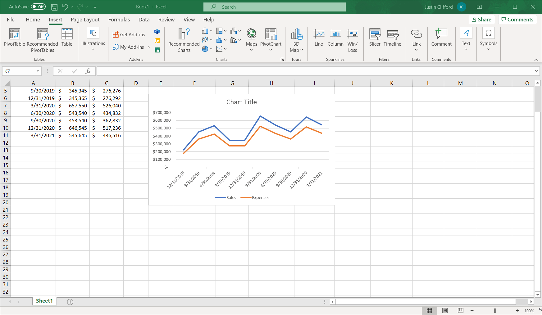
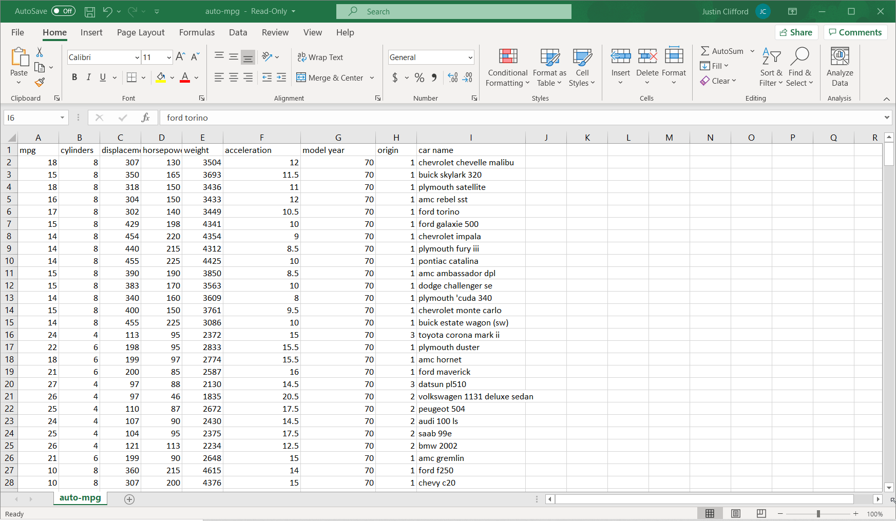
  2. Scalability. Much of the world today remains stuck on Excel. That’s not completely a bad thing; Excel is a highly intuitive product that makes otherwise complex analyses quite straightforward for non-technical users. But where Excel falls well short of Python is in scaling. Excel files face a limit of just over one million rows per tab, which is not a limitation for Python; in today’s big data-backed data science world, one million rows of data is not that huge of a dataset, so Python therefore enables data scientists to complete more thorough analyses than Excel. And even if you can fit all of your data onto an Excel sheet, Excel’s performance starts to deteriorate much faster than Python when dealing with larger and larger datasets.
  3. Automation. If you want your dashboards, reports, and other analyses to update automatically, Python is the way to do that. Python specializes in compiling data from disparate sources (e.g., SQL databases, APIs, CSV files, and many more) into one place and inserting it into PowerBI, Tableau, or whatever other analytics tool you choose on a completely hands-free basis.

While we are familiar with R and other languages, and are happy to work in those languages as well, we choose Python for the reasons mentioned above. We think it’s the best of the best for data analytics and data science.

Applications of Python: API Integration

APIs (Application Programming Interfaces) are a tool that a developer can use to programmatically extract data from some other location in real time. For example, if you have data stored in Salesforce, Zoho, Monday, or other CRM, you can pull that data into a customized analysis in real time via an API using Python. Because of the increased level of automation that this method provides, it is seen as preferable to downloading data from the program into a CSV or Excel file and then repeating the analysis manually. While Python is not the only programming language that can be used to pull data from an API, it is advantageous to keep your end-to-end data process in one language, especially if the analysis of the data you’re pulling is to be completed in Python. Boxplot specializes in building fully-automated customized dashboards and reports for our clients using data stored in some third-party system; Python is always our preferred language for client projects along those lines.

It is also possible to insert data into a third-party storage system in real time using an API in addition to pulling data. This technique comes in handy when trying to ensure that multiple data storage systems don’t get out of sync; a Python-based program can automatically update data in some storage system A based on updates made in some other system B. Boxplot has also worked on many client projects involving this sort of work.

Applications of Python: Big Data

As aforementioned, Python does not face the same data volume limits that users run into with Excel. Python enables users to process even one million rows of data in a near-instantaneous manner on an average-quality computer. And if you anticipate utilizing a massive billion-row dataset, Python easily integrates with Spark, Hadoop, and other parallel computing frameworks. In short, if you’re going for anything big-data-related, Python is the way to do it.

Applications of Python: Machine Learning

Machine Learning involves teaching a computer how to detect and extrapolate upon data without having to give it specific instructions on how to do so. Python is far and away the strongest programming language for machine learning, as numerous free-to-use machine learning libraries are available. These libraries include packages used in both supervised learning (i.e., when a computer tries to predict a set output) and unsupervised learning (i.e., when a computer creates abstract labels for categories of data observed in the dataset). Boxplot has completed numerous client projects in both supervised and unsupervised learning, and we always turn to Python as our go-to solution.

Github Tutorial

What Is GitHub And Why Is It Useful?

GitHub is the world’s most commonly-used code hosting/storage platform. It is used by coders of all sorts to view, store, write, and collaborate on code, all for free. GitHub uses a tool called Git to enable these abilities (i.e., “GitHub” refers to the website where code gets stored; “Git” is the tool that the website uses to do that). Because GitHub stores code in a centralized location accessible to anyone with the proper credentials, it is an extremely useful resource when it comes to collaboration, update syncing, version history, and so on; these aspects of software development are much more cumbersome if coders are each storing their own copy of your codebases locally. As with any technology, there is a slight learning curve if you are new to GitHub. However, the vast majority of skills you will need to get started using GitHub effectively are covered in this brief tutorial.

GitHub Basics And Initial Setup

The GitHub workflow consists of (1) the directory containing the files that you are editing on your computer, (2) a “staging area” or “index” where files are temporarily stored and verified before being permanently recorded in GitHub, (3) a “local repository” which records your changes but is only visible to you, and (4) a “remote repository” (i.e., GitHub itself) which records your changes so that anyone with access can see them. An important note is that the staging area is temporary storage; you do not create a traceable version history by adding files as you do with the GitHub repository. If you want to have a version history ―being one of the main assets of using GitHub to begin with― you will need to commit your changes permanently to (3) or (4).

You can interact with GitHub repositories and staging areas using either the command line or by using GitHub’s desktop app. To use the command line, you need to have Git installed. It can be downloaded here. The desktop app can be downloaded here.

You need to either start a new repository or clone an existing one to begin inserting files into it. We will have a future blog post that covers these options.

Git Pull

“Pulling changes” refers to the process of updating your own copy of each file that you want to view and/or edit to be in sync with the up-to-date version stored in GitHub before making any of your own changes to those files. It is important ―at the very minimum― to do so each time you edit anything stored in GitHub to make sure the changes you make do not (a) get applied to an out-of-date version, and as a consequence, do not (b) fail to incorporate someone else’s progress.

It’s very simple to perform a pull operation. In the command line:

and if you are using the desktop app, use the “Pull origin” button at the top to perform this same task:

Git Add

This command takes your locally-saved files and puts them in the staging area. Note that this step does not make any changes to the GitHub repository. It only moves a “rough draft” of the files to the staging area; if you check over each rough draft file and determine they are all set to overwrite the current versions in GitHub, you then use the git push command to do so (we will cover this command later in this tutorial).

Let’s see how it works in the command line. Navigate to the directory with the files you want to add by dragging the folder onto the terminal. Then, you can check which files are eligible to be uploaded to staging by using the git status command. The eligible file names are shown in red:

Add the files to staging by using the git add command followed by the names of the files you want to add to staging separated by spaces:

Alternatively, put a star rather than the file names to indicate you want to add all files of a certain file type:

Finally, you can add all files in the directory using this command:

Confirm that the correct files have been added to staging by using git status again. The file names in green confirm they have been added to staging.

Note that it will tell us if any commits have occurred or not.

In the desktop app, checking and unchecking files in the toolbar on the left hand side is the equivalent to adding and removing those files from staging:

git commit -m “message”

Uploading your changes to GitHub from the staging area is referred to as “committing” your changes. When you commit changes to GitHub, you pass in a message along with your changes that describes the changes that you are making. This feature is helpful if you ever have to look through the version history of a particular file in GitHub because these messages remind you of what changes occurred with each version; if a certain change ever has to be reverted, you know right where that change occurred. This message gets passed inside quotation marks at the end of the git commit command. For example, if you wanted to copy the two files from the previous section that are currently sitting in staging, you would do this:

If you prefer to use the GitHub desktop app, put your commit message in the box just above where it says “Description” and then click the Commit button in the bottom left:

git push

This command moves what is in staging to GitHub (the remote repository). You can perform this action using this command:

You will be prompted to enter your GitHub username and password. After doing so, the files will be pushed to GitHub.

If you are using the desktop app, go to Repository -> Push to push the files.

Small Business Social Media Metrics

A superior social media analytics practice is one of the best ways for small businesses to gain an edge over larger competitors. And the growing accessibility of advanced analytical tools makes social media analytics a worthwhile pursuit even if on a tight budget. This blog post covers some of the most useful social media-specific metrics ―which cover topics including audience/demographics, brand ecosystem, and engagement/conversion― to help organizations like yours get started with social media analytics. Check out our social media presentation blog post here.


Audience & Demographics

These metrics involve analyzing those who interact with your social media content rather than analyzing the social media content itself.

  1. Age Distribution. Do your social media pages attract older or younger audiences? Knowing the ages of who is interacting with your social media pages, such as the average and median age of those who “like” your posts, can help with everything from content selection to product pricing strategies.
  2. Geographical Distribution. How global is your organization’s reach on social media? Analyzing social media data by geography, such as viewing the number of followers on your Instagram page broken down by country, is one of the best ways to understand your existing and prospective customers. Knowing the geographical distribution of your audience may also assist with knowing when to post; the goal there being to post content to align with the time of day that people in each time zone are likely to be on social media.
  3. Gender. What is the distribution of your audience among different genders? How does that differ in terms of who views your posts versus who “likes” your posts?
  4. Ethnic Background. Similar to other demographic information, understanding how audiences of different ethnic backgrounds interact with your social media content allows you to infer a lot of insights that can help optimize your organization’s strategy.

Engagement & Conversion

These metrics involve analyzing data about the pages and posts themselves that your organization is creating via social media.

  1. Click-Through Rate. Out of all visitors to your social media pages, what proportion click on links that appear there? This is what click-through rate (CTR) measures. A higher CTR means that your audience is well-engaged with the content that you post.
  2. Clicks. Exactly what it sounds like: how many times has your audience clicked on content that you post on your social media pages? This metric can be measured on an overall basis or for individual posts.
  3. Impressions. Impressions count the number of times one of your pages is shown to someone.
  4. Pageviews. Pageviews count the number of times an audience member views one of your pages. This metric differs from impressions in that it counts views rather than actions. In other words, if someone views your page three times, that would count as three impressions but only one pageview.
  5. Shares/Retweets. Again, this metric can be calculated on an overall or post-by-post basis.
  6. Subscriptions. How many audience members have subscribed to your communications via social media, such as subscribing to your YouTube channel or to a monthly mailing list?
  7. Comments

Brand Ecosystem

These metrics concern trends occurring in the industry in which your organization operates. One key difference between this group of metrics and the others covered in this article is that these metrics analyze data originating from external social media pages rather than your organization’s.

  1. Industry Trends. There are many separate metrics within this category. For example, what has been the most talked about new product on social media over the past six months in the industry in which your organization operates? 
  2. Comparative Pricing. How are your competitors’ audiences reacting to their prices on social media? What percent of reactions in the comments are positive versus negative? Knowing this information can help your organization optimize pricing strategies to win over potential buyers from competitors, and it is all accessible by analyzing social media data.

None of these lists are exhaustive either! If you’re a very small business that doesn’t have a lot of time to dedicate to this, but wants to get started understanding your social media performance, we recommend our sister company Pulse Metrics. Their app will deliver insights like “Your average number of likes is down by 20% this month” or “Did you know that most of your audience is female between the ages of 18 and 24?” right to your email inbox. No need to learn how to make dashboards, or spend any time configuring settings. Connect your social media platforms in a few clicks and the app automatically starts generating insights. 

If you are a larger business and need more custom analyses to reach your analytical goals through social media data, a bespoke selection of metrics to focus on is almost always the most successful. As always, Boxplot is happy to discuss your strategy when it comes to social media analytics, regardless of your prior level of experience with it.

Line Graphs

What Is A Line Graph?

A line graph is a series of data points on an xaxis, connected by a line. There are two kinds of line graphs: colored-in (also known as area charts) and standard. While the area under the line of a colored-in line graph is shaded in, the area under a standard line chart is not.

Standard chart

Real-world example of a standard line graph

Area chart (colored-in)

Example of the same data as an area chart

Within area charts, there are two types: stacked and proportion of whole. Stacked area charts simply show the series as-is, such as the area chart immediately above; proportion of whole area charts show an entire population ―represented by 100%― split up into the proportion of that population that each group represents. It’s easy to differentiate between the two types of area chart by the fact that the uppermost line on a proportion of whole area chart is always flat at 100%, while that of stacked area charts varies over time. Area charts are not recommended by some data visualization experts because their data points can be hard to compare and misleading.

Real-world example of a proportion of whole area chart.

When To Use Line Graphs

Because line graphs convey the progression of a series of data very well, it is most common to see line graphs being used to display information over time. You’ll occasionally see line graphs represent distributions (what is the frequency of each possible value for a data set) but time series are definitely the most common. In terms of choosing between standard line graphs and area charts, it is more common to use an area chart if you want to compare different groupings of the same series/population ―e.g., if you want to compare the number of people who have gotten at least one dose of the coronavirus vaccine with the number of people who are fully vaccinated, as seen above― but much more common to use a standard line graph if you want to see a single metric, such as the first example graph shown. A standard line graph is also common if you’re looking at multiple different series (not to be confused with different groupings of the same series), e.g., if you want to compare how many people have been vaccinated in the United States vs. the number of people vaccinated in Canada.

Common Programs For Making Line Graphs

Likely the most commonly-used program to make either type of line graphs is Excel; beginner and expert data analysts alike love Excel’s ease of use, flexibility, and universality. However, other business intelligence software which can be used to make any type of line graphs include Tableau, Qlik, and Microsoft’s Power BI (which are each superior to Excel in terms of automation and customizability) as well as Google Sheets. Additionally, programmatic tools such as R and Python each include packages for creating line graphs.

Tutorial: Making Line Graphs In Excel

Although there are a number of different programs in which you can make line graphs, I’ll do a quick tutorial here in Excel since that’s the most popular. To start, organize your data into adjacent rows or columns, where one of those rows/columns contains the data to appear on the x-axis (this is usually a row/column of dates), and the other row(s)/column(s) correspond to the values that you want to appear in your chart. For example:

It would also work just as well to have the three categories of data as rows instead of columns:

While it isn’t absolutely necessary for the rows/columns of data to be adjacent, it will make the process of creating the line chart much easier; you’ll see why in a second. Note that any of the values in these rows/columns of data can be calculated by Excel formula(s) or hardcoded (raw) values. However, formulas are preferable if possible because when a calculated value is updated, it’ll also update the graph that shows that value automatically; this is not the case with hardcoded values, on the other hand.

To create your line graph, highlight the data, and then go to Insert and click on the line graph icon:

You’ll also see the stacked line and 100% stacked line options alongside the standard line chart option, and creating those two types of chart works the same way. However, in this context, the standard line chart makes the most sense. Using Excel’s Recommended Charts option will also give you a line chart by default as it assumes a line chart is desired for time-series data.

To customize the title of the line chart, simply click into the title box at the top of the chart and type in the desired title:

I can also change the font and formatting of the title in the same way.

There’s a small issue with this chart that we need to adjust: the x-axis starts at 12/1/2018 even when my data doesn’t begin until 12/31/2018. To customize my x-axis ―or any other chart component, for that matter― right click on the axis, and then select Format Axis. Next, set this axis type to a text axis (Excel thinks of dates such as 12/31/2018 as month dates that simply correspond to December 2018, and thus records them on charts as 12/1/2018 by default instead of 12/31/2018):

There are nearly countless other customization options available to you on this same toolbar that you just used to adjust the x-axis. To access the other options, click on the down arrow next to the Axis Options label:

Here, you have the ability to edit the chart area, chart title, horizontal axis, vertical axis, legend, plot area, and series, in terms of size/properties, effects, fill/line, and/or axis. For items corresponding to any sort of text label, the Text Options button also appears:

I won’t go into too much detail on all these options as doing so would take a VERY long time, but know that nearly any customization feature imaginable is available somewhere in these options.

While you’re at it, let’s go through the other customization options to make sure the line graph is exactly as you desire. If you click on your chart, you’ll see three icons on the top right corner:

The plus icon controls which elements you want to show up on your line chart. By clicking on this icon and hovering over each checkbox, you can view what your chart will look like with each option selected or unselected in real time; the arrows you see on the right side point you to additional toggle options:

You can use this feature to add or remove the axes, axes titles, the chart’s title, labels for each individual data point, a data table, error bars (showing standard error, percentage, standard deviation, etc. for each individual data point), gridlines, a legend, a trendline ―although that wouldn’t make very much sense in the context of a line graph― and up/down bars which show differences between the two series.

Next, the paintbrush icon allows you to change the visual styling of the line graph. Take some time to play around with the different options it gives you for style and color, and see which one you like best:

Note that more color options are available; the ones you see on this tab are just a few preset out-of-box options.

Lastly, you have the funnel icon, which lets you filter which data you do and don’t want to appear on your graph. You can even remove an entire series from the graph this way, or remove one of the dates along the x-axis; control these two options by checking/unchecking boxes, and then click Apply to see the results:

When you click on the graph, you may have noticed two extra tabs on the Excel ribbon that aren’t normally there: the Chart Design and Format tabs:

Let’s briefly go over those two tabs as well. On the Chart Design tab, the first three dropdowns (Add Chart Element, Quick Layout, and Change Colors) as well as the scroll menu in the center of the tab, give you some options that are duplicates from the plus and paintbrush icons explored earlier. Hovering over any of these options will show you what the chart will look like in real time. To reiterate, these are preset options, and if you don’t see something within these options that you want, chances are good you’ll be able to access the desired customizations in another way. There is also the option to switch row and column ―although for line graphs time always goes on the x-axis―, to update the selection of data that goes into the graph, to change the type of graph that displays, and to move the chart to another sheet in the Excel file.

Finally, there’s the Format tab, which replicates a lot of the functionality present on the toolbar that you used to adjust the x-axis. Take some time to play around with the options.

Summary

  1. Line graphs are used to show the progression of a series of data, usually over time. An area chart is used if the series is being split up into multiple groups, but if it is not being split up, a standard line graph is more common.
  2. Excel, Google Sheets, Power BI, Tableau, Qlik, Python, and R all include packages for building line graphs.
  3. There are countless options for customizing your line graphs in Excel. Review the tutorial in this blog post, or spend some time playing around with the functionality to build your optimal line graph.

Tips For Building Likert Surveys

Likert Surveys ―pronounced LICK-ert― are one of the most popular ways of collecting survey data. Their simple design of providing a series of prompts with a discrete scale of responses for each prompt (such as “Strongly Disagree”, “Disagree”, “Neutral”, “Agree”, and “Strongly Agree”; “Poor”, “Fair”, “Average”, “Good”, and “Excellent”, etc.) makes Likert Surveys an extremely popular survey type. But they are also one of the most commonly abused types of survey; this blog post provides a brief tutorial to ensure your Likert Surveys are implemented correctly.

Creating a Likert Survey may seem simple enough, but there are common pitfalls to avoid. When these hazards aren’t avoided, it leads to results that are biased at best and downright deceitful at worst. This is an especially important consideration whether you are designing a Likert Survey or analyzing the results of one; it may seem simple enough to design a Likert Survey, but only if these tips are followed can the survey yield truly fair, unbiased results.

  1. Make sure options are evenly spaced. 
    For example, you wouldn’t want the options to be “Poor”, “Good”, “Very Good”, and “Excellent” because moving from “Poor” to “Good” would likely be a much larger improvement than going from “Good” to “Very Good”. To avoid this potential pitfall, it often makes sense to have respondents rank things on a scale from 1 to 10 instead of assigning qualitative descriptors such as “Poor” and “Good” to their responses.
  2. Make sure options are evenly distributed. 
    For example, you wouldn’t want the options to be “Poor”, “Average”, “Good”, and “Excellent” because there would be more above-average options than below-average options in this case. I recently came across a Likert Survey pertaining to the quality of a new software product, distributed by the firm that sells that product. One of the prompts was, “[product name] has enhanced my ability to automate menial tasks”, and the options were “Disagree”, “Agree Somewhat”, “Agree”, and “Strongly Agree”. Obviously, with more options pointing to the product’s success than the product’s failure, respondents are more likely than otherwise to choose an option that makes the product look successful; thus, the firm in question is trying to use their survey to make their product seem more successful than it actually is. This is an especially egregious example, but it clearly points to how Likert Surveys can be biased and/or can be used to deceive, if not implemented correctly.
  3. Provide some positive prompts and some negative prompts. 
    For example, if you are asking respondents’ opinions on pizza and tacos, frame the first prompt as “Pizza is delicious” (with the options being strongly disagree, disagree, etc.) and frame the other prompt as “Tacos are overhyped”. Studies such as this one have shown that the practice of framing some prompts negatively and some positively ―known as balanced keying― can reduce what’s known as acquiescence bias in your survey results. Acquiescence bias describes the human tendency to acquiesce (choose the “agree” option) to a statement if respondents are unsure of their true feelings.

Building A Likert Survey In Google Forms

There are a great number of platforms which can be used to build a Likert Survey, but we’ll go over Google Forms because it’s free and allows for seamless response data conversion to spreadsheets.

Let’s say I’m trying to set up a Likert Survey on pizza toppings. To do this, I would first navigate to www.google.com/forms, and log into my Google account. On the resulting screen, under Start a new form, click on the plus icon labelled Blank:

Then, I’m going to fill out the name of my survey where it says Untitled form and provide a description if I want. Now it’s time to start creating the questions/prompts. First and foremost, on the dropdown menu on the right-hand side, I make sure to select either the linear scale option or multiple choice option; these options allow me to turn this survey into a Likert Survey. Next, I choose how many options to provide my respondents for this question (the default is 1 to 5, with customizable option labels). I fill in all of this information according to my survey’s requirements, but I remember to evenly distribute the labels. When I’m finished, I click the plus icon to move on to my next question.

I create the rest of your questions in succession, paying special attention to the aforementioned tips.

A few quick notes on the functionality of the right-hand side toolbar (the toolbar of icons with the plus icon for adding new questions on it): as previously mentioned, the top icon/plus icon allows me to add more questions to the survey, the second icon down allows me to import questions from other Google Forms surveys, the third icon down allows me to add additional titles and descriptions to subsections of the survey, the fourth and fifth icons down allow me to add images and videos, respectively to your survey, and finally the sixth icon down allows me to add a skip logic-enabled subsection. For more on skip logic and other survey technicalities, view our article on survey specifics here.

When I’m finished, I can send out this survey to respondents by clicking the “Send” button. There are three ways of distributing the survey: through email, by copying a link to the survey, or by embedding the survey in another page.

The Responses page will show respondent activity in real time. From that page, I can end the survey by clicking the Accepting responses toggle button; I can also send response data to a Google Sheet by clicking the green Create spreadsheet button, and/or I can send response data to a .csv file by clicking on the three dots in the top right of this page, and then clicking Download responses (.csv).

Analyzing Survey Data

Now that I have data from my respondents, what can I do with it? The answer to this question depends on whether my data are ordinal or interval data. Interval data preserves order and distance; for example, a Likert-like prompt to rate something on a scale from 1 to 10 would be interval data because we know that 2 is greater than 1, that 3 is greater than 2, and so on, but we also know that an improvement from a 1 to a 2 is of the same size as an improvement from a 2 to a 3. Ordinal data, on the other hand, merely preserves order; for example, a scale of (“Poor”, “Fair”, “Good”, and “Excellent”) would yield ordinal data because we cannot be assured that an improvement from “Poor” to “Fair” is of the same size as an improvement from “Fair” to “Good”.

Ordinal data is much more qualitative than interval data, and so it makes much more sense to use a bar chart, column chart, or pie chart to analyze such data. Interval data, on the other hand, can be used to run more advanced statistical tests such as histograms/distribution analysis, means, standard distributions, and hypothesis testing.

If I’m trying to apply Machine Learning to the results of a Likert Survey, my methods for doing so will also depend on whether I have ordinal or interval data. If I’m trying to apply Machine Learning to an ordinal target variable, I’ll be using a classification algorithm such as Decision Trees, Random Forests, Neural Networks etc. because the results of such a survey are discrete; regression analysis would not be a good strategy for ordinal target variables. For an interval target variable, I could opt for a classification model, but regression analysis would also be available to me because I can treat such a variable as continuous.

Interpreting Linear Regression Results

A Brief Introduction To Linear Regression

Linear regressions discover relationships between multiple variables by estimating a line or other function of best fit to a set of data. For example, the orange line is what a linear regression’s result would look like for the data shown in blue:

This function of best fit (shown here in orange) is expressed in the format of y = mx + b, where is the variable we are trying to predict and x, sometimes referred to as a regressor, is the variable whose effect on we are examining. Since represents the slope of the line, it can be thought of as the effect of on y (mathematically, m tells us the amount we would expect y to increase by for an increase of 1 in x, so essentially tells us by how much x is affecting y). Thus, the orange line represents our best estimate of the relationship between x and y. Note two things. First, we can use linear regression to discover relationships between more than two variables; we are not limited to just one x variable to explain the y. Second, the relationship we estimate does not have to be a straight line as it is in this example; it can also be a polynomial function, an exponential function, etc.

Interpreting Linear Regression Results In Excel

I can see that the equation it gives for the best fit linear trend line is y = -0.0014x + 19.606. The main insight embedded in this equation is the -0.0014, which represents m from the previous section; this number tells us that every one-pound increase in the weight of a car results in a reduction of acceleration by 0.0014; a negative means that an increase in the x variable is associated with a reduction in y and vice versa. Additionally, since our relationship is linear, we know that this relationship scales as well (so, for example, this value for m also tells us that every ten-pound increase in the weight of a car results in a reduction of acceleration by 0.014, every one-hundred-pound increase in the weight of a car results in a reduction of acceleration by 0.14, and so on).

In some cases, the intercept value b (19.606 in this case) is meaningful, but in this case, it is not. The intercept value tells us what we should expect the value of to be if the value of is 0. In this case, the value of x being 0 would translate to a car that weighs 0 pounds, which is obviously not meaningful.

So we’ve established that acceleration decreases by 0.0014 for every one-pound increase, but to understand the full influence of weight on acceleration, we also want to know: how much of the total variability in acceleration does weight account for? This is the question that a special metric called R2 answers. It’s called R2 because it’s the squared value of the correlation, which is represented by R. To get the Rscore on an Excel regression, go back into the formatting options that we used to add the regression equation, and check off the box for Display R2:

The resulting R2 value is 0.1743, which means that an estimated 17.43% of the variation in acceleration can be explained by weight.

Note that while it is possible to include more than one x variable in our regression to understand the effect of multiple variables on our chosen y, it is much better practice to use a programmatic tool such as R or Python rather than Excel for such cases.

Interpreting Linear Regression Results In Python And Other Programmatic Tools

Fire up your preferred Python IDE and load in the .csv or .xlsx file using the following code:

Obviously, you’ll have to replace the file path inside the read_csv method call with whatever file path and file name you saved the data under. There are two ways to run a linear regression in Python: by using the sklearn package and by using the statsmodels package. Here’s how to use Python’s sklearn package to run the regression (there are of course other ways of doing this, but this blog post is about interpreting results, not the actual coding):

Next, use reg’s coef_ attribute to retrieve the value of m:

Once again, we have arrived at a value of about -0.0014 for m. We can also check on the R2 value by using the score() method within reg:

and sure enough, it’s about 0.1743 again.

If we want to use the statsmodels package, the code to be run is:

The summary() method returns us a clean table which confirms the coefficient value of -0.0014, a constant (intercept) value of 19.606, and an R2 value of 0.1743:

This table also gives us a bunch of other information. We won’t go through all of it in this blog post, but here are a few highlights:

  1. Adjusted R2: Tells us the R2 value adjusted for the number of regressors in the regression. It increases over regular R2 if new regressors improve R2 by an abnormally large amount. Since there is only one regressor in this regression, adjusted R2 is slightly lower than regular R2.
  2. Model: The Model is denoted as OLS, which stands for ordinary least squares. This is the standard form of linear regression that we’ve explored in this blog post.
  3. Df Model: Tells us the number of degrees of freedom in the model, which is the number of regressors in the regression.
  4. std err, t, and P>|t|: These metrics show which results are statistically significant, and which are not. Values in the std err column tell us the accuracy of the coef values, where lower std err values correspond to higher accuracy. Values in the t column tell us the t-values of the coef values, which indicates the number of standard errors away from 0 the coef values are. The t-values are very important ―especially in the row(s) that correspond to regressor(s)― because if a t-value is at or near 0, it means that the constant/regressor in that row has an effect of 0 on the variable (i.e., the regressor is meaningless). But if a t-score is higher than about 2, it means that the regressor in that row is statistically significant. Finally, values in the P>|t| tell us the probability that the constant/regressor in that row is not equal to 0; if the P>|t| is high enough, we can therefore conclude that the constant/regressor is “significant”, i.e., we can be sure that that constant/regressor has a meaningful effect on the variable.

While the exact command/syntax used for linear regressions varies among Python, R, SPSS, Stata, and other tools, each tool is able to give you similar information to what we looked at in Python and Excel.

How B2C Businesses Can Use Their Data

In order to understand your customers fully and correctly, the data and analytics you maintain about those customers are extremely important. For B2C organizations especially ―which sell directly to customers― customer data and analytics are a necessary component of sales, marketing, and managerial strategies for both pre- and post-market decision making. There is a long list of channels through which a superior data practice can help B2C organizations gain a leg-up on their competition; this blog post will focus on some of the most prominent of those. If you’re a member of a B2C organization interested in hearing about what your business can do to make better use of data, this blog post is for you!

Social Media Analytics

Because they sell directly to end-user customers, in this day and age effective B2C organizations must be aware of the way that their customers engage with the business through social media. There are several different forms of social media analytics that help B2C organizations understand their customer base.

First, these organizations can use social media analytics to improve their social media strategy itself. For example, an organization may build an automatically-updating report to inform them of which sorts of posts (what time of day was it posted, long posts or short posts, which medium was it posted on, etc.) are generating the greatest number of click-throughs, the  greatest number of likes, the greatest number of sales leads, and so on; or alternatively, an organization may build an automatically-updating report to inform them of which sorts of posts are not working so well. Either way, the insights that these reports generate enable this organization to optimize their social media strategy according to what’s working and what’s not.

Second, these organizations can use social media analytics to improve their general marketing strategy. Knowing which sort of consumer is more likely to engage with your social media content also helps you determine which sorts of products/services those groups of people enjoy buying, and in turn, which product(s)/service(s) should you focus on building to gain ground on competitors. To read more on the benefits of social media analytics, view our separate blog post on the topic here.

Know Your Customers At A More In-Depth Level With Machine Learning

Characterizing your existing customer base by past spending habits, demographic information, and more can be a helpful strategy, but you have the ability to go into much more depth than simply aggregating known data. Data scientists can use a special kind of programming called machine learning ―defined as teaching a computer how to extrapolate on known data to create new data― to generate new, currently unknown information about your customers.

For example, let’s say your organization is planning the launch of a new service and wants to optimize its marketing strategy for that service. Obviously, you won’t have data on which marketing strategies worked and didn’t work before the service actually hits the market, nor will you ever have any data pertaining to strategies that you don’t end up pursuing. As a result, conventional data analytics won’t help you here. But what you can do is use machine learning to extrapolate on the data you do have to make an objective, unbiased prediction of which marketing strategy is the best given the circumstances.

Your organization can also use machine learning to predict future customer behavior, predict supply chain issues, diagnose drivers of cost overruns before they actually occur, personalize marketing by predicting which material(s) a given viewer may be more interested in seeing, and much, much more.

Customer Relationship Management Analytics

What can your organization do to retain more customers? Being able to answer this question is a primary objective of most B2C organizations, as B2Cs almost always feature shorter customer lifecycles than B2Bs. When applied in the proper way, data analytics is the most reliable way to identify customers who are at risk of terminating their business with your organization before they actually do; then, you can apply the proper retention tactics with these customers to keep them onboard for longer. To identify such customers, data scientists often turn to a technique called survival analysis, which can estimate the likelihood that a current customer leaves your customer base over time. Then, the data scientist can examine which diagnostic factor(s) have the greatest downward influence over that likelihood; when these diagnostic factor(s) are then identified in a certain customer, your organization can deduce that corrective action is necessary for that customer.

There are a lot of other questions that customer relationship management analytics can answer as well. Here are a few examples:

  1. Which type of prospects and sales leads tend to turn into clients, and what can be done to improve the conversion rate of those who are less likely to become clients?
  2. How can we measure client conflicts and what can be done to prevent them?

Data collection is also a straightforward exercise in order to conduct customer relationship management analytics, especially if your organization has CRM software.

Accounting Analytics

What are the principal causes of cost overruns for your organization? What is the size of the average purchase from your business, and how has that changed over time? If a customer buys a certain product/service from you, which of your other products/services are they more/less likely to also buy? The answer to each of these questions are buried somewhere in your accounting records. To uncover insights such as these, a necessary step is to build some sort of data feed from wherever your accounting data is stored onto bespoke report(s) and/or dashboard(s); the payoff of an expert data analyst in this case is to build an efficient, effective, and ideally automated set of data feeds and reports to enable your organization to receive fully-updated, industry-leading accounting analytics whenever they are required.

Your Organization’s Data Strategy

These are just a few examples. Many B2C organizations will have all kind of data that could be valuable to the business. Contact us to chat about your organization’s data-related needs.

Conditional Formatting with Excel

Conditional formatting is an Excel feature that allows users to customize the formatting of a single cell or group of cells based on whether a certain rule is satisfied. This feature is extremely useful in terms of automation, because the formatting of the selected cells changes automatically if the chosen condition is no longer satisfied (or becomes satisfied where it wasn’t satisfied before); otherwise, you would have to change the formatting by hand each time the condition is affected. For example, you may want to highlight cells with positive values green and cells with negative values red. If you use conditional formatting to do this, the highlight color automatically changes from green to red if a positive value then becomes negative, and vice versa:

Figure 1

There are seemingly countless options to choose from when setting up your conditional formatting; you aren’t just limited to the basic type of formatting shown in this brief example. This blog post provides an overview of the many, many different possibilities that exist within Excel’s conditional formatting module.

Accessing The Conditional Formatting Options

To access the conditional formatting menu, go to Home on the Excel ribbon, and then click on Conditional Formatting:

Figure 2

By doing so, the eight basic categories of options for conditional formatting appear: Highlight Cells Rules, Top/Bottom Rules, Data Bars, Color Scales, Icon Sets, New Rule, Clear Rules, and Manage Rules. As you’ll see, there’s a lot of overlap in terms of the capabilities offered by each option; in most circumstances, there’s more than one way of doing things with conditional formatting. Let’s dive into an in-depth review of each of those options. If you want to follow along, download an Excel version of UCI’s Auto-mpg dataset ―which is the dataset I’m using― from the UCI website or from Kaggle.

Highlight Cells Rules

Highlight Cells Rules has seven sub-options: Greater Than, Less Than, Between, Equal To, Text that Contains, A Date Occurring, and Duplicate Values (there’s also the More Rules button, but that brings up the same screen as the New Rule option which we’ll explore later).

  1. Greater Than. This sub-option allows you to highlight in a customizable way cell(s) that contain values greater than some other value. The value that you’re comparing to can either be a hard-coded value (such as simply “9”) or the value in another cell accessed via a cell reference (when in doubt, it’s always better to cell reference than to hardcode because cell referencing will allow the conditional formatting to update itself automatically when the value in the cell you’re referencing changes). When clicking on Greater Than, the following window appears:
    figure 3
    Figure 3.1.1
    The box on the left-hand side is where I fill in the value I’m comparing to; the dropdown menu on the right-hand side is where I choose how I want the cells that meet the greater than condition to be formatted. Explore the pre-set options available to you in the dropdown menu. If none of them appeal to you, you can also select Custom Format. By selecting Custom Format, you allow yourself access to all of the standard cell formatting options that would be available to you for regular (non-conditional) formatting:
    Figure 4
    Figure 3.1.2
    Let’s say I want to highlight values in the mpg column green and show values in white writing if the car gets over 20 miles per gallon. To do that, I would first enter in 20 to another cell so that I could cell reference the comparison value; remember that it is better to cell reference than hardcode. Then, I would highlight the column’s values so that the conditional formatting applies to the whole column, and then go to Conditional Formatting → Highlight Cells Rules → Greater Than. Next, I would cell reference the comparison cell in the left-hand box, and select Custom Format in the right-hand dropdown. Finally, I would customize according to the options available to finish my conditional formatting:
    Figure 5
    Figure 3.1.3
    Now we can observe the benefits of cell referencing the comparison cell in action. Try changing the value in the comparison cell from 20 to something else, and watch the conditional formatting in the mpg column update automatically:
    Figure 6
    Figure 3.1.4
    See how the highlighting disappears when I change the comparison value from 20 to 22?
  2. Less Than. Less Than is a similar option to Greater Than, but as the name suggests, it applies to conditions where cells are less than a certain value. If you want to try it out, do the same exercise we just did for Greater Than, but conditionally format all of the cells which are less than 20 instead.
  3. Between. Again, Between works the same way as Greater Than and Less Than, but applies to conditions where cells fall between two values.
  4. Equal To. Same idea as what we’ve been looking at, but it’s used to conditionally format cells that are exactly equal to a certain value, whether it’s hard-coded or in another cell.
  5. Text that Contains. This sub-option is the only one within the Highlight Cells Rules that applies primarily to text data instead of numerical data. To demonstrate this sub-option, let’s say I’m trying to highlight the car names of Buicks. Similar steps are involved again; note that by default, the condition satisfaction is not case sensitive, so I can use “Buick” as the comparison cell value even though it shows up lowercase in the data column:
    Figure 6
    Figure 3.5.1
  6. A Date Occurring. This sub-option is used to format cells in the selected range of cells containing dates that meet the chosen criterion from a set list of criteria. The criteria are (occurring) Yesterday, Today, Tomorrow, In the last 7 days, Last week, This week, Next week, Last month, This Month, and Next month. For example, if today is Wednesday 4/14/2021 and I highlighted a cell containing 4/12/2021, choosing the “In the last 7 days”, “This Week”, and “This Month” criteria would highlight the cell but none of the others would. Unfortunately, cell referencing is not possible for selecting condition criteria, nor are the criteria customizable; you are limited to the pre-set criteria.
  7. Duplicate Values. This sub-option allows you to highlight duplicate values or unique values within a selected range of cells. If you want to try it out, try highlighting unique values in the acceleration column; you’ll see that the Ford Torino’s acceleration of 10.5 in row 6 is a unique value in that column. Using the Duplicate Values sub-option works the same general way as the other sub-options we’ve explored so far.

Top/Bottom Rules

The second conditional formatting option is Top/Bottom Rules, which allows you to conditionally format cells whose values meet a ranking criterion within the selected range of cells (e.g., if you want cells whose values fall within the top 10 values in a column to be automatically formatted in a certain way, you would use the Top/Bottom Rules option). The sub-options within Top/Bottom Rules are Top 10 Items, Top 10%, Bottom 10 Items, Bottom 10%, Above Average, and Below Average.

  1. Top 10 Items. As you’ll also see with the Top 10%, Bottom 10 Items, and Bottom 10% sub-options, the Top 10 Items sub-option is somewhat of a misnomer, because you can choose the number of items to fit the condition; hence, a better way to think about these sub-options is the Top X Items, The Top X%, and so on. Here’s a quick example: if I wanted to highlight the top 25 heaviest vehicles (in the weight column), I would select that column, go to Conditional Formatting → Top/Bottom Rules → Top 10 Items, fill in 25 in the box on the left-hand side of the resulting screen, and then select my formatting:
    Figure 6
    Figure 4
    You should see straight off the bat that the Pontiac Catalina and Ford F250 both fall into the top 25 heaviest cars in the dataset. Note that this sub-option only works for numeric data, not text data; if you try to apply it to a text column, it won’t highlight the top X cells based on alphabetical order. I will not go into great detail on the Top 10%, Bottom 10 Items, and Bottom 10% sub-options because they all work essentially the same way as the Top 10 Items sub-option.
  2. Above Average and Below Average. These two sub-options conditionally format cells that, as the names would suggest, fall above and below the average respectively within the selected range of cells. There is only one customization available for each of these sub-options, and that is how the cells meeting the criterion should be formatted; there is no way to specify how much above/below the average a cell has to be to meet the criterion. Another limitation is that as with the four other sub-options within the Top/Bottom Rules, Above Average and Below Average can only be applied to numeric data.

Data Bars

Data Bars are a relatively straightforward conditional formatting option. They are used to highlight some portion of cells containing numerical values to express those values in relation to all other values in the selected range; the greater the value, the longer the highlight bar. For example, if I use Data Bars to conditionally format a range of five cells of values 1-5, 20% of the cell with value 1 will be highlighted, 40% of the cell with value 2 will be highlighted, and so on. Data Bars do not apply to text cells.

There’s the option to show a gradient highlight or solid highlight using the Data Bars option. Play around with the different highlights available to find the one you like; remember that hovering over each highlight format shows you what the selected range of cells will look like if you select that format. Additionally, hovering over the various highlights displays a text overview of what each one looks like when applied.

Here’s an example of what applying the Data Bars option to the acceleration column looks like:

Figure 5

Color Scales

Color Scales is a similar option to Data Bars, but it conditionally formats the selected range of cells as a color gradient instead of a quantity bar. If I apply Color Scales to the example from the Data Bars section, it would fill in the 1 at one end of the chosen color spectrum and 5 at the opposite end of that spectrum, with the intermediate values colored in according to their position on the 1-5 scale.

Icon Sets

The Icon Sets option is similar to Color Scales and Data Bars in that it formats cells according to their values relationally to other values within the selected range. However, Icon Sets display an icon in each cell to indicate its comparative value instead of coloring it in. There are four groupings of icons within the Icon Sets option: Directional, Shapes, Indicators, and Ratings. Each grouping pertains to a slightly different way of indicating comparative value via icons, but the application of each grouping works the same. Hover over/play around with the different icons to select the one that makes the most sense given the context of your needs; for example, I might use one of the icon sets in the Ratings grouping if I were trying to format the mpg column, because cars with higher gas mileage would have a higher “rating” in that regard.

New Rule

The New Rule option is obviously accessible by clicking on New Rule, but it is also accessible under the other options by clicking More Rules.

New Rule is the most customizable option within Excel’s conditional formatting package. There are six sub-options:

  1. Format all cells based on their values. Using this sub-option formats all cells within the selected range a certain way. In the bottom box, the Format Style dropdown lets you format selected cells as a 2- or 3-color scale (similar to the Highlight Cells Rules and Top/Bottom Rules options), as a Data Bar, or as an Icon Set, based on the values of the cells. Then, you choose the way you want minimum and maximum values to be selected (either automatic, the lowest value, a specific number, a percentage, a formula, or a percentile). If you select the specific number or percentage options, all cells that fall below the selected minimum are formatted the same way as the minimum value; the same thing applies for values above the selected maximum value. Lastly, you can customize the color used for the shading within this sub-option. Here’s an example of applying the same conditional formatting shown in the Data Bars section using this option:
    Figure 6
    Figure 6.1.1
  2. Format only cells that contain. The name of this option is self-explanatory in terms of how it differs from the previous option. There are seven sub-options, which determine the type of data that get conditionally formatted via the rule you’re setting up: Cell Value, Specific Text, Dates Occurring, Blanks, No Blanks, Errors, and No Errors. If you’re using Cell Value, you can then select whether you want to conditionally format cells that fall between two values, not between two values, equal to a certain value, not equal to a certain value, greater than a certain value, less than a certain value, greater than or equal to certain value, and less than or equal to a certain value. For the Specific Text sub-option, you can conditionally format cells containing, not containing, beginning with, or ending with, a certain segment of text. The Dates Occurring sub-option has the same customizable features as the Dates Occurring. And the rest of the sub-options feature dropdown menus to determine which cells are formatted. Once that’s established, you can format the cells that fit the selected condition by clicking the Format button; all options available to you in Excel’s regular formatting package are available by doing so.

I won’t go through the rest of the New Rule options in detail because they are all straightforward to use; take some time to play around with the other options on your own.

Clear Rules

This is a pretty self-explanatory option. You can use it to clear rules only from selected cells or from the entire sheet; if you’re using tables and/or pivot tables, you also have the ability to remove conditional formatting rules from each individual table/pivot table.

Manage Rules

Selecting this option brings up a window that can be used to adjust the functionality of the rules you’ve already created:

Figure 7

First, next to the “Show formatting rules for” header, you can choose whether to display the already-created rules for the currently selected cells or for the entire worksheet.

There are six buttons on this window’s header: New Rule, Edit Rule, Delete Rule, Duplicate Rule, Move Up, and Move Down. New Rule brings up the same window we explored in the New Rule section. Edit Rule also brings up this same window, but with the selected existing rule already pre-populated; to use this button, first select a rule in the bottom section of the window, and then click Edit Rule. Delete Rule and Duplicate Rule are self-explanatory. Finally, Move Up and Move Down are used to alter the prioritization the rules you’ve created; you may have noticed that the leftmost column of the bottom section of the window is titled “Rule (applied in order shown)” and this is because it’s showing you the prioritization order of all created rules in the event that more than one rule applies to the same cell.

Lastly, we have the bottom section of the window, which shows each rule that’s been created, each rule’s format, the range of cells each rule applies to, and the Stop If True button, which if selected ensures that rules that fall below it won’t be executed if the former rule’s condition(s) is/are satisfied.

Whenever you make an alteration using the Manage Rules option, always click the Apply button in the lower right-hand corner before closing the window.

This blog post has been a very in-depth look into conditional formatting in Excel (most of what’s been covered is also available in Google Sheets). If you’re struggling to implement Conditional Formatting or any other features of Excel or another BI program at your workplace, contact us.

Histograms

Figure 1

A histogram is a type of bar chart that shows the distribution ―i.e., the probability of a variable being within a certain range of values, out of all possible values― of a certain variable. For example, we can use a histogram to show customer wait times at a restaurant:

This histogram indicates that approximately 4 customers waited between 8 and 9.3 minutes, approximately 6 customers waited between 9.3 and 10.6 minutes, and so on. We can then estimate that because there are 400 total customers in the sample, that the probability of waiting between 8 and 9.3 minutes is 4/400 = 1%, the probability of waiting between 9.3 and 10.6 minutes is 6/400 = 1.5%, and so on for every possible waiting time. Clearly, there is a ton of information that can be inferred from this one simple chart, which is why statisticians find histograms so helpful.

Note that histograms are usually used for continuous variables ―variables that have infinite possible values― and so we divide the set of possible values into equally-spaced ranges, such as between 8 and 9.3, between 9.3 and 10.6, and so on; in our example, it would be impossible to show every possible value for minutes waited because 8 minutes of waiting would be distinct from 8.00001 minutes, which would be distinct from 8.00000000000001 minutes, and so on, so we split up the variable into ranges.

Fun fact For those of you familiar with Bell Curves (also known as a Normal Distribution): “Bell Curves” got their name because they are essentially histograms that are shaped like bells! In fact, if we create a histogram of most random variables, including the one from our example, it comes out looking somewhat like a bell curve.

Creating Histograms In Excel And Google Sheets

The process to create a histogram in Excel is very similar to the process in Google Sheets, so we’ll show them side-by-side in this tutorial. We’ll be using the famous Auto-mpg dataset for this demonstration; if you want to follow along, the dataset is accessible on the UCI website and Kaggle. Feel free to follow along using your own dataset, however.

To start off, remember that histograms are used to visualize a single continuous variable, and so make sure the data you’re trying to build a histogram off of is organized into a single column or row. In the Auto-mpg dataset, the goal would be to build a histogram based off of just one attribute at a time, which would correspond to one column of data; for example, you could build a histogram to display the distribution of mpg, or of cylinders, or of displacement, and so on, but you would almost never build a histogram that involved more than one of these at a time.

Figure 2

Also remember that histograms are used to analyze continuous variables, and thus it would not make sense to build a histogram for the car name attribute (a “histogram” for a discrete attribute like this one would just be a regular bar chart).

Let’s make a histogram!

The process is slightly different for Excel than for Google Sheets, so I’ll show the former and then the latter. In Excel, select the entire column of data you want to analyze (I’ll do the mpg attribute) and then go to Insert on the Excel ribbon, and click on the blue bar-chart-looking logo, two buttons to the right of the Recommended Charts button; this button, labeled “Insert Statistic Chart” is used to insert histograms. Finally, click on the option in the top left of the resulting box, labeled “Histogram”:

Figure 3. *Note – animation has a 2-3 second delay.

We can see that unlike the previous example, this particular attribute’s histogram is abnormally distributed; that is, the distribution does not follow the symmetric bell curve shape that we saw earlier. In fact, mpg looks to be what we call “right-skewed”, which means it is much more likely for the value of the variable to be towards the lower end of the overall range than towards the higher end.

It’s also worth going over how to adjust what we call the “binning” of the data, which is the way values are grouped into ranges on the histogram; each group is referred to as a “bin”. By default, we have 11 bins in this histogram on intervals of 3.7: (1) between 9 and 12.7, (2) between 12.7 and 16.4, (3) between 16.4 and 20.1, and so on:

Figure 4

By right-clicking on the values across the x-axis and then clicking Format Axis, we open up the side-bar that can be used to alter the binning of the data:

Figure 5 *Note – animation has a 2-3 second delay.

Under Axis Options on that toolbar, we have several options for binning. By default, the binning is set to Automatic, but we can also set it to:

  1. By category. This option is not relevant to single continuous variables such as mpg.
  2. Bin width. This option allows us to customize how wide each bin is. It is set to 3.7 by default, but if we were to set it to 7.4 for example, we would only have half as many bins. In general, the larger a bin width you choose, the fewer bars there will be in the histogram, and vice versa.
    (Figure 6 *Note – animation has a 2-3 second delay.)
  3. Number of bins. This option allows us to customize the binning based on the total number of bins. It is set to 11 by default, but if we were to set it to 22, the range for each bin would decrease by half. The same process for using the Bin width option also applies to this option.

There are also the overflow and underflow bin options, which allow us to group all observations above and below a specific value, respectively, into a single bin. Take some time to play around with the optioning on your own until you are satisfied with the result.

To create the same histogram in Google Sheets, again select the column of data and go to Insert on the ribbon, but then click on Chart. A scatter plot will then appear by default; change this chart to a histogram by changing Chart type to “Histogram chart”:

Figure 7 *Note – animation has a 2-3 second delay.

The binning is editable by clicking on the three dots in the upper right-hand corner of the chart, and then clicking Edit chart. The chart editing toolbar appears, and then go to Customize and click into the Histogram section:

Figure 8 *Note – animation has a 2-3 second delay.

There aren’t as many binning options in Google Sheets as there are in Excel as you can see, but there are two:

  • Bucket size. This option is similar to the Bin width option in Excel, although it only lets us choose the sizes from a dropdown instead of letting us customize it fully (as it does in Excel).
  • Outlier percentile. This option allows us to determine the percentage of overall values that are grouped into the two outermost bins. In that sense, it is similar to the overflow/underflow options in Excel; however, Google Sheets only lets us group values into these outermost bins at preset percentiles (unlike Excel), and we are forced to use both an overflow and underflow bin, but we can’t use one or the other exclusively as we can in Excel.

Histograms can be made in Excel, Tableau, Power BI, and any major analytics program or language. If your organization could use help harnessing the power of its data, contact us.

Boxplot Makes List of 64 Best Pennsylvania Database Startups

This month, April 2022, Boxplot was listed as one of Pennsylvania’s best database startups. Startup Pill is an online international resource for startup founders, investors, and consultants. 


The companies on this list were selected based on innovation, growth, management, and social impact. Take a scroll through their article to see our feature!

About Boxplot

Boxplot is a data analytics consulting firm. We help organizations use their data to make smarter business decisions and solve pressing problems. 

Our primary service is producing data-driven reports and dashboards. We can work with nearly any data source, in any format – CRM, financial/accounting, POS, IT/ticketing, Sales, HR, Marketing, Inventory, mobile/web app data, geographic/GIS data, social media, government data sources, surveys, and more. We’ll then turn that organizational data into dashboards and reports with actionable insights. We also are excellent at explaining the analyses – we’ll make sure your team can use the business intelligence to enact meaningful change that will help your business reach its goals. 

Our other services include custom data projects, automating data processes, creating, cleaning and organizing databases, supporting existing data teams, surveys, corporate training, and data-related recruiting assistance

What sets us apart is our deep data expertise – working with data is all we do, and all of our team members are highly vetted to ensure expert-level understanding of the concepts needed to complete projects. Many of our team members have direct degrees in math or statistics, and all work is reviewed by a statistician with a degree in the field. The Boxplot team is well-versed in all major analytics programs including Excel, SQL, Tableau, Qlik, JavaScript, Python and R just to name a few. We’ve also worked with data from a variety of industries including marketing, human resources, law, finance, telecommunications, customer support, and sales.

Need help applying these concepts to your organization's data?

Chat with us about options.

Contact Us  

Continue to make data-driven decisions.

Sign up for our email guides that contains relevant tips, software tricks, and news from the data world.

*We never spam you or sell your information.

Back to Top