Make a Bubble Plot in Excel

Most people don’t know that bubble plots even exist in Excel. In this blog post, we’ll walk through how to take advantage of these very effective charts! They are great for comparing three quantitative variables at once.

Getting the Right Data

A standard plot is used for comparing three quantitative variables in one chart. Think of a quantitative variable as a number column in Excel. Remember, a good way to choose which type of chart to use when you are performing data analysis is to consider the types of data you are working with. Check out Chart Cheat Sheet blog post for a comprehensive guide to choosing the right visualization.

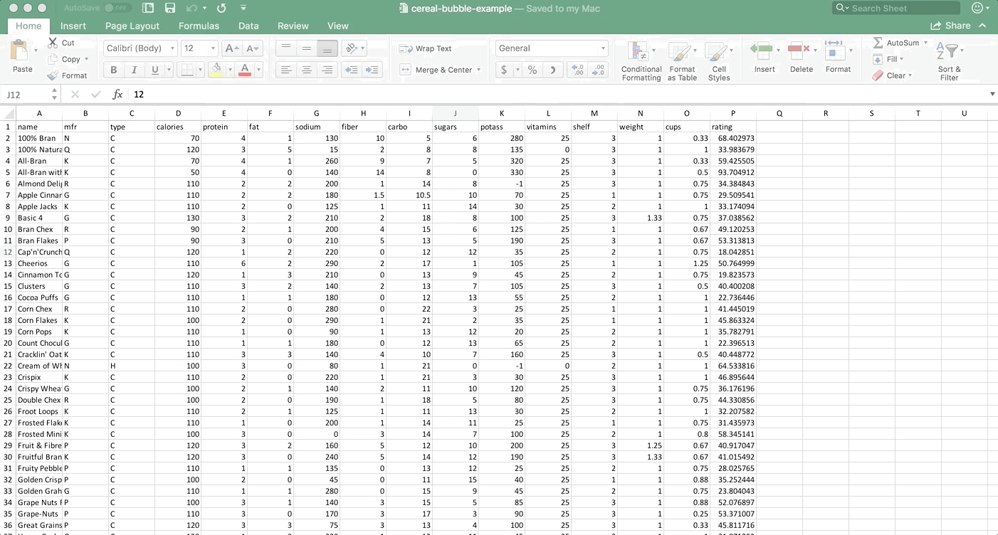
Let’s take an example to understand this better. Say you work for a nutrition nonprofit and are interested in learning about nutritional information for breakfast cereals. We have this dataset from Kaggle that I modified a tiny bit (I changed values in about 4 or 5 cells) so that the bubble plot example would be easier. Download the .xlsx file here if you’d like to follow along. Here’s a preview of the dataset:

namemfrtypecaloriesproteinfatsodiumfibercarbosugarspotassvitaminsshelfweightcupsrating
100% BranNC7041130105628025310.3368.402973
100% Natural BranQC1203515288135031133.983679
All-BranKC704126097532025310.3359.425505
All-Bran with Extra FiberKC5040140148033025310.593.704912
Almond DelightRC110222001148-125310.7534.384843
Apple Cinnamon CheeriosGC110221801.510.5107025110.7529.509541
Apple JacksKC1102012511114302521133.174094
Basic 4GC1303221021881002531.330.7537.038562
Bran ChexRC9021200415612525110.6749.120253
Bran FlakesPC9030210513519025310.6753.313813
Cap’n’CrunchQC12012220012123525210.7518.042851
CheeriosGC11062290217110525111.2550.764999
Cinnamon Toast CrunchGC1201321001394525210.7519.823573
ClustersGC11032140213710525310.540.400208
Cocoa PuffsGC1101118001213552521122.736446

We want to compare the sugar, fat, and caloric content of the cereal brands all at once. How can we squeeze all of that information into one plot effectively? A bubble chart!

Choose your Data

You need to decide on a few things when making a bubble plot:

X Axis

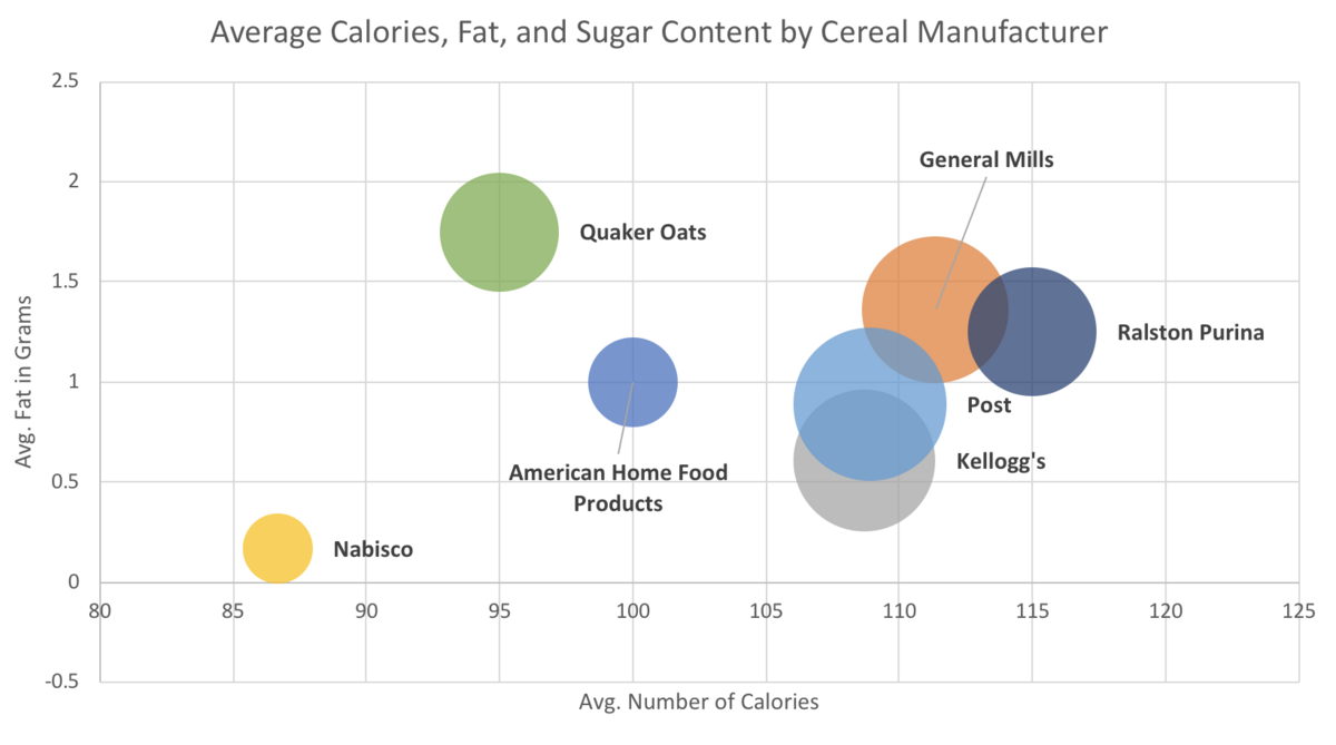
Any quantitative variable will do, but you can get more out of your visualization by picking a variable that you think is influencing the y variable. In this case, I hypothesized that the higher the average number of calories, the higher the average fat content would be for each brand of cereal. So, I made average number of calories my x axis.

Y Axis

Same as the x axis, any quantitative variable will do, but you’ll get more out of your visualization by picking a variable that you think is being influenced by the variable you chose for the x axis. So, we’re going with average fat content for our y axis.

Size of Bubble

The size of the bubble can also be any quantitative variable, and it should be one that will be relevant when compared to the x and y variables. However, generally, it’s a good idea to pick a variable that has a lot of variation if you can so that your bubbles aren’t all the same size and are actually showing something interesting. We’re going to go with average sugar content for our bubble size.

Optional: Bubble Color

You can get a FOURTH variable into a bubble plot believe it or not! If you want to add a categorical variable (think of that as a text column in Excel) to the three quantitative columns, you can do it by making the color of the bubbles represent values from the categorical variable. For this first example, we’re going to have the bubble color represent a unique manufacturer of cereals.

Set Up the Data in Excel

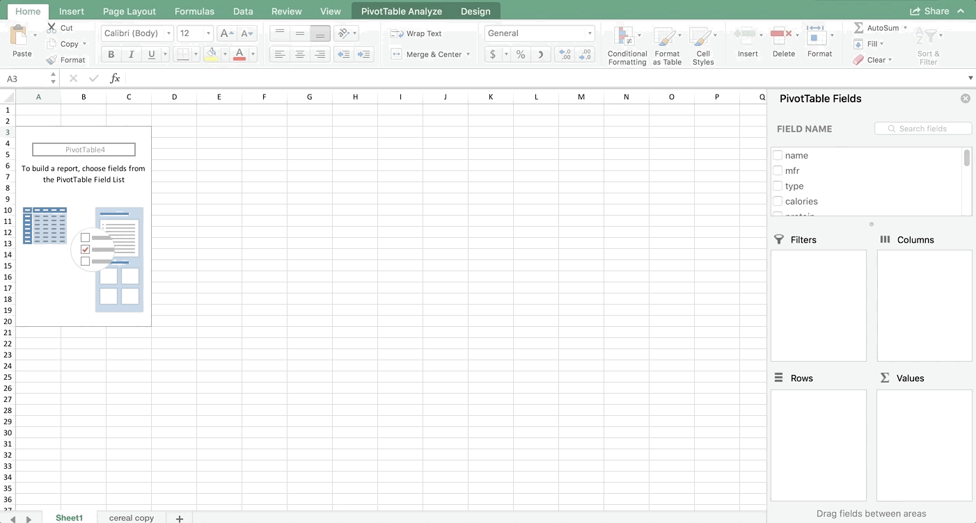
Let’s start by making a Table, then a PivotTable. You don’t have to make a PivotTable in order to make a Bubble Plot (in fact, later in this post we’ll make a Bubble Plot without making a PivotTable). But since I want to aggregate the information by manufacturer, a PivotTable makes sense here. If you aren’t familiar with PivotTables, you should still be able to follow these instructions to produce one. If you want to understand PivotTables better, check out my blog post “PivotTable Basics”.

Step 1:

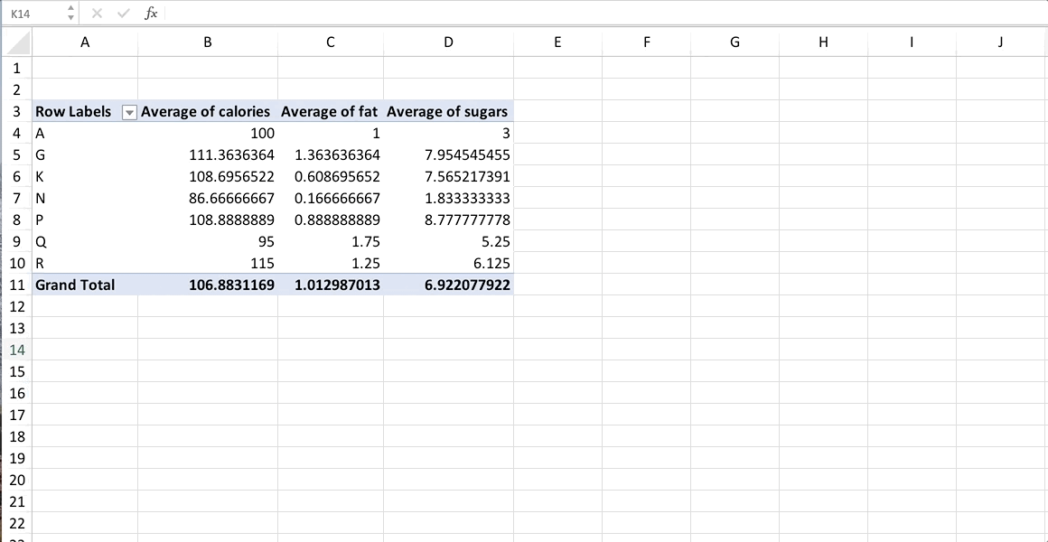
Click on any non-blank cell in the dataset. Go to Insert >> Table. Tables make things easier to work with (a blog post about tables is coming next!). Then either leave the Table highlighted, or just click on any non-blank cell again. Now go to Insert >> PivotTable. Check out the GIF if you are lost:

Step 2:

Add the variables to your PivotTable like shown in the next GIF below. Make sure your variables in the Values box are in the exact same order that mine are. For almost every chart, Excel wants the data in a particular order. You don’t have to follow this order, but it will make your life easier if you do. For bubble plots, it wants x axis first, then y axis, then size of bubble. Also make sure they are averages. You’ll notice that the sums didn’t make sense (that represents the total fat, sugar, and calories in all cereals produced by each manufacturer which doesn’t make logical sense for what we’re seeking).

Step 3:

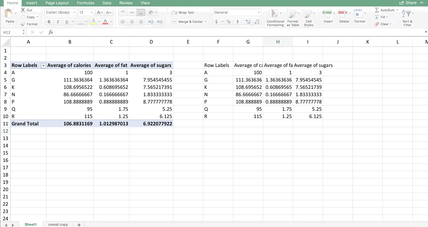
Most versions of Excel won’t let you make a bubble plot directly from a PivotTable. Some will, but most won’t. If yours won’t let you, simply copy the PivotTable and paste it as values, or even better, copy it as references. That way if something changes in the PivotTable later, your references will also change, and your chart will automatically update too. Again, check out my blog post on Tables if you’re interested in learning more about efficient workbook layout in Excel.

Make a Bubble Plot!

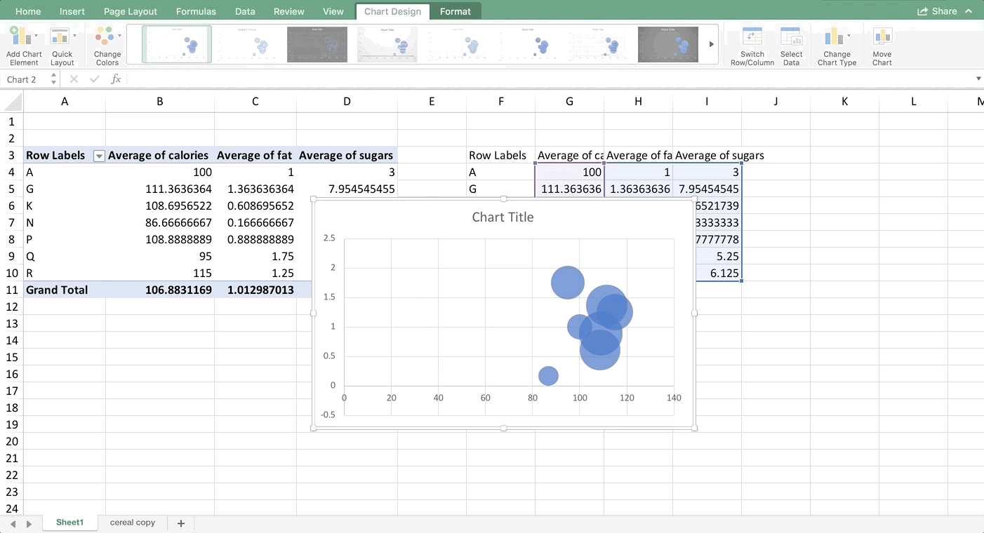
We’re finally ready to make our Bubble Plot!! Highlight all the numbers in the copied data (NUMBERS ONLY, no text or titles) and go to Insert >> Scatterplot and choose Bubble. If you’re on an older version of Excel, your scatterplot button might be in a different place.

Let’s clean this up a bit. For bubble and scatter plots, you can modify the axes to zoom in on the points. So, let’s set the minimum value for the x-axis to 85. Let’s also label the axes:

This looks good, and we can already glean some information from this chart. The bubbles aren’t really in a line, but there is a very small positive trend. The bubble size doesn’t seem to get larger in any direction in this case, but that’s something you could look for too. However, we don’t know which one is which. We can add color and data labels to help distinguish the bubbles.

Since we only have one value for each cereal brand in this example (that is, one row for each cereal brand and therefore just one bubble per color) we can right-click on any bubble, choose “Format Data Series” and get to the spill-paint icon. From there, choose Fill and then check off “Vary Colors by Point”:

final bubble plot

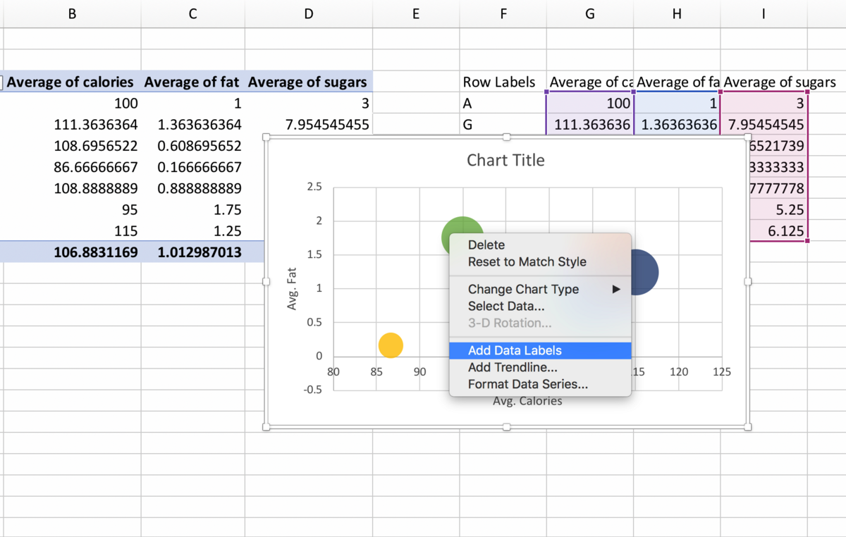
Finally, to add data labels, right-click on any bubble again, and choose “Add Data Labels”. If you’re on a PC, you can right-click on any data label, choose “Format Data Labels” and then check off “Value from Cells” in the Format Data Labels panel that appears to the right. Highlight the names of the cereal manufacturers in the copied cells and hit OK. Then un-check Y value and you should just see the names of the brands remaining next to the bubbles.

Unfortunately, on a Mac, this is much more tedious because there is no “Value from Cells” option. On a Mac you need still right-click on the bubble and add the Data Labels, but from here you have to hand-type the names of the cereal manufacturers in each of the label text boxes. Your final product should look like this:

final bubble plot

What if I want multiple bubbles that are the same color?

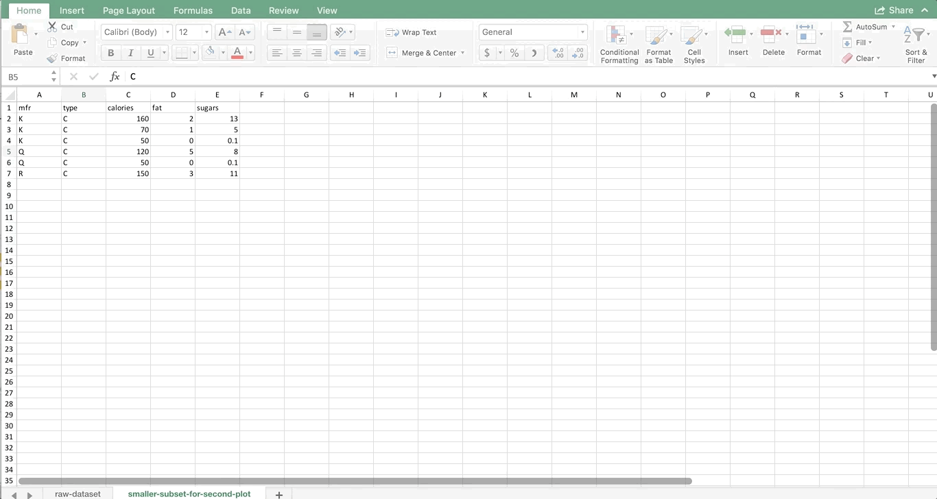
You can do this, and in this example we’ll make a bubble plot directly from the raw data. Using our whole dataset would produce a pretty messy plot with too many bubbles. So, let’s say you’re interested in only this subset of cereals:

mfrtypecaloriesfatsugars
KC160213
KC7015
KC5000.1
QC12058
QC5000.1
RC150311

Now we have multiple rows that are the same manufacturer (3 K’s, 2 Q’s, and 1 R). This gets a bit more tedious, but labeling the colors is much easier.

Step 1: Get The First Series In

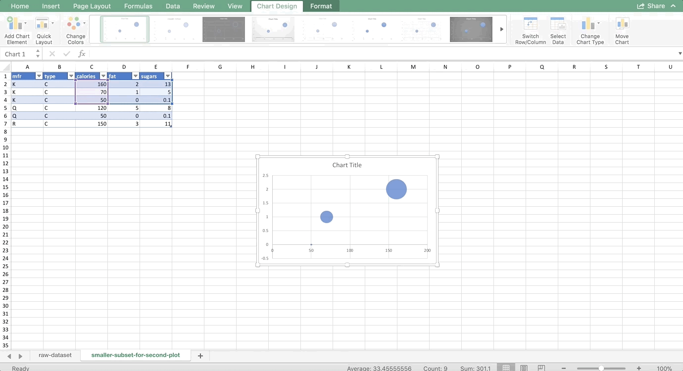
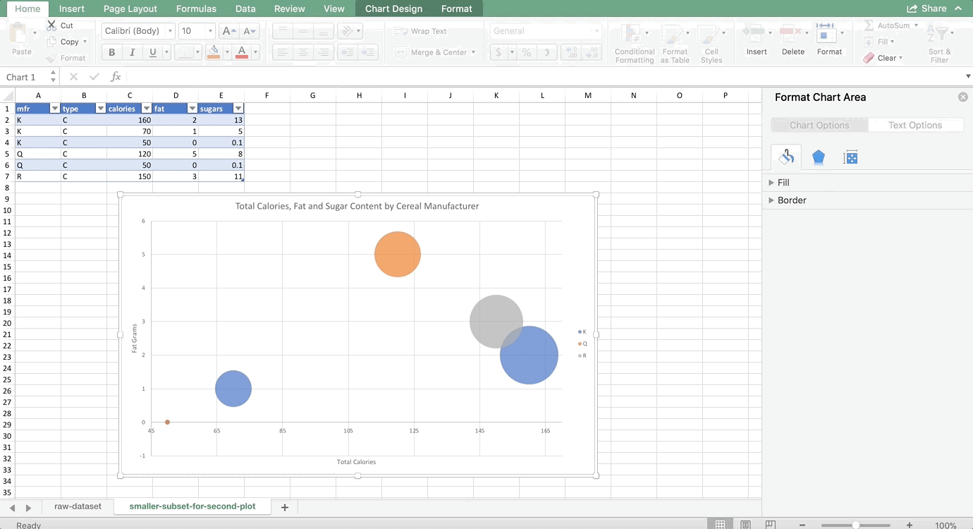
As usual, we’ll make the data into a table first. For the first series in any multi-color chart, you can highlight all of the numbers associated with that series, and the insert the chart. So, we’re going to highlight all of the numbers associated with K, and insert a bubble plot:

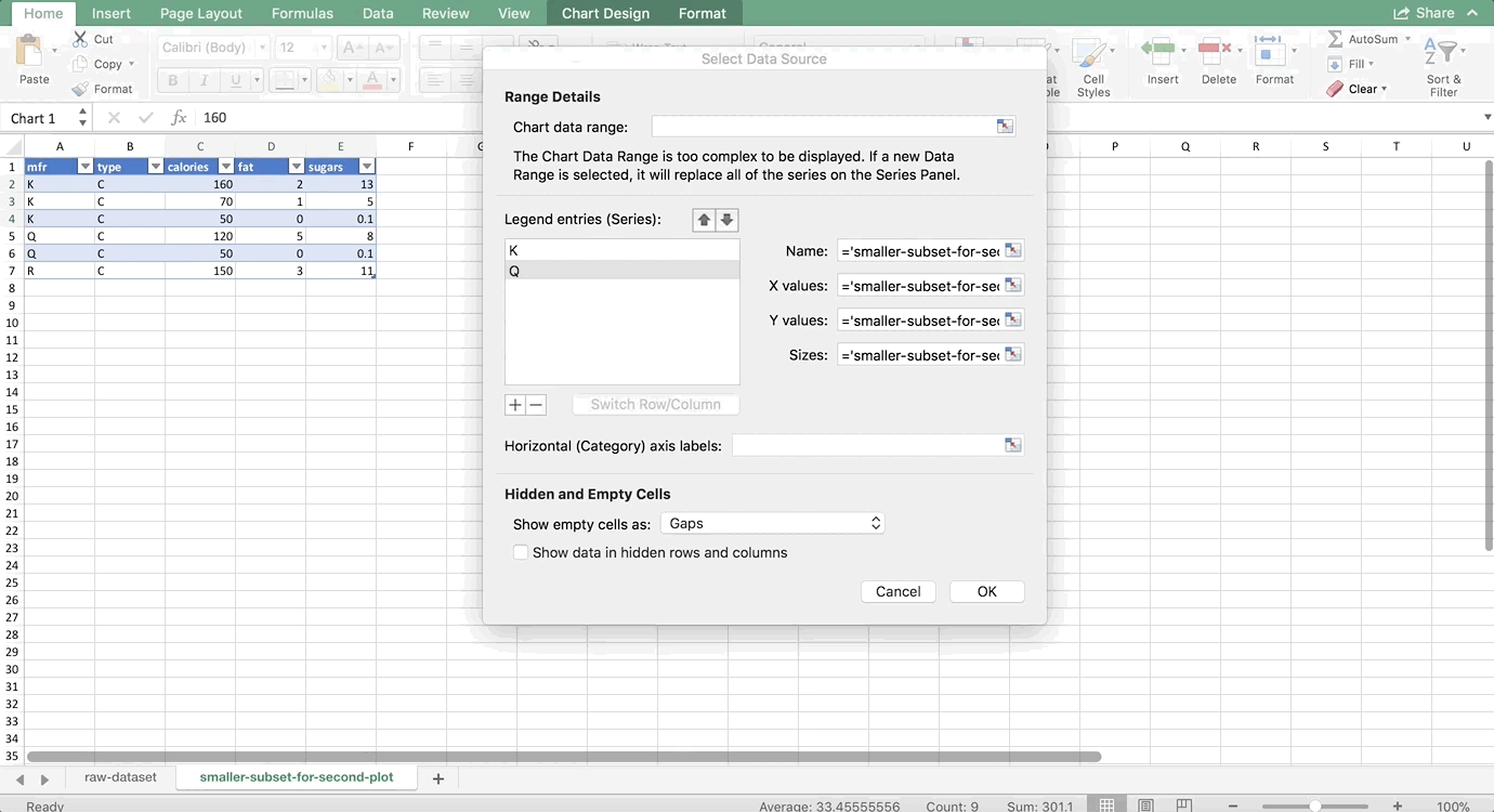
To get the other manufacturers in as separate colors, we need to right-click on the chart and choose Select Data. You should see a windows like this:

final bubble plot

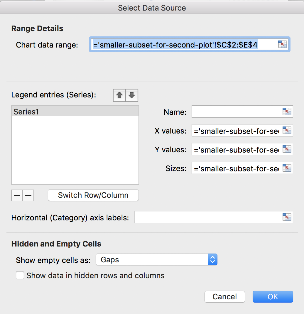
It will look different if you are using a PC, but the four boxes that are important should be the same: Name, X values, Y values, and Sizes (or Size of Bubble). Since we highlighted the data for K, it autopopulated these fields for us. Let’s name this series K before we move on to the others. That way, when we add a Legend to our chart later, it will automatically show the names of the manufacturers. In the name box, either type K or click on one of the cells with K in it inside the dataset.

Then, we’ll add the Q series. On a Mac, hit the + sign. On a PC, you’ll want to choose the “Add” button. We’ll do Q next. Type Q or click on one of the cells that has Q in it for the Name. For the X values, we want to highlight all calorie cells associated with the Q manufacturer. For the Y values, we want to highlight all of the fat values associated with the Q manufacturer. And, for the size of the bubble, we want to highlight all values in the sugar column that are associated with the Q manufacturer. Putting it all together looks like this:

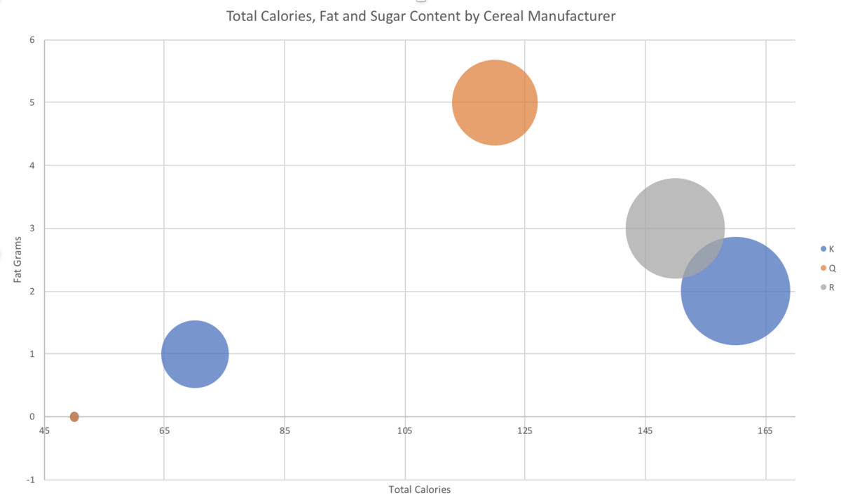
Finally, let’s add the R manufacturer’s series. There’s only one row for R, so it would look like this:

You can change the axes and add titles like we did in the first example. I chose my minimum x-axis value to be 45, and my max to be 170. Don’t forget to add a legend too, so we can tell which color is which. On a Mac, start by clicking on the chart. Then the “Chart Design” menu should appear in the ribbon at the top of the screen. Click the button all the way to the left, “Add Chart Element” (this is the same button used to add the titles above, see the GIF if you are lost). Then choose Legend >> Right. The final result looks like this:

final bubble plot

If you want the legend to show the name of the manufacturer instead of the letter abbreviation, you have to change this in the original dataset like so:

Technically, I didn’t have to change all of them, only the ones I referred to in the “Name” box when we were in the “Select Data” dialog. But, I couldn’t remember which I chose, and there are so few in this data subset that I changed all of them 🙂

Notice it looks like there are only 5 bubbles – there are actually 6, but two of them have the exact same x and y values, so they are overlapping. It’s the ones that have 0 fat and 50 calories. Be careful of situations like this – as you can see Excel seems to have randomly chosen to put the orange bubble on top, so someone who is not familiar with the data might not realize that there is a blue bubble underneath it. Also take note that this is no longer averages. We didn’t do a PivotTable to aggregate the data before making this chart, so it’s total calories, fat, and sugars per cereal.

Takeaways

Aren’t bubble plots cool? Admittedly, people who are new to analytics may have a bit of trouble fully understanding what is going on the first time they look at a bubble plot. However, if they are created properly, they are an effective chart that is not misleading. Sometimes it’s tempting to squeeze a lot of variables into one visualization in other ways that do become misleading. But here, we were able to compare four variables at once (manufacturer, calories, fat, and sugar) in an effective and accurate way.

Python Resources

Python Resources


Driven Data

This is a great way to tackle Machine Learning and Python at the same time!  I also like Driven Data because it’s a project with a specific goal. I think that’s the best way to learn!
 

Automate the Boring Stuff with Python

This is another project-based site that also is pretty useful for daily life!                

HackerRank

Looking for just straight-up practice problems? HackerRank is perfect for that. It’s free and you can even use it on a resume to show your skills (companies often will test applicants using this).

Learn Python the Hard Way

This is a widely-loved book. It starts from 0 and their goal is to get you to the point where you can move on to other books and resources.


Exercism

Get practice problems in almost any language (including Python of course!) and have a mentor review your code for free!

Understanding JOINs in SQL

Joins in SQL

Joins are one of the most important (if not THE most important) concepts in SQL. If you take the time to solidly understand how joins work, you’ll be in an excellent place for writing queries. We also have an in-depth article about performing multiple joins. So, let’s dive in!

Join Definitions

Joining tables in SQL is a way of combining them. It is directly comparable to a VLOOKUP in Excel, so if you are familiar wtih VLOOKUPs you already understand how joins work. For example, let’s say you have a table that contains orders placed by your customers (each row in that table represents a unique order). Then you have a second table that is only items that have been returned by your customers (each row in that table represents a unique order too, but not all orders are returned so the table has fewer rows).

Orders Table

order_idproductcost_per_unittotal_amountprofitshipping_method
1A5705Air
2B1012097Air
3C15150135Air
4A52010Air
5B1011096Air
6C15305Air
7A5459Air
8B1015064Air
9C1521063Air
10A56544Air
11B1012076Air
12C153018Air
13A52019Ground
14B1010059Ground
15C153014Ground
16A55515Ground
17B10101Ground
18C1510528Ground
19A57537Ground
20B105041Ground
21C15159Ground
22A53022Ground
23B10120117Ground
24C15195166Ground
25A5201Ground

Returns Table

idamount_returnedReason
1510Broken
2115No Reason Given
2485Unsatisfied
715Unsatisfied
1220Unsatisfied
9130Unsatisfied
1710No Reason Given
2115No Reason Given
1870Broken
1710Broken

You can’t just copy and paste these tables next to each other to figure out what was returned, because the rows won’t match up. You need a way of comparing each row in the orders table to the returns table to see if a match exists, and then bring back the information from the returns table that you’re interested in. Enter joins!

Let’s take a look at join syntax first:


SELECT *
FROM table_1 INNER JOIN table_2
ON table_1.id = table_2.id
	

Notice the ON statement, which is required for every join. You need to pick a column from each table that you want SQL to compare in order to join them together, and that’s what the ON statement is specifying. This example says compare the id column in table_1 to the id column in table_2 when trying to match up rows between the two tables during the join.

How do you choose which colunns to use for the ON statement? Generally you want to pick a column that uniquely identifies each row, like an id number. The two columns don’t have to have the exact same name, but they need to be the same type (for example, integer or text) and represent the same thing. The order_id columnn from the orders table above is the same thing as the id column in the returns table – they both represent the id of the order.

There are four types of joins: left, right, inner and outer. The right join functionally does the same thing as the left join, so many SQL programs are choosing not even to support it anymore. For that reason, we won’t be covering it in this article.

As usual, we’ll start with a basic example. Say you have a database with the following two tables in it:

nutrition1

idnamecalciumserving_sizeweight
1apples101 ea138
2asparagus221/2 cup90
3avocado191 ea173
4bamboo shoots101 cup131
5banana71 ea114
6beets91/2 cup85
7blackberries461 cup144
8Blueberries raw91 cup145
9broccoli2051 spear180
10brussels sprouts561 cup156

nutrition2

idpercent_waterenergyproteinfood_type
184800.3FRUITS
292222.3VEGETABLES AND LEGUMES
3733054FRUITS
494252.3VEGETABLES AND LEGUMES
5741051.2FRUITS
1190942.4FRUITS
1288310.7VEGETABLES AND LEGUMES
1392151.2VEGETABLES AND LEGUMES
149560.3VEGETABLES AND LEGUMES
1581490.8FRUITS

The nutrition1 table contains information about foods, and the nutrition2 table contains different information about foods. We’re going to join on the id column (this will be our ON statement) because it’s the unique identifier for each row in both of the tables. So, take note that nutrition1 has id numbers 1-10, but nutrition2 has id numbers 1-5 and then skips to 11-15.

Inner Joins

When you inner join two different tables together, SQL will compare the columns you specify in the ON statement and only keep rows that those columns have in common. Looking at our nutrition tables, the only id numbers that the two have in common are 1 through 5. So when we run this query:


SELECT *
FROM nutrition1 INNER JOIN nutrition2
ON nutrition1.id = nutrition2.id

we’ll get this result:

idnamecalciumserving_sizeweightidpercent_waterenergyproteinfood_type
1apples101 ea138184800.3FRUITS
2asparagus221/2 cup90292222.3VEGETABLES AND LEGUMES
3avocado191 ea1733733054FRUITS
4bamboo shoots101 cup131494252.3VEGETABLES AND LEGUMES
5banana71 ea1145741051.2FRUITS

Cool! Now we have more information than we previously did about apples, asparagus, etc. Notice that the result displays 1-5 from nutrition1, lined up next to those columns 1-5 from nutrition2, and everything else is gone. No other rows appear in the result because inner joins only keep what the two tables have in common, and nothing else.

Left Joins

When you perform a left join, SQL keeps everything from the left table, no matter what, and then only pulls in information from the right table that matches the left based on the columns you specify in the ON statement. So when we run this query:


SELECT *
FROM nutrition1 INNER JOIN nutrition2
ON nutrition1.id = nutrition2.id

we’ll get this result:

idnamecalciumserving_sizeweightidpercent_waterenergyproteinfood_type
1apples101 ea138184800.3FRUITS
2asparagus221/2 cup90292222.3VEGETABLES AND LEGUMES
3avocado191 ea1733733054FRUITS
4bamboo shoots101 cup131494252.3VEGETABLES AND LEGUMES
5banana71 ea1145741051.2FRUITS
6beets91/2 cup85NULLNULLNULLNULLNULL
7blackberries461 cup144NULLNULLNULLNULLNULL
8Blueberries raw91 cup145NULLNULLNULLNULLNULL
9broccoli2051 spear180NULLNULLNULLNULLNULL
10brussels sprouts561 cup156NULLNULLNULLNULLNULL

For this result, we have the entire nutrition 1 table (id numbers 1-10) and lined up next to it the rows from the nutrition2 table that matched base on the id (just 1-5). Notice the NULL values. The nutrition2 table didn’t have rows for id numnbers 6-10, but we had to keep those rows because the definition of a left join tells us to keep everything from the LEFT table, so the nutrition2columns for id numbers 6-10 get filled in with NULLs.

Outer Joins

Finally, let’s take a look at what an outer join does. Here’s the query:


SELECT *
FROM nutrition1 INNER JOIN nutrition2
ON nutrition1.id = nutrition2.id

and the result:

idnamecalciumserving_sizeweightidpercent_waterenergyproteinfood_type
1apples101 ea138184800.3FRUITS
2asparagus221/2 cup90292222.3VEGETABLES AND LEGUMES
3avocado191 ea1733733054FRUITS
4bamboo shoots101 cup131494252.3VEGETABLES AND LEGUMES
5banana71 ea1145741051.2FRUITS
6beets91/2 cup85NULLNULLNULLNULLNULL
7blackberries461 cup144NULLNULLNULLNULLNULL
8Blueberries raw91 cup145NULLNULLNULLNULLNULL
9broccoli2051 spear180NULLNULLNULLNULLNULL
10brussels sprouts561 cup156NULLNULLNULLNULLNULL
NULLNULLNULLNULLNULL1190942.4FRUITS
NULLNULLNULLNULLNULL1288310.7VEGETABLES AND LEGUMES
NULLNULLNULLNULLNULL1392151.2VEGETABLES AND LEGUMES
NULLNULLNULLNULLNULL149560.3VEGETABLES AND LEGUMES
NULLNULLNULLNULLNULL1581490.8FRUITS

Outer joins keep everything, no matter what, and line up rows that match. Here, we have the entire nutrition1 table, and next to it the nutrition2 table but broken up so that it matches the id numbers of nutrition1 properly.

Takeaways

Understanding the definitions of the joins and how each fundamentally works is very important in SQL. Usually, you’ll be working with so much data that you have to join the tables together in SQL and can’t just pull everything into Excel and do a VLOOKUP. Excel can only handle so many rows (a little over a million) and so many columns (a little over 16,000). That sounds like a lot but SQL databases can hold millions and with more and more data being generated and available every day, there’s a good chance that even at a small company you’ll be dealing with more information than can fit into Excel. Sometimes too, your data will fit into Excel but the VLOOKUP will be so computationally taxing that Excel will simply crash or go so slow it isn’t worth it. SQL is built for stuff like this, so it will compute joins much faster. Check out my understanding SQL blog post for a more in-depth discussino of what SQL is and when to use it.

Filed under: Data Analytics, SQL by Boxplot
No Comments »

Understanding Multiple JOINs in SQL

Multiple joins are one of the toughest SQL concepts – in this post we’ll decode them and review some common pitfalls.

One of the best ways to learn is with an example. If you’d like to follow along, you can download this zip file that contains the three tables as .csv files here, and import them into DB Browser for SQLite. Read my post on how to use SQLite Browser here.

Say you work on the marketing team at a software company. Your database has the following tables.

ad_info

Each row represents a unique campaign your company has run. All campaigns are included in this table.

ad_id

INTEGER

date_launched

DATE

total_budget

INTEGER

launching_team

TEXT

internal_purpose

TEXT

fb_info

Each row represents a unique Facebook campaign. Only Facebook campaigns will show up in this table!

ad_id

INTEGER

fb_id

INTEGER

impressions

INTEGER

unique_reaach

INTEGER

unique_clicks

INTEGER

engagement_rate

FLOAT

ad_results

Each row represents a unique campaign your company has run. All campaigns are included in this table.

ad_id

INTEGER

customers_engaged

INTEGER

revenue

INTEGER

products_sold

INTEGER

employees_hired

INTEGER

new_customers

INTEGER

success_score

INTEGER

Your boss asks you: what percentage of ad campaigns that were launched by the Europe or Australia teams and had success scores above 4 were Facebook campaigns?

To answer this question, we need to do a few things. Let’s break it down:

  • Filter results so we are only seeing European and Australian campaigns that had success scores above 4. We’ll do this in the WHERE clause. Don’t pay too much attention to this part for this example – we’re doing this to establish why we need all three tables, but the point of this example is to understand the joins. I’m not trying to trick anyone with the WHERE clause 🙂

  • Join the tables together so all the information is in one place.

  • Get the percentage of these specific campaigns that were Facebook campaigns. To do that, we’re going to count the number of rows in our result that have any information in the fb_information columns, and divide by the total number of rows in the result.

Okay, now we have all of the information we need to get started. You go back to your desk and you think “hmmmm…. I’m not sure how to do this.” We’re going to go through a few incorrect answers first before we look at the correct one so you can understand why the correct one is the right way to approach the problem.

Attempt 1: All Inner Joins

So, first you try all inner joins. Here’s a graphical representation of the joins:

A box represents the table
—- a line represents an inner join
and an arrow represents a left outer join.

ad_info

facebook_info

ad_results

And this is what the query looks like. I chose only to select the columns we need to answer the question, plus a few extras in the SELECT statement because if I selected all the columns, the table would be too large to fit easily into this webpage. But, for your own practice, you could do SELECT * if you want to see all the columns.


SELECT ad_info.ad_id, launching_team, fb_id, impressions, unique_reach, unique_clicks, engagement_rate, success_score
FROM ad_info INNER JOIN facebook_info
ON facebook_info.ad_id = ad_info.ad_id
INNER JOIN ad_results ON ad_results.ad_id = ad_info.ad_id
WHERE success_score > 4 AND launching_team IN ('Europe', 'Australia');

And finally, this is the result it produces:

Result:

ad_idlaunching_teamfb_idimpressionsunique_reachunique_clicksengagement_ratesuccess_score
9Europefb-76475346371330540.8225154867
15Europefb-89829603950850750.5337610436
16Australiafb-37639997685451070.7451123435
22Australiafb-20113636246416140.6550324686
27Europefb-74482677170213940.8190364287
33Europefb-15267135418541430.9899641585
39Europefb-651310188626990.8109048727
40Australiafb-36808755578552120.9009507358
52Australiafb-15844808440927500.62372425
124Australiafb-38668283820943720.5325861866
130Australiafb-29772964287825560.88811674810
135Europefb-83596316530837580.7079879438
136Australiafb-95692174207818130.8724735327
142Australiafb-17907966574351860.9030123638
147Europefb-29334202303028870.9528052815

Remember, we are looking for the number of rows with data in the Facebook columns (fb_id, impressions, unique_reach, unique_clicks, engagement_rate) divided by the total number of rows in the result. This result looks like 100% of the European and Australian campaigns with a success_score greater than 4 were Facebook campaigns because all of the rows in the result have values in the Facebook columsn.

That should set off a red flag! Whenever you get something like this (100%, 0 rows, etc.) you should double-check your work. Remember, the scariest thing in SQL is not an error, but an incorrect result that we think is correct! What actually happened here is we’ve eliminated all of the non-Facebook European and Australian campaigns with success scores greater than 4.

Before I explain why, there are a few very important things to understand.

When you are doing all inner joins or all outer joins, whether you are joining 3 tables or 300, the order of the joins does not matter. Think back to the definition of the joins (check out this blog post for a refresher). Inner joins only keep what the tables have in common. So it doesn’t matter if I switch the order of the tables, I’ll still get a result that only contins rows that all tables have in common. An outer join will keep all rows from all tables, no matter what. So again, it doesn’t matter if I switch the order of the tables because SQL will always keep all rows.

It’s not the way it looks. First, it takes the entire ad_info table and inner joins it to the facebook_info table, and gets that result. Then it takes THAT RESULT and inner joins it to the ad_results table! So it’s not ad_info joined to facebook_info, and then facebook_info joined to ad_results. It’s the RESULT of ad_info-Inner-Join-facebook_info joined to ad_results.

It’s like you’re creating a cumulative table (but not always one that’s getting larger, it dependso n the type of JOINs you are doing). This makes multiple joins more difficult, because SQL will not show you the result of each join. You have to have an idea of what each result looks like at each

Therefore, the reason we got 100% is because the only thing these tables have in common is Facebook campaigns, since that is all that is in the facebook_info table. So, all inner joins is not the way to go.

Attempt 2: Mixed Joins Starting with facebook_info

Now let’s say we start with the facebook_info table, do a left outer join on the ad_info table next, and then an inner join to the ad_results table.

facebook_info

ad_info

ad_results

Here’s the query:


SELECT ad_info.ad_id, launching_team, fb_id, impressions, unique_reach, unique_clicks, engagement_rate, success_score
FROM facebook_info LEFT JOIN ad_info
ON facebook_info.ad_id = ad_info.ad_id
INNER JOIN ad_results ON ad_results.ad_id = ad_info.ad_id
WHERE success_score > 4 AND launching_team IN ('Europe', 'Australia');

Result:

ad_idlaunching_teamfb_idimpressionsunique_reachunique_clicksengagement_ratesuccess_score
9Europefb-76475346371330540.8225154867
15Europefb-89829603950850750.5337610436
16Australiafb-37639997685451070.7451123435
22Australiafb-20113636246416140.6550324686
27Europefb-74482677170213940.8190364287
33Europefb-15267135418541430.9899641585
39Europefb-651310188626990.8109048727
40Australiafb-36808755578552120.9009507358
52Australiafb-15844808440927500.62372425
124Australiafb-38668283820943720.5325861866
130Australiafb-29772964287825560.88811674810
135Europefb-83596316530837580.7079879438
136Australiafb-95692174207818130.8724735327
142Australiafb-17907966574351860.9030123638
147Europefb-29334202303028870.9528052815

We get the exact same result as the inner joins. Why? Again, think back to the definition of the joins. A left join keeps everything from the left table (no matter what) and then only pulls in information from the right table that matches. So here, we kept everything from the facebook_info table, and only pulled in information from the ad_info table that matched as our first join. And of course, as we saw from the first example, the only rows from ad_info that match facebook_info are Facebook campaigns. Then when we take that result of the first join (which only contains Facebook campaigns) and join it to the ad_results table, we still remove the non-Facebook campaigns because the inner join only keeps what’s common between the result of the first join and the ad_results table.

Attempt 3: Mixed Joins Starting with ad_info

Finally, let’s try starting with the ad_info table, left outer joining the facebook_info table, and then inner joining the ad_results table.

ad_info

facebook_info

ad_results

And the query:


SELECT ad_info.ad_id, launching_team, fb_id, impressions, unique_reach, unique_clicks, engagement_rate, success_score
FROM ad_info LEFT JOIN facebook_info
ON facebook_info.ad_id = ad_info.ad_id
INNER JOIN ad_results ON ad_results.ad_id = ad_info.ad_id
WHERE success_score > 4 AND launching_team IN ('Europe', 'Australia');

Result:

ad_idlaunching_teamfb_idimpressionsunique_reachunique_clicksengagement_ratesuccess_score
9Europefb-76475346371330540.8225154867
15Europefb-89829603950850750.5337610436
16Australiafb-37639997685451070.7451123435
22Australiafb-20113636246416140.6550324686
27Europefb-74482677170213940.8190364287
33Europefb-15267135418541430.9899641585
39Europefb-651310188626990.8109048727
40Australiafb-36808755578552120.9009507358
52Australiafb-15844808440927500.62372425
63EuropeNULLNULLNULLNULLNULL6
69EuropeNULLNULLNULLNULLNULL8
70AustraliaNULLNULLNULLNULLNULL10
75EuropeNULLNULLNULLNULLNULL7
81EuropeNULLNULLNULLNULLNULL8
82AustraliaNULLNULLNULLNULLNULL10
87EuropeNULLNULLNULLNULLNULL6
88AustraliaNULLNULLNULLNULLNULL10
94AustraliaNULLNULLNULLNULLNULL10
99EuropeNULLNULLNULLNULLNULL6
100AustraliaNULLNULLNULLNULLNULL7
105EuropeNULLNULLNULLNULLNULL5
111EuropeNULLNULLNULLNULLNULL8
124Australiafb-38668283820943720.5325861866
130Australiafb-29772964287825560.88811674810
135Europefb-83596316530837580.7079879438
136Australiafb-95692174207818130.8724735327
142Australiafb-17907966574351860.9030123638
147Europefb-29334202303028870.9528052815

That gets us the result we want! We can see that only 15 out of the 28 European and Australian campaigns with success rates greater than 4 were Facebook campaigns. That’s 53.57%, not 100%!

Takeaways


Okay, let’s review!

If you have all inner joins or all outer joins, the order doesn’t matter. But as soon as you start mixing and matching join types, the order can change your result. It’s important to understand the definitions of the joins, and also imagine the result of each join as you do it, because that result is what’s being joined to the next table. Think about what rows may be lost or gained with each join.

What if you didn’t know that the facebook_info table only contained rows Facebook ad compaigns? You might have stopped at the first attempt (which is incorrect!). You could be SQL Syntax Expert of the Universe, but if you don’t know the data, you’ll produce wrong answers.

It’s critically important to know what type of information can show up in any given table, any given column, and if you’re working across multiple servers, any given database or server! Think of another example: let’s say you’re looking at geographic data and there’s a STATE column. Throughout the history of your company, some people coded Pennsylvania as “PA”; others coded it as “Pa.”; still others coded it as “Penn.”, etc. SQL doesn’t know these are all Pennsylvania! So if you are tryign to query the database for all customers living in Pennsylvania and you don’t incorporate this knowledge into your query, you’ll get the wrong answer. Your query may be syntactically perfect, but you’ll still get the wrong answer.

This doesn’t apply 100% of the time, but it’s a good rule of thumb to get started if this is the first time you are working with multiple joins. As we saw in Attempt 2, when you start with the smaller table, it’s impossbile to get that data back without doing right or outer joins. Right joins are not supported by many SQL programs anymore since it is the same as the left join but backwards, and outer joins often will bring back more information than you need. In my experience, left and inner joins are the most common types of joins and what you’ll mostly use in practice. But, you *could* do this exact problem differently using outer or right joins.

People get frustrated when they see errors in SQL, but getting an error is WAY BETTER than getting an incorrect result and thinking it’s correct. Just because SQL produces a result, doesn’t mean it’s what you originally wanted. You have to understand all of the things mentioned above (the definitions of the joins, how multiple joins work, what your data looks like. etc.) to ensure you are getting the correct answer.

Phew! You made it to the end, congratulations! Comments are welcome, let me know if you have questions, spot a typo, want to suggest a correction, or simply post your thoughts!

Free Datasets

A list of freely available data on the web. The first list is sites we think are the best for accessing quality datasets. Below that are additional sources by category.

Best Sources

Kaggle

By far our personal favorite! There are dozens if not hundreds of quality datasets available here.

ICPSR

You have to create an account, but it’s free and they have a pretty extensive list of datasets you can download directly from their site.

US Open Data

The open data site for the United States government. There are dozens if not hundreds of datasets linked here.

Yelp Open Data

This is a single dataset (but a large one) offered by Yelp.

General Social Survey

This is another single dataset (and another large one!) offered by the University of Chicago.

Federal Committee on Statistical Methodology

You’ll have to work a bit harder to use one of these datasets – you have to choose the release, then choose the data tab, and then you may get the data in a relatively dirty format and have to clean it. But there are a lot of options on this site, and more datasets are added regularly.

Police Data Initiative

A list of datasets from local police departments.

Makeover Monday

This is the website for a data visualization book. They make the data easy to access, but there might be duplicate datasets from some of the other sources on this page (like Data.World).

KDNuggets

They have a few pages on their website that offer lists of datasets. There’s “Datasets for Data Mining and Data Science“, “Data: APIs, Hubs, Marketplaces, and Platforms“, and “Data: Government, State, City, Local and Public“.

Data.World

You have to dig a bit to find the datasets on this site. You also may need to create an account to access them/get the full list of datasets.

This Quora Post

Somebody asked this exact question on Quora and got a pretty extensive list of data sources as a response!

Stats2Labs

This site maintains a sorted list of datasets.

A Facebook Page

Do you manage or know someone that manages a Facebook page? Maybe a local nonprofit? You can easily download the data as a .csv.

Other Sources by Category

GOVERNMENT DATA

CITY-SPECIFIC DATA

FINANCE DATA

EDUCATION DATA

HEALTHCARE DATA

SOCIAL MEDIA DATA

SPORTS DATA

WEATHER DATA

RELATIONAL DATA

OTHER

Formatting Charts in Excel

Formatting charts in Excel is no easy task. It’s time-consuming, and Excel is pretty fussy which doesn’t make things easier. In this post I’ll give general tips for formatting charts, and also go over a few common scenarios.

Understand the Parts of a Chart

First thing’s first: it’s important to get the syntax down pat for Excel charts. Here’s what Microsoft calls the various parts of a chart:

labeled image of a chart in excel

We’ll go through some of these less obvious ones in more detail later in the post (like data series vs. data point) but it’s important to get the general terminology down because when you right-click on a chart, the menu will change depending on where you right-click.

Right-clicking

Most people already know that right-clicking on something, whether it’s a link in a web browser or a chart in Excel, will make a menu of options appear. When right-clicking on charts in Excel, however, it is important to right-click on the *exact* thing that you want to change.

You will get different menus if you right-click in different places on a chart in Excel.

So, if you want to modify the y-axis, you need to right-click directly on the y-axis. Sometimes, you might think you’re clicking on the y-axis, but if it’s not *exactly* on the y-axis, you won’t get the option to modify the axis. It’s tricky! See what happens below when I click in the white space naer the y-axis (between the 800 and 1200) as opposed to when I click directly on the 1200:

it’s different menus! The first time, I got a larger menu with “Format Chart Area” at the bottom of the menu. The second time, I got a smaller menu with “Format Axis” at the bottom of the menu. If I’m trying to change the y-axis, I’d want the second one so I can click on “Format Axis”.

Common Scenarios

Usually, you want the “Format …” option when right-clicking.

Of course this will not be the case 100% of the time, but for the majority of chart changes that people want to make in Excel, the option at the bottom of the menu is what you’re looking for. As I just mentioned, this option will change depending on where you click on the chart – if you right-click on the x or y axis, it will be “Format Axis.” If you right-click on a point on a scatterplot, it will be “Format Data Series.” If you right-click on the white space around the edges of the chart, it will be “Format Chart Area”. That will bring up a window or panel (depending on your version of Excel) that will allow you to add/remove borders, change colors, modify the minimum and maximum axis values, etc. For example, if you are trying to change the color of all the bars in a bar chart, you’d right-click on a bar, all of the bars will become selected, and you’ll choose “Format Data Series”.

To remove the border of a chart, you’d right-click in the white area surrounding the chart, and then choose “Format Chart Area”. Then, under the spill-paint icon, choose “Border” and set it to “No Line”.

Finally, to change the maximum value of the y-axis, right-click on the axis and choose “Format Axis”. Then set the maximum to whatever you want and hit enter:

Chart Area vs Plot Area

This has its own section because it is particularly tricky. There is a “chart area” in Excel and a “plot area”. The “plot area” is inside of the chart area. On the figure below, the chart area is the red, and the plot area is the yellow:

chart versus plot area

Data Series vs. Data Point

This is even trickier than plot are vs chart area! If you single LEFT CLICK on a bar in a bar chart in Excel, you will select the entire “Data Series”. That is, every bar of that same color. If you single LEFT CLICK a SECOND time on that same bar, you will select ONLY that bar, which is called a “Data Point”. Notice I’m not saying “double click” – it’s single left clicking twice that produces this result. This same phenomenon will happen for other charts too – if you left-click once on a poixnt in a scatterplot in Excel, it will select all points of that color. If you single left-click on that same point again, it will select only that one point.

Sometimes, when you left-click once on a point in a scatterplot, it looks like it is not selecting all the points of that color. It may look like it is only select some of the points of that color, but that’s just a display flaw of Excel – it’s actually selecting all of the points of that color.

Notice how the menu changes when I select an entire data series versus just a data point:

And finally, that is how you would change the color of a single bar on a bar chart, instead of all bars of that color:

Takeaways

Excel is super fussy and it can be frustrating when you are first learning to modify charts and Excel won’t do what you want. Keep this page as a reference for when you get stuck – these guidelines should cover the basics of formatting, as well as many common formatting scenarios in Excel. Remember, right-clicking is usually the way to go, but it’s important to right-click on exactly what you are trying to modify.

Excel File Setup for Analysis

Excel gives you a lot of flexibility when creating files and starting projects, and we’re often asked what the “best” solution is for keeping things organized. This post will review what we recommend. As with everything in life, there may be a few exceptions where you’ll want to set up your file differently. However, this guide should serve you well for the vast majority of your projects.


Worksheet 1: Raw Data

The first worksheet (or “tab”) in your Excel file should be your raw data. And unless you have a specific reason to call it something else, we usually actually name the worksheet “Raw Data”. You should not modify the data in this sheet at all. Leave it exactly as you received it, always.


Worksheet 2: Cleaned Data

The second worksheet in your Excel file is the cleaned data. Again, we recommend naming this worksheet “Cleaned Data”.

To create this worksheet, copy and paste everything from the Raw Data sheet into this sheet. (Alternatively, right-click on the Raw Data sheet and choose “Make a Copy”). Then, without highlighting, create a Table. You can read more about how to create tables in our other blog post here.

After creating the table, you may begin making modifications to the data to clean it. Removing unnecessary rows, adding calculated columns and formulas, etc. Formulas should only be used if you are creating an entire new column from the formula (see next section for why).


Worksheet 3: Analysis

This worksheet, named “Analysis” will contain all of your PivotTables and calculations. While it may be tempting to put PivotTables, calculations, etc. in the Cleaned Data worksheet, we don’t consider this to be the best practice. Especially when the calculations/PivotTables are put below the dataset – this can cause serious problems later on when you are trying to select data for analyses and visualizations. It’s best to keep all of the analysis work separate from the datasets.

As mentioned above, the only exception is when you are using a formula to create an entirely new column in the Cleaned Data sheet. Those formulas can stay in the Cleaned Data sheet. All other formulas used for calculations, though, that don’t become columns in your dataset should be in the Analysis sheet and separate.


Worksheet 4: Dashboard/Presentation

This is the last worksheet you would need for a simple project (the next section after this one is only required for more complex projects). We recommend naming this worksheet “Dashboard” (or “Presentation” if it’s not really a dashboard).


Worksheets 5+

If you are dealing with a large dataset or a large project, you may need to repeat the “Analysis” and “Dashboard/Presentation” tabs. For example, say you’re working with data from your company’s Facebook page. Facebook gives you over 1800 variables (columns). It would be impossible to squeeze all of this information into one presentation/dashboard effectively. And if you tried to do all of your analysis on one worksheet, that would get very messy. Instead, you might have one analysis sheet just for “Engagement” data, and one dashboard sheet for “Engagement” data. Then another analysis worksheet for “Impressions” data, and a corresponding dashboard worksheet for “Impressions” data. And so on and so forth.


So, the final worksheets in your file might look something like this (in this order):

You can even color-code the worksheets so that you can easily identify them – for example, the Engagement analysis and Engagement dashboard sheets could be green, the Impressions analysis and Impressions dashboard sheets blue, etc. Or, color coding could be done by analysis vs dashboard sheets – for example, all analysis sheets could be green and all dashboard sheets blue.

It’s also somewhat common practice to hide the analysis sheets if you plan on passing off the file to colleagues who aren’t analysts. This way they know to focus on the presentation/dashboard sheets only.

Takeaways

We hope this guide serves as a helpful framework for setting up your next analytics project! As mentioned previously, it may not be the best solution for every project, but it will most likely be a usable model for most projects.

Filed under: Data Analytics, Excel by Boxplot
No Comments »

What is SQL?

What is SQL?

Currently, if you Google this question, you’ll get a whole slew of technical articles that aren’t very helpful for understanding just what SQL is and when people use it. We’ll break that down in this blog post. This is a high level overview – if you want to understand how to actually write queries, check out our Introduction to SQL blog post.

The Basics

SQL stands for “Structured Query Language.” Some people spell it out when referring to it (“S-Q-L”) and some people say something that sounds like “sequel.” Both are acceptable. Notice the word “language” in there. The word “SQL” just stands for the language itself. To use SQL, you need to pick a product first. Here are some popular SQL products:

Logo

SQL Language

Program

As you can see, each product comes with its own version of SQL language and its own program for typing in SQL queries and running them. Most of the programs are free to download and use. Storing data on the server is what costs money, and usually your company’s IT department will handle all that. They’ll set up a server, put the data onto it, and then give you a username and password to connect to that server.

Even though each of these programs use their own SQL language, the good news is that SQL is standardized – that means that the major concepts won’t change no matter which program you are using. The bad news is that there will be small (and annoying) syntax changes taht you’ll need to be aware of if you switch between programs. For example, concatenation in Microsoft SQL and MySQL does the same thing – puts strings together. But in MySQL, you’d type SELECT CONCAT('MS','SQL','Tips') whereas in Microsoft SQL Server you’d type SELECT ('MS' + 'SQL' + 'Tips').

By the way, most of these programs look almost exactly the same. Here’s what pgAdmin looks like:

PG Admin interface

The other programs have an almost identical layout. You’ll type your queries in the box at the top of the screen, you’ll see what servers/databases you are connected to on the left side of the screen, and you’ll see a preview of the results of your query in the box towards the bottom of the screen.

The Data

If you’re a data analyst, or someone who works with data in their job, you will be using SQL to extract data from a server. Companies, even small ones, have massive amounts of data associated with their business. They have data about their employees. Data about who visits their website. Data from social media platforms about who their fans are or where the fans are clicking. Data about sales and customers… you get the picture! Very quickly, a business owner will realize that s/he cannot store all of this information in Excel. The data will simply become too large. So, the solution is to store the data in a server.

A server is a machine whose entire purpose is to store data. Picture a CPU (like for a desktop computer) but with no mouse, no keyboard, no monitor. It’s literally a physical box that just sits, turned on, all day and stores your data. This box could be located physically in your company’s office, but that’s unlikely. Most companies pay for space on Google or Amazon’s servers, which are stored in giant warehouses across the country. To help organize your data, you can have multiple “databases” on that server, and then within each database, you can have multiple “tables.” Graphically, the hierarchy looks something like this:

SQL Hierarchy Diagram

You use a SQL program (like one of the ones listed above) to connect to this server (and thus also the databases and tables) and then write SQL language to tell the server exactly what data you need for whatever project or question you’re working on.

Real World Sequence

Okay, let’s put it all together in practice. In the real world, the scenario might look something like this:

Your boss asks you a question.

It might be something as simple as “how many customers do we currently have?” (which would be a single number as an answer) or something as complicated as “tell me everything you can find out about our Facebook presence” (which would be a series of dashboards based on your company’s Facebook data).

Get the data you need to answer the question.

You open up your SQL Program (Microsoft SQL Server, Postgres, MySQL, whichever) and write a query that will return exactly the data you need to answer your boss’s question. No more no less. Then you export it (usually as a .csv file).

Analyze the data.

You open up that export from the previous step and use an analysis program like Microsoft Excel, Tableau, or Python to get the answer to your boss’s question. So for example, if you exported as a .csv file, you might open up that .csv file in Microsoft Excel and do some formulas, charts, and PivotTables to get results.

Pass off the results and repeat.

Send the results to your boss – this could mean sending an email with a number in it or sending an entire Excel file with multiple dashboards in it. Or making a PowerPoint and presenting it. Whatever format your company wants is the format in which you’ll deliver the results. Then, you’ll repeat all of these steps for the next question!

Takeaways

While it’s nice to understand that there is a server, as the analyst you don’t usually need to get too caught up in the inner workings of servers and databases. Analysts are typically not responsive for creating databases, changing databases, getting data into databases, or organizing databases. You just need to know how to run SQL queries to extract the data needed to answer questions for your organization.

Data Hour (July)

Barb returns to PowerToFly as a guest speaker for another “Data Hour” webinar. This “Data Hour” webinar consists of answers that Barb has for some general and more specific data analysis-related questions that the audience has.

In this webinar, Barb answers many questions about data visualisation such as some of her favorite tools for compiling data for visual presentations, the best colors to use, and the process she goes through for creating a dashboard. A recurring question that arose in both Data Hour webinars is the use of Tableau (as it is quite pricey), and leading, comparable platforms that can be used in place of it. Some other questions asked: “What is the most impactful data story you have told?”, “How do you integrate automated quality assurance into your process?”, and “What skill sets do I need to be credible in this line of work?”.

Barb goes into the difference between working as a data scientist and data analyst, two career paths that sound similar, but are very different in their skill sets and programs and languages required. She ends the webinar with some of the most useful ways that one can make themself more marketable and prepared in a data analytics career along with a variety of resources.

Watch the Webinar


View the Slide Deck

(Use the arrows in the bottom left corner to navigate the slides)

Data Chat

Barb returns to PowerToFly as a guest speaker, this time, for a “Data Hour” webinar. This webinar consists of answers that Barb has for some general and more specific data analysis-related questions that the audience has. What’s unique about these Data Hour webinars is that audience members are able to get specific answers to questions that likely do not have real answers on the internet, and with such detail.

Some of the audience questions include: “Which data pipelines do you prefer to work with?”, “What do I do if some of the columns in my data set have missing values?” and “What is the most basic to most sophisticated software to use for data input and extrapolation?” As part of this webinar, Barb walks through a detailed, live demonstration for how to write SQL queries in a Jupyter notebook to help an audience member who was having trouble doing so.

Barb describes the pros and cons of different programs and languages such as Excel, Python, Javascript, and R, that are used for a variety of data analysis-related career paths and explains which ones are better suited for said paths.

Watch the Webinar


View the Slide Deck

(Use the arrows in the bottom left corner to navigate the slides)

Need help applying these concepts to your organization's data?

Chat with us about options.

Contact Us  

Continue to make data-driven decisions.

Sign up for our email guides that contains relevant tips, software tricks, and news from the data world.

*We never spam you or sell your information.

Back to Top