Useful Python Snippets
The goal of this blog post is a compilation of little tidbits and code snippets that address common issues when programming for data analysis in Python.
General Snippets
Difference between JSON and XML
This page gives a great example of the difference between data in JSON format and XML format. It shows the exact same data in both formats: https://json.org/example.html
Converting scientific notation into numbers
Converting from scientific notation in a Pandas Dataframe: https://re-thought.com/how-to-suppress-scientific-notation-in-pandas/
Remove ellipses from pandas dataframe preview:
pd.options.display.max_columns = 2000

#If you don't want to make the change permanently for the notebook,
(e.g., to avoid excessive output in other cells), you can also use
pd.option_context:

with pd.option_context('display.max_columns', 2000):
     print(df.describe())
#temporarily display all columns
with pd.option_context('display.max_seq_items', None):
    print (df.columns)
Isolate date columns:
datecols2 = []

for item in prod.columns:
    if 'Date' in item:
        datecols2.append(item)

datecols2
Add grand total column to a pivot table:
test_df = pd.pivot_table(prod, index="Color", columns="Class", values="ListPrice", aggfunc=np.sum)
test_df['Grand Total'] = test_df.sum(axis=1)
test_df
Comparing group by syntax to pivot table syntax:
prod.groupby(['Class', 'Style']).count()[['Name']]
pd.pivot_table(prod, index=['Class', 'Style'], values="Name", aggfunc="count")
Use apply for multiple columns in a dataframe:
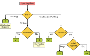
avo.apply(lambda row: row.AveragePrice * row['Total Volume'], axis=1)Choose an argument for the open function (file i/o)
Install packages in Jupyter Notebook
# Install a pip package in the current Jupyter kernel
import sys
!{sys.executable} -m pip install pytime
Understanding copying objects in python
These two links are excellent at explaining:
https://stackoverflow.com/questions/2612802/how-to-clone-or-copy-a-list
and
https://www.geeksforgeeks.org/copy-python-deep-copy-shallow-copy/
Reverse Dictionary Function
def reverse_dict(lookup_value):
    dictionary = {'george' : 16, 'amber' : 19}
    for key, value in dictionary.items():
        if value == lookup_value:
            print(key)

reverse_dict(19)
What are args and kwargs?
Removing duplicate rows in a dataframe
https://pandas.pydata.org/pandas-docs/version/0.17/generated/pandas.DataFrame.drop_duplicates.html
https://jamesrledoux.com/code/drop_duplicates
This is an extremely important pandas doc page! Indexing & slicing dataframes
https://pandas.pydata.org/pandas-docs/stable/user_guide/indexing.html
Selecting & looping through parts of a dataframe
Connect to a mySQL database:
import mysql.connector
# Set up your connection to the database
myConnection = mysql.connector.connect( host=
[PUT YOUR HOST NAME HERE], user=[PUT YOUR USERNAME HERE],
passwd=[PUT YOUR PASSWORD HERE], db=[PUT THE DATABASE NAME HERE] )

# Read the results of a SQL query into a pandas data frame.
my_table = pd.read_sql('SELECT * FROM table_name, con=myConnection)
Connect to postgres database:
import psycopg2
connection = psycopg2.connect(user =
"your-username-here-keep-quotes",
password = "your-password-here-keep-quotes",
host = "your-host-here-keep-quotes",
port = "5432",
database = "your-database-here-keep-quotes")
cursor = connection.cursor()
cursor.execute("SELECT * FROM django_session;")
record = cursor.fetchone()
print(record)
Connect to the Twitter API
import numpy as np
import pandas as pd
import json
from pandas.io.json import json_normalize
import twitter

# You need to replace all the capital words in brackets with your
# ACTUAL keys. The quotation marks stay but the brackets and
# capital words must go.
api = twitter.Api(consumer_key='[CONSUMER KEY GOES HERE]',
                  consumer_secret='[CONSUMER SECRET GOES HERE]',
                  access_token_key='[ACCESS TOKEN KEY GOES HERE]',
                  access_token_secret='[ACCESS TOKEN SECRET]')

# Get the tweet data since that last tweet
# The user_id is for Boxplot's timeline, replace it with your
# own if you'd like!
user_timeline = api.GetUserTimeline(user_id='959273870023905280')
latest_twitter_data_final = pd.DataFrame()

for i in range(len(user_timeline)):
    rowasdf = \ json_normalize(json.loads(json.dumps(user_timeline[i]._json))) \
    latest_twitter_data_final = pd.concat([latest_twitter_data_final, \
rowasdf]).reset_index(drop=True)

latest_twitter_data_final
Loop through a Series and make sure that each subsequent value is greater than or equal to the one before it. If not, set the value equal to the one before it:
previous_value = 0

def previous(current):
   global previous_value
   if current < previous_value:
       return_value = previous_value
#        previous_value = current
   else:
       return_value = current

   previous_value = return_value
   return return_value
choc['Rating'].head(10).apply(previous)
Remove white space in a column
df = pd.DataFrame({'a':[' app le ']})
print(len(df.a[0]))
df.a = df.a.str.strip()
len(df.a[0])
Customizing Matplotlib Visualizations
How to customize the range of the x-axis and rotate the tick marks:
awesome_table1 = pd.pivot_table(data, index='DEGFIELD3',
columns='REGION2', values='CBSERIAL', aggfunc='count')
#len(list(awesome_table1.index))
awesome_table1.plot(figsize=(18,12));
plt.xticks(range(0,13),list(awesome_table1.index),rotation=-45)
Also see:
https://stackoverflow.com/questions/12608788/changing-the-tick-frequency-on-x-or-y-axis-in-matplotlib
and
https://stackoverflow.com/questions/10998621/rotate-axis-text-in-python-matplotlib
Create reusable settings for a chart:
def my_scatterplot(x_txt, y_txt, df, colorcol):
    df.plot(kind='scatter', x=x_txt, y=y_txt, c=colorcol, colormap='winter', figsize=(10,4), s=10, alpha=.5)

my_scatterplot('Total Bags', 'AveragePrice', avo, 'type_as_num')
Change the size of all charts in a notebook:
# put this at the top of the notebook:
plt.rcParams["figure.figsize"] = [15, 10]
Example of changing colors and marker types in scatterplots:
colors = ['b', 'c', 'y', 'm', 'r']

en = plt.scatter(books_data[books_data['language_code']=='en']
['average_rating'], books_data[books_data['language_code']=='en']
['ratings_count'], marker='x', color=colors[0])

spa = plt.scatter(books_data[books_data['language_code']=='spa']
['average_rating'], books_data[books_data['language_code']=='spa']
['ratings_count'], color=colors[2])

fre  = plt.scatter(books_data[books_data['language_code']=='fre']
['average_rating'], books_data[books_data['language_code']=='fre']
['ratings_count'], marker='o', color=colors[1])

# a  = plt.scatter(random(10), random(10), marker='o',
color=colors[2])
# h  = plt.scatter(random(10), random(10), marker='o',
color=colors[3])
# hh = plt.scatter(random(10), random(10), marker='o',
color=colors[4])
# ho = plt.scatter(random(10), random(10), marker='x',
color=colors[4])

plt.legend((en,spa,fre),
          ('English', 'Spanish', 'French'),
          scatterpoints=1,
          loc='lower left',
          ncol=3,
          fontsize=8)

plt.show()
Multiple y axes, and forced axis
# This is one data point we're trying to plot
chart1 = sets.groupby('year')['num_parts'].count()
# This is the other data point we're trying to plot
chart2 = sets.groupby('year')['num_parts'].mean()
fig, ax = plt.subplots(sharey='col')

# Create a MatPlotLib figure & subplot
ax2 = ax.twinx() # ax2 shares X axis with the ax Axes object
#  This is what forces scale on the second Y-axis!!
ax2.set_ylim(bottom=0, top=799)

# graph both of our data sets, one bar, one line
ax.bar(chart1.index, chart1, color='dodgerblue')
ax2.plot(chart2.index, chart2, color='red')

# Set the size of the resulting figure
fig.set_size_inches(12,8)
Other Visualizations
A great tutorial for mapping:
https://towardsdatascience.com/mapping-geograph-data-in-python-610a963d2d7f
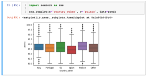
Side by side boxplots with seaborn:
Set x and y axes for seaborn plots:
ax = sns.barplot(x = 'val', y = 'cat',
data = fake,
color = 'black')
ax.set(xlabel='common xlabel', ylabel='common ylabel')
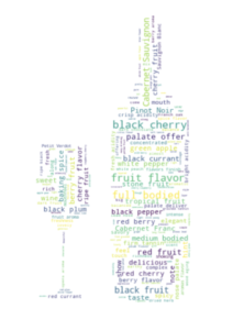
plt.show()Make a word cloud in the shape of a custom image:
# If using Jupyter Notebook, you need to install the
# wordcloud module like this

import sys
 !{sys.executable} -m pip install wordcloud

# import the libraries needed

from PIL import Image
 import numpy as np
 import pandas as pd
 from wordcloud import WordCloud, STOPWORDS, ImageColorGenerator
 import matplotlib.pyplot as plt

#  import your dataset
prod = pd.read_csv('winemag-data-130k-v2.csv')

# import the image mask
wine_mask = np.array(Image.open("wine_mask.png"))

# generate the word cloud
comment_words = ''

stopwords = set(STOPWORDS)

stopwords.update(["drink", "now", "wine", "flavor", "flavors"])

for val in prod.description.iloc[0:1000]:

    val = str(val)

    tokens = val.split(' ')

for i in range(len(tokens)):
    tokens[i] = tokens[i].lower()
    #print(tokens[i])

for word in tokens:
    comment_words = comment_words + ' ' + word

wordcloud = WordCloud(background_color="floralwhite",

                      max_words=1000,

                      mask=wine_mask,

                      stopwords=stopwords,

                      contour_width=3,

                      contour_color='floralwhite').generate(comment_words)

plt.figure(figsize = (48,48), facecolor = None)

plt.imshow(wordcloud, interpolation="bilinear")

plt.axis('off')

plt.tight_layout(pad=0)

plt.title("Frequent Words from Tasters - Wine Form",fontsize = 40,color='gray')

plt.show()
Make a single box and whisker plot with Matplotlib:
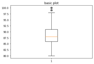
fig, axs = plt.subplots(1, 1)
 axs.boxplot(prod['points'])
 axs.set_title('basic plot')
plt.show()
Multiple box and whisker plots with Matplotlib:
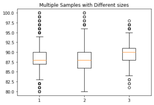
# To make side by side box and whisker plots (in this example, get
# points for each country, and then make a list of those lists).
# That is what is passed in to the boxplot function:

u = list(prod[prod['country']=='Italy']['points'])
m = list(prod[prod['country']=='Portugal']['points'])
w = list(prod[prod['country']=='Germany']['points'])
final_list = []
final_list.append(u)
final_list.append(m)
final_list.append(w)

fig7, ax7 = plt.subplots()
ax7.set_title('Multiple Samples with Different sizes')
ax7.boxplot(final_list);
Pie Chart:
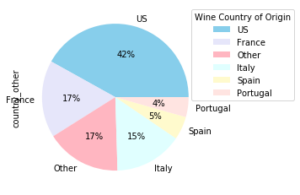
prod.country_other.value_counts().plot(kind='pie',
   autopct='%1.0f%%', colors=['skyblue', 'lavender', 'lightpink',
   'lightcyan', 'lemonchiffon', 'mistyrose'])
plt.legend(title = 'Wine Country of Origin', loc='best', bbox_to_anchor=(1, 0, 0.5, 1))
plt.figure(figsize=(360, 250))