Make a Bubble Plot in Excel
Make a Bubble Plot in Excel
by Boxplot Sep 1, 2019
Most people don’t know that bubble plots even exist in Excel. In this blog post, we’ll walk through how to take advantage of these very effective charts! They are great for comparing three quantitative variables at once.
Getting the Right Data
A standard plot is used for comparing three quantitative variables in one chart. Think of a quantitative variable as a number column in Excel. Remember, a good way to choose which type of chart to use when you are performing data analysis is to consider the types of data you are working with. Check out Chart Cheat Sheet blog post for a comprehensive guide to choosing the right visualization.
Let’s take an example to understand this better. Say you work for a nutrition nonprofit and are interested in learning about nutritional information for breakfast cereals. We have this dataset from Kaggle that I modified a tiny bit (I changed values in about 4 or 5 cells) so that the bubble plot example would be easier. Download the .xlsx file here if you’d like to follow along. Here’s a preview of the dataset:
| name | mfr | type | calories | protein | fat | sodium | fiber | carbo | sugars | potass | vitamins | shelf | weight | cups | rating |
|---|---|---|---|---|---|---|---|---|---|---|---|---|---|---|---|
| 100% Bran | N | C | 70 | 4 | 1 | 130 | 10 | 5 | 6 | 280 | 25 | 3 | 1 | 0.33 | 68.402973 |
| 100% Natural Bran | Q | C | 120 | 3 | 5 | 15 | 2 | 8 | 8 | 135 | 0 | 3 | 1 | 1 | 33.983679 |
| All-Bran | K | C | 70 | 4 | 1 | 260 | 9 | 7 | 5 | 320 | 25 | 3 | 1 | 0.33 | 59.425505 |
| All-Bran with Extra Fiber | K | C | 50 | 4 | 0 | 140 | 14 | 8 | 0 | 330 | 25 | 3 | 1 | 0.5 | 93.704912 |
| Almond Delight | R | C | 110 | 2 | 2 | 200 | 1 | 14 | 8 | -1 | 25 | 3 | 1 | 0.75 | 34.384843 |
| Apple Cinnamon Cheerios | G | C | 110 | 2 | 2 | 180 | 1.5 | 10.5 | 10 | 70 | 25 | 1 | 1 | 0.75 | 29.509541 |
| Apple Jacks | K | C | 110 | 2 | 0 | 125 | 1 | 11 | 14 | 30 | 25 | 2 | 1 | 1 | 33.174094 |
| Basic 4 | G | C | 130 | 3 | 2 | 210 | 2 | 18 | 8 | 100 | 25 | 3 | 1.33 | 0.75 | 37.038562 |
| Bran Chex | R | C | 90 | 2 | 1 | 200 | 4 | 15 | 6 | 125 | 25 | 1 | 1 | 0.67 | 49.120253 |
| Bran Flakes | P | C | 90 | 3 | 0 | 210 | 5 | 13 | 5 | 190 | 25 | 3 | 1 | 0.67 | 53.313813 |
| Cap’n’Crunch | Q | C | 120 | 1 | 2 | 220 | 0 | 12 | 12 | 35 | 25 | 2 | 1 | 0.75 | 18.042851 |
| Cheerios | G | C | 110 | 6 | 2 | 290 | 2 | 17 | 1 | 105 | 25 | 1 | 1 | 1.25 | 50.764999 |
| Cinnamon Toast Crunch | G | C | 120 | 1 | 3 | 210 | 0 | 13 | 9 | 45 | 25 | 2 | 1 | 0.75 | 19.823573 |
| Clusters | G | C | 110 | 3 | 2 | 140 | 2 | 13 | 7 | 105 | 25 | 3 | 1 | 0.5 | 40.400208 |
| Cocoa Puffs | G | C | 110 | 1 | 1 | 180 | 0 | 12 | 13 | 55 | 25 | 2 | 1 | 1 | 22.736446 |
We want to compare the sugar, fat, and caloric content of the cereal brands all at once. How can we squeeze all of that information into one plot effectively? A bubble chart!
Choose your Data
You need to decide on a few things when making a bubble plot:
X Axis
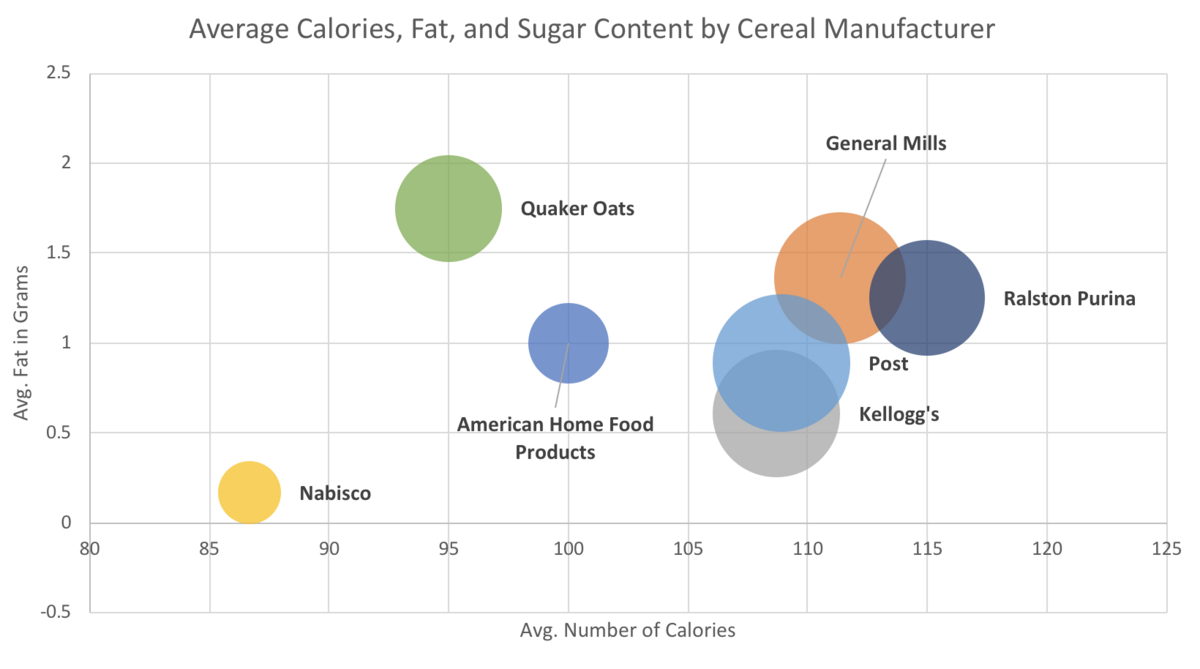
Any quantitative variable will do, but you can get more out of your visualization by picking a variable that you think is influencing the y variable. In this case, I hypothesized that the higher the average number of calories, the higher the average fat content would be for each brand of cereal. So, I made average number of calories my x axis.
Y Axis
Same as the x axis, any quantitative variable will do, but you’ll get more out of your visualization by picking a variable that you think is being influenced by the variable you chose for the x axis. So, we’re going with average fat content for our y axis.
Size of Bubble
The size of the bubble can also be any quantitative variable, and it should be one that will be relevant when compared to the x and y variables. However, generally, it’s a good idea to pick a variable that has a lot of variation if you can so that your bubbles aren’t all the same size and are actually showing something interesting. We’re going to go with average sugar content for our bubble size.
Optional: Bubble Color
You can get a FOURTH variable into a bubble plot believe it or not! If you want to add a categorical variable (think of that as a text column in Excel) to the three quantitative columns, you can do it by making the color of the bubbles represent values from the categorical variable. For this first example, we’re going to have the bubble color represent a unique manufacturer of cereals.
Set Up the Data in Excel
Let’s start by making a Table, then a PivotTable. You don’t have to make a PivotTable in order to make a Bubble Plot (in fact, later in this post we’ll make a Bubble Plot without making a PivotTable). But since I want to aggregate the information by manufacturer, a PivotTable makes sense here. If you aren’t familiar with PivotTables, you should still be able to follow these instructions to produce one. If you want to understand PivotTables better, check out my blog post “PivotTable Basics”.
Step 1:
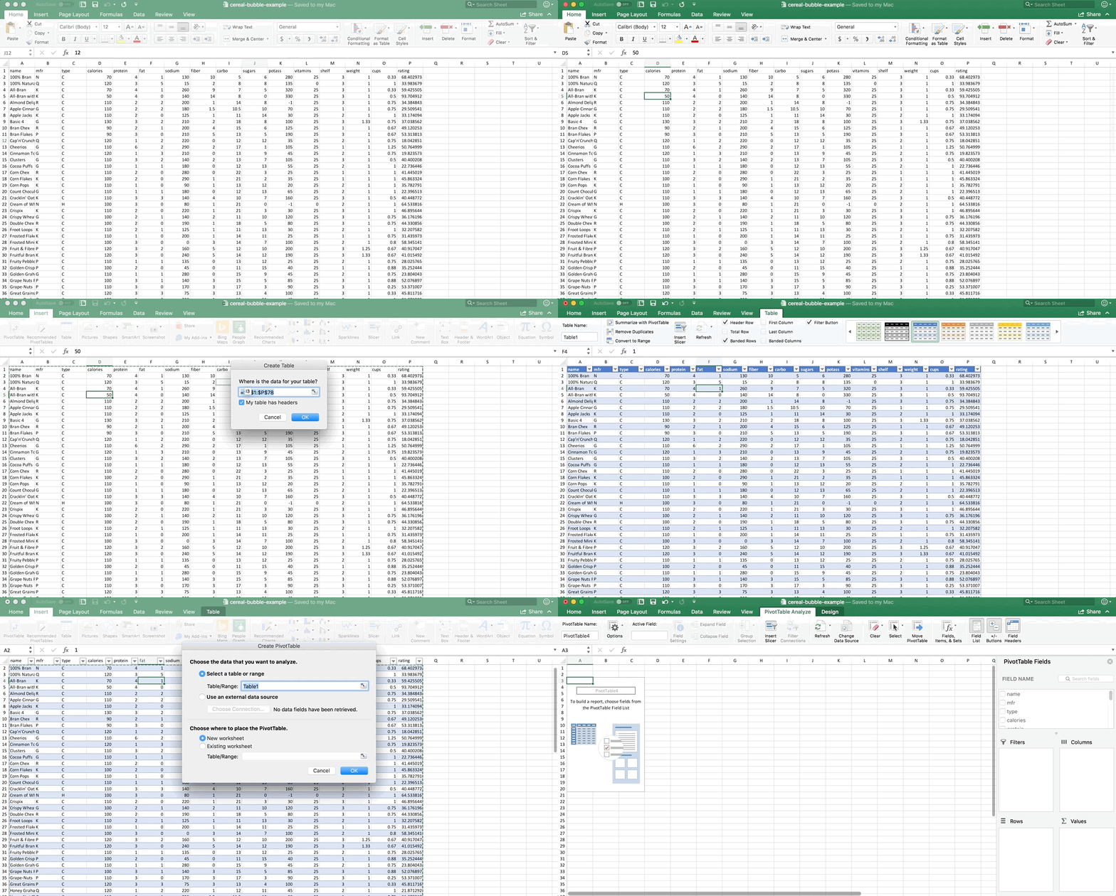
Click on any non-blank cell in the dataset. Go to Insert >> Table. Tables make things easier to work with (a blog post about tables is coming next!). Then either leave the Table highlighted, or just click on any non-blank cell again. Now go to Insert >> PivotTable. Check out the GIF if you are lost:
Step 2:
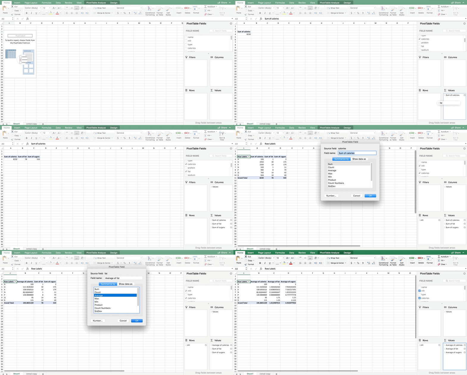
Add the variables to your PivotTable like shown in the next GIF below. Make sure your variables in the Values box are in the exact same order that mine are. For almost every chart, Excel wants the data in a particular order. You don’t have to follow this order, but it will make your life easier if you do. For bubble plots, it wants x axis first, then y axis, then size of bubble. Also make sure they are averages. You’ll notice that the sums didn’t make sense (that represents the total fat, sugar, and calories in all cereals produced by each manufacturer which doesn’t make logical sense for what we’re seeking).
Step 3:
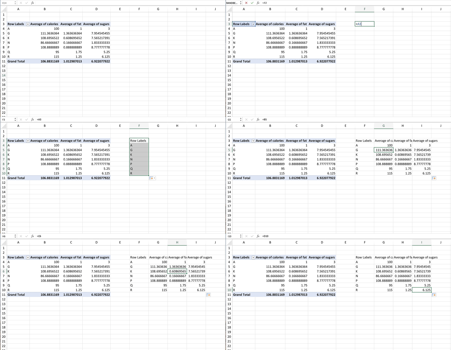
Most versions of Excel won’t let you make a bubble plot directly from a PivotTable. Some will, but most won’t. If yours won’t let you, simply copy the PivotTable and paste it as values, or even better, copy it as references. That way if something changes in the PivotTable later, your references will also change, and your chart will automatically update too. Again, check out my blog post on Tables if you’re interested in learning more about efficient workbook layout in Excel.
Make a Bubble Plot!
We’re finally ready to make our Bubble Plot!! Highlight all the numbers in the copied data (NUMBERS ONLY, no text or titles) and go to Insert >> Scatterplot and choose Bubble. If you’re on an older version of Excel, your scatterplot button might be in a different place.
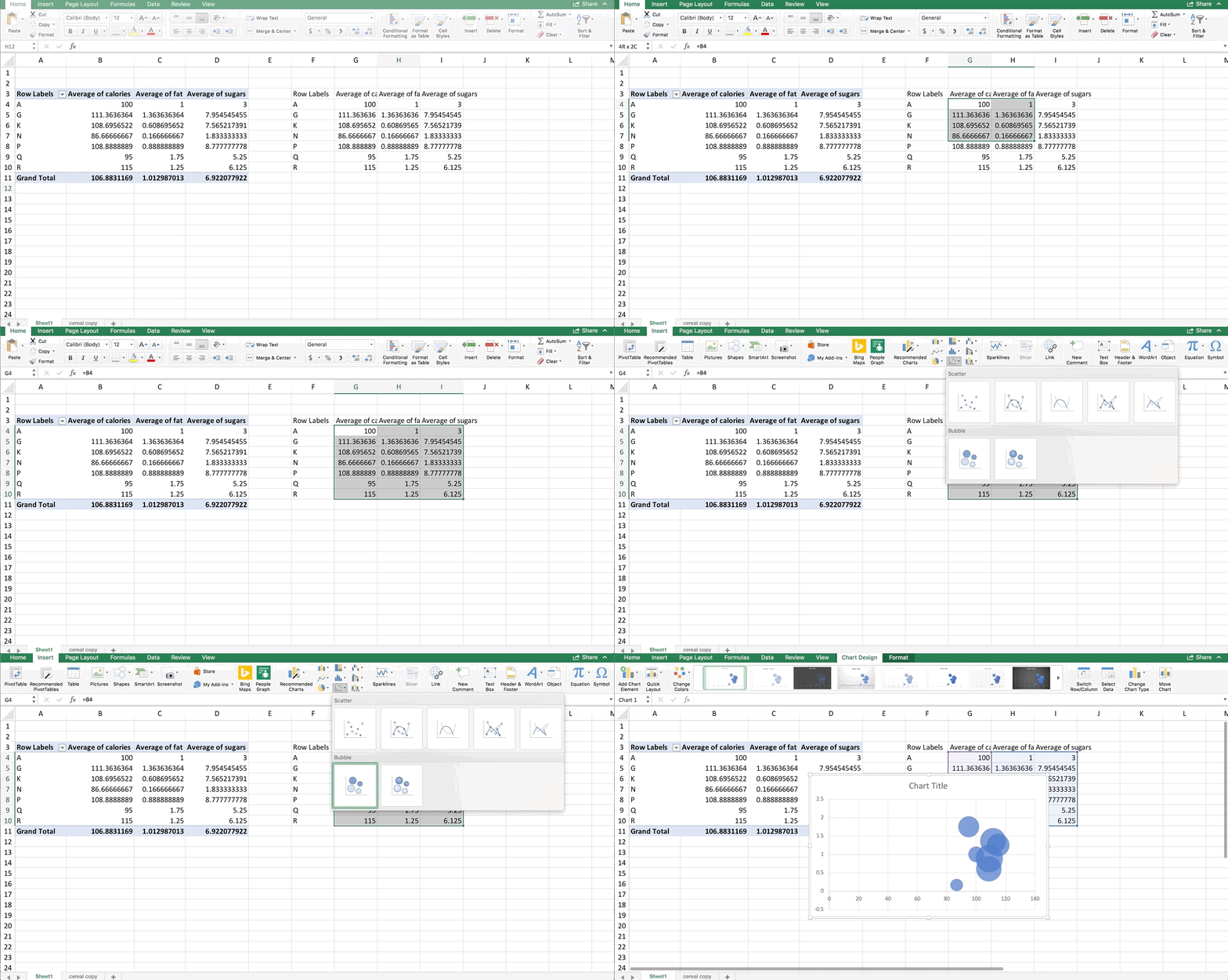
Let’s clean this up a bit. For bubble and scatter plots, you can modify the axes to zoom in on the points. So, let’s set the minimum value for the x-axis to 85. Let’s also label the axes:
This looks good, and we can already glean some information from this chart. The bubbles aren’t really in a line, but there is a very small positive trend. The bubble size doesn’t seem to get larger in any direction in this case, but that’s something you could look for too. However, we don’t know which one is which. We can add color and data labels to help distinguish the bubbles.
Since we only have one value for each cereal brand in this example (that is, one row for each cereal brand and therefore just one bubble per color) we can right-click on any bubble, choose “Format Data Series” and get to the spill-paint icon. From there, choose Fill and then check off “Vary Colors by Point”:
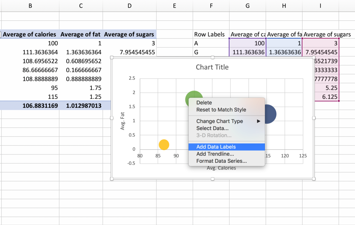
Finally, to add data labels, right-click on any bubble again, and choose “Add Data Labels”. If you’re on a PC, you can right-click on any data label, choose “Format Data Labels” and then check off “Value from Cells” in the Format Data Labels panel that appears to the right. Highlight the names of the cereal manufacturers in the copied cells and hit OK. Then un-check Y value and you should just see the names of the brands remaining next to the bubbles.
Unfortunately, on a Mac, this is much more tedious because there is no “Value from Cells” option. On a Mac you need still right-click on the bubble and add the Data Labels, but from here you have to hand-type the names of the cereal manufacturers in each of the label text boxes. Your final product should look like this:
What if I want multiple bubbles that are the same color?
You can do this, and in this example we’ll make a bubble plot directly from the raw data. Using our whole dataset would produce a pretty messy plot with too many bubbles. So, let’s say you’re interested in only this subset of cereals:
| mfr | type | calories | fat | sugars |
|---|---|---|---|---|
| K | C | 160 | 2 | 13 |
| K | C | 70 | 1 | 5 |
| K | C | 50 | 0 | 0.1 |
| Q | C | 120 | 5 | 8 |
| Q | C | 50 | 0 | 0.1 |
| R | C | 150 | 3 | 11 |
Now we have multiple rows that are the same manufacturer (3 K’s, 2 Q’s, and 1 R). This gets a bit more tedious, but labeling the colors is much easier.
Step 1: Get The First Series In
“Series” is Excel’s code word for “Color”. If you want more colors in your chart, simply add more series.
As usual, we’ll make the data into a table first. For the first series in any multi-color chart, you can highlight all of the numbers associated with that series, and the insert the chart. So, we’re going to highlight all of the numbers associated with K, and insert a bubble plot:
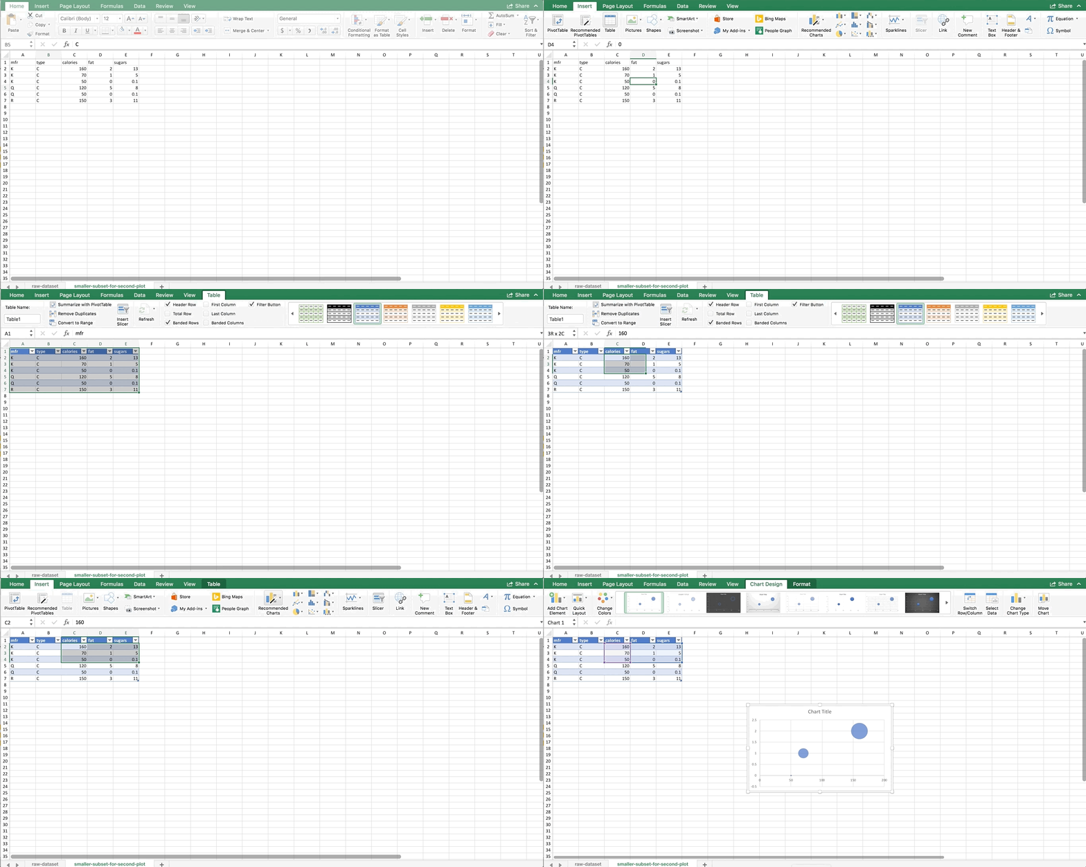
To get the other manufacturers in as separate colors, we need to right-click on the chart and choose Select Data. You should see a windows like this:
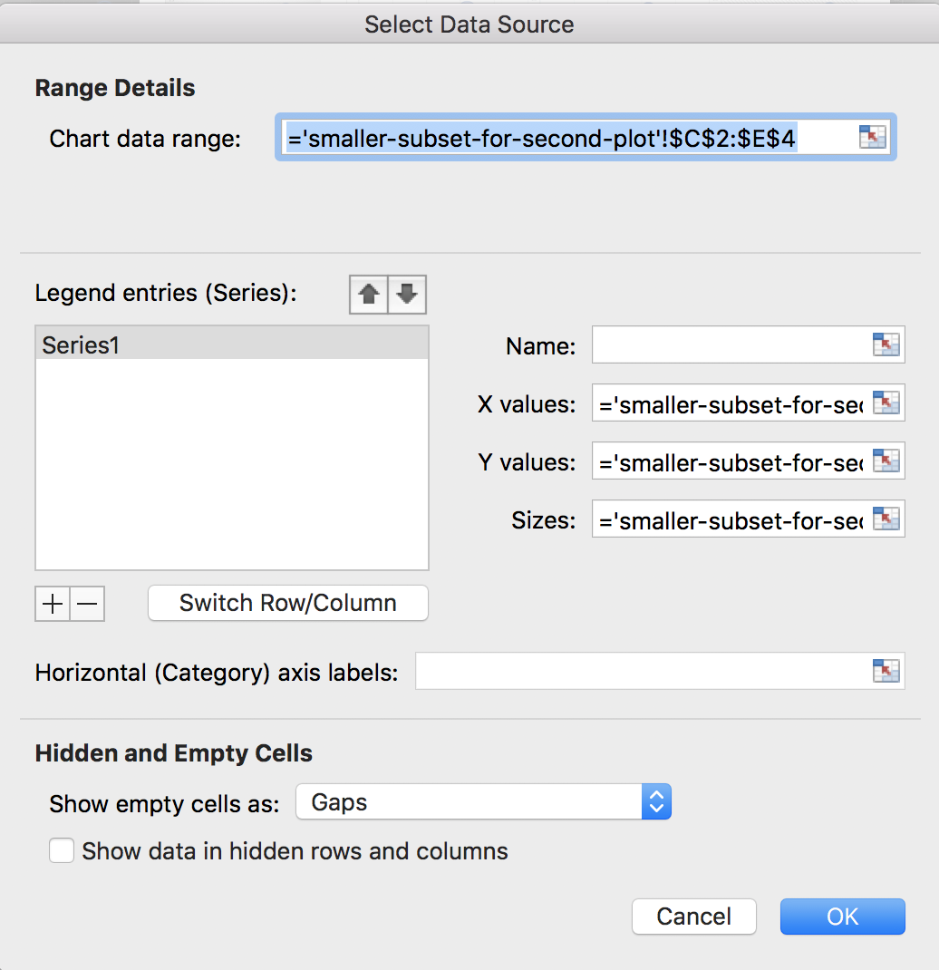
It will look different if you are using a PC, but the four boxes that are important should be the same: Name, X values, Y values, and Sizes (or Size of Bubble). Since we highlighted the data for K, it autopopulated these fields for us. Let’s name this series K before we move on to the others. That way, when we add a Legend to our chart later, it will automatically show the names of the manufacturers. In the name box, either type K or click on one of the cells with K in it inside the dataset.
Then, we’ll add the Q series. On a Mac, hit the + sign. On a PC, you’ll want to choose the “Add” button. We’ll do Q next. Type Q or click on one of the cells that has Q in it for the Name. For the X values, we want to highlight all calorie cells associated with the Q manufacturer. For the Y values, we want to highlight all of the fat values associated with the Q manufacturer. And, for the size of the bubble, we want to highlight all values in the sugar column that are associated with the Q manufacturer. Putting it all together looks like this:
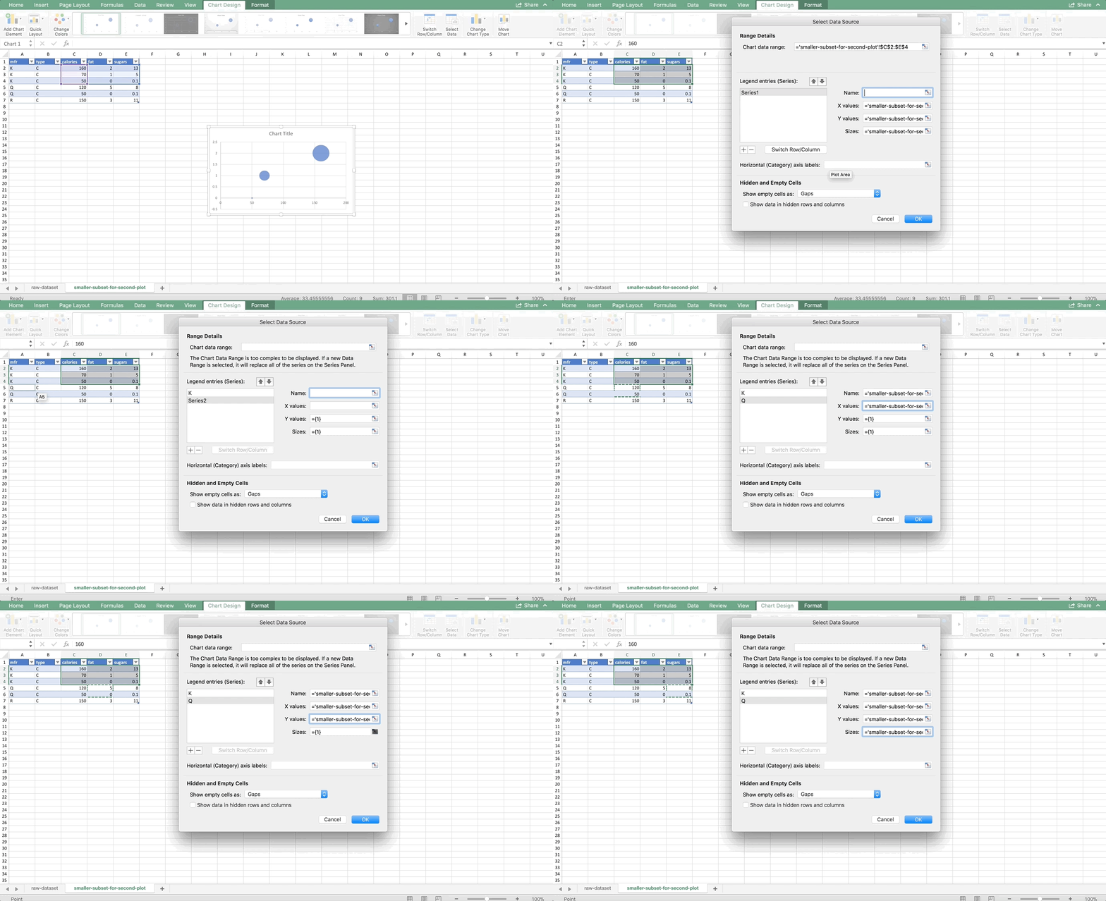
Finally, let’s add the R manufacturer’s series. There’s only one row for R, so it would look like this:
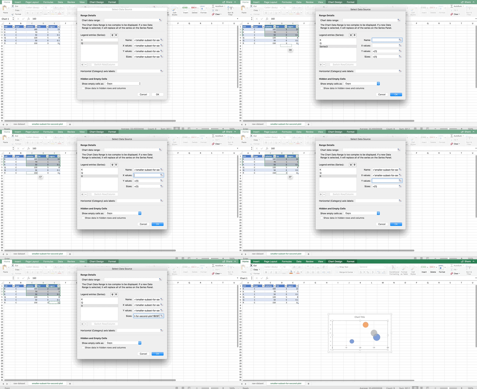
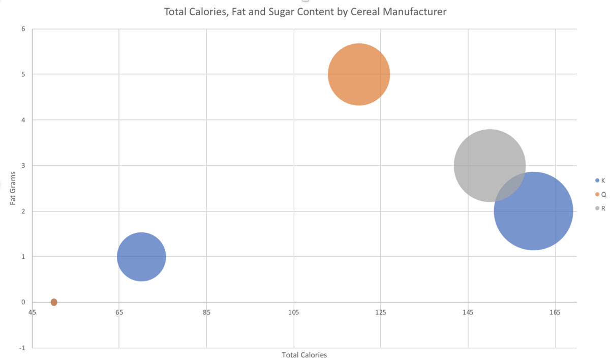
You can change the axes and add titles like we did in the first example. I chose my minimum x-axis value to be 45, and my max to be 170. Don’t forget to add a legend too, so we can tell which color is which. On a Mac, start by clicking on the chart. Then the “Chart Design” menu should appear in the ribbon at the top of the screen. Click the button all the way to the left, “Add Chart Element” (this is the same button used to add the titles above, see the GIF if you are lost). Then choose Legend >> Right. The final result looks like this:
If you want the legend to show the name of the manufacturer instead of the letter abbreviation, you have to change this in the original dataset like so:
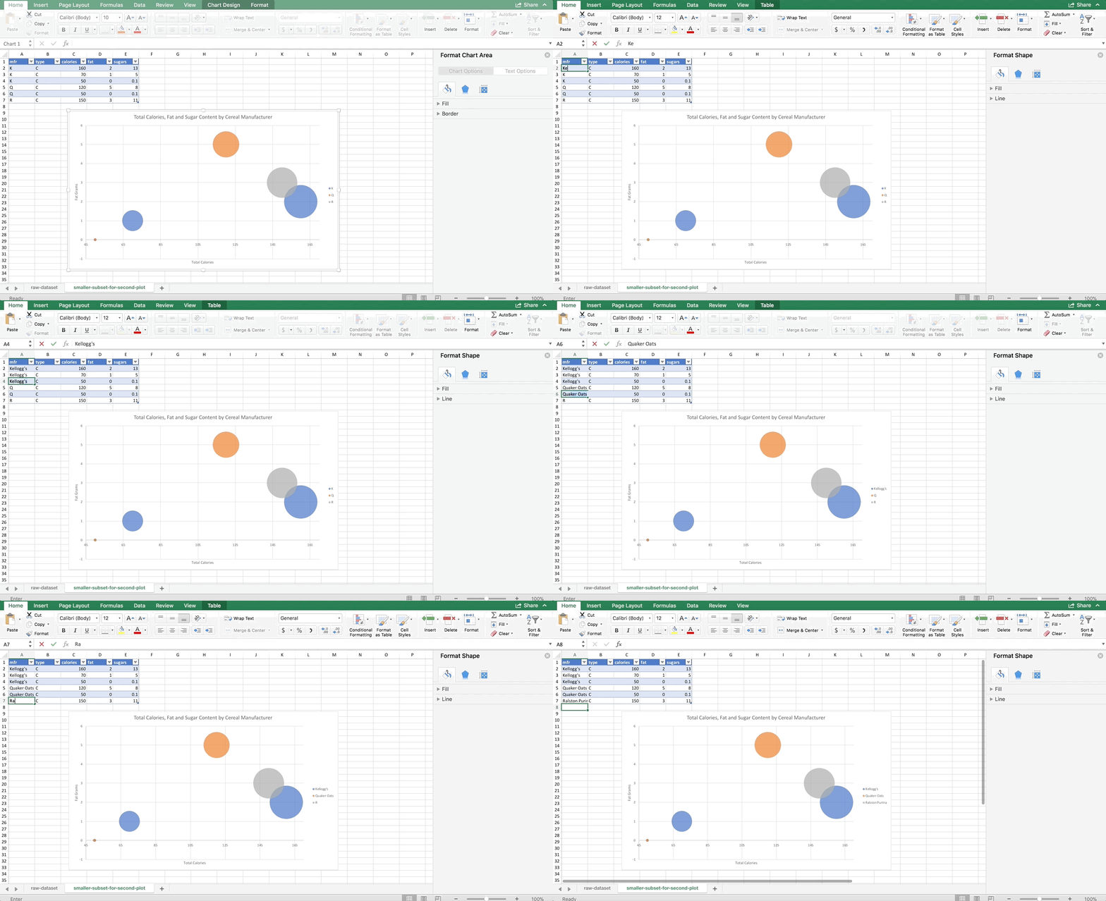
Technically, I didn’t have to change all of them, only the ones I referred to in the “Name” box when we were in the “Select Data” dialog. But, I couldn’t remember which I chose, and there are so few in this data subset that I changed all of them 🙂
Notice it looks like there are only 5 bubbles – there are actually 6, but two of them have the exact same x and y values, so they are overlapping. It’s the ones that have 0 fat and 50 calories. Be careful of situations like this – as you can see Excel seems to have randomly chosen to put the orange bubble on top, so someone who is not familiar with the data might not realize that there is a blue bubble underneath it. Also take note that this is no longer averages. We didn’t do a PivotTable to aggregate the data before making this chart, so it’s total calories, fat, and sugars per cereal.
Takeaways
Aren’t bubble plots cool? Admittedly, people who are new to analytics may have a bit of trouble fully understanding what is going on the first time they look at a bubble plot. However, if they are created properly, they are an effective chart that is not misleading. Sometimes it’s tempting to squeeze a lot of variables into one visualization in other ways that do become misleading. But here, we were able to compare four variables at once (manufacturer, calories, fat, and sugar) in an effective and accurate way.
<< Previous Post
"Python Resources"
Next Post >>
"Installing & Running Jupyter Notebook"
