PowerToFly has Barb on as a guest speaker in the “Intro to SQL” webinar. In this webinar, Barb answers various questions regarding SQL including: “What is SQL?”, “What kind of jobs use SQL?” and “What is a SQL query and what do I need to make one?”, followed by more specific questions that were asked live during the webinar.
Barb explains the difference between SQL, Excel, Tableau and other platforms used for data programming and visualization, and summarizes the 3 step process for data analysis. Barb provides some tips on how to get hands-on SQL practice and some examples for how one can make a transition from SQL queries to real-life projects in the workplace.
This webinar also contains a live, interactive demonstration for how to write a SQL query and filter data using the 3 principal SQL commands: SELECT, FROM, and WHERE, as well as JOIN, a command that many users find confusing to write and understand.
Feel free to connect with me on LinkedIn. I post news, classes and other data analytics resources regularly. Boxplot’s accounts also post the same type of data analytics resources regularly: Twitter, LinkedIn, Facebook
General Data Analysis Resources
HighCharts(Barb’s recommended library for creating web-ready visualizations).
The goal of this blog post is a compilation of little tidbits and code snippets that address common issues when programming for data analysis in Python.
General Snippets
Difference between JSON and XML
This page gives a great example of the difference between data in JSON format and XML format. It shows the exact same data in both formats: https://json.org/example.html
pd.options.display.max_columns = 2000

#If you don't want to make the change permanently for the notebook,
(e.g., to avoid excessive output in other cells), you can also use
pd.option_context:

with pd.option_context('display.max_columns', 2000):
     print(df.describe())
#temporarily display all columns
with pd.option_context('display.max_seq_items', None):
    print (df.columns)
Isolate date columns:
datecols2 = []

for item in prod.columns:
    if 'Date' in item:
        datecols2.append(item)

datecols2
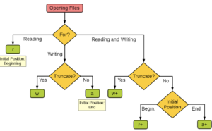
Choose an argument for the open function (file i/o)
Install packages in Jupyter Notebook
# Install a pip package in the current Jupyter kernel
import sys
!{sys.executable} -m pip install pytime
Understanding copying objects in python
These two links are excellent at explaining: https://stackoverflow.com/questions/2612802/how-to-clone-or-copy-a-list and https://www.geeksforgeeks.org/copy-python-deep-copy-shallow-copy/
Reverse Dictionary Function
def reverse_dict(lookup_value):
    dictionary = {'george' : 16, 'amber' : 19}
    for key, value in dictionary.items():
        if value == lookup_value:
            print(key)

reverse_dict(19)
import mysql.connector
# Set up your connection to the database
myConnection = mysql.connector.connect( host=
[PUT YOUR HOST NAME HERE], user=[PUT YOUR USERNAME HERE],
passwd=[PUT YOUR PASSWORD HERE], db=[PUT THE DATABASE NAME HERE] )

# Read the results of a SQL query into a pandas data frame.
my_table = pd.read_sql('SELECT * FROM table_name, con=myConnection)
Connect to postgres database:
import psycopg2
connection = psycopg2.connect(user =
"your-username-here-keep-quotes",
password = "your-password-here-keep-quotes",
host = "your-host-here-keep-quotes",
port = "5432",
database = "your-database-here-keep-quotes")
cursor = connection.cursor()
cursor.execute("SELECT * FROM django_session;")
record = cursor.fetchone()
print(record)
Connect to the Twitter API
import numpy as np
import pandas as pd
import json
from pandas.io.json import json_normalize
import twitter

# You need to replace all the capital words in brackets with your
# ACTUAL keys. The quotation marks stay but the brackets and
# capital words must go.
api = twitter.Api(consumer_key='[CONSUMER KEY GOES HERE]',
                  consumer_secret='[CONSUMER SECRET GOES HERE]',
                  access_token_key='[ACCESS TOKEN KEY GOES HERE]',
                  access_token_secret='[ACCESS TOKEN SECRET]')

# Get the tweet data since that last tweet
# The user_id is for Boxplot's timeline, replace it with your
# own if you'd like!
user_timeline = api.GetUserTimeline(user_id='959273870023905280')
latest_twitter_data_final = pd.DataFrame()

for i in range(len(user_timeline)):
    rowasdf = \ json_normalize(json.loads(json.dumps(user_timeline[i]._json))) \
    latest_twitter_data_final = pd.concat([latest_twitter_data_final, \
rowasdf]).reset_index(drop=True)

latest_twitter_data_final
Loop through a Series and make sure that each subsequent value is greater than or equal to the one before it. If not, set the value equal to the one before it:
previous_value = 0

def previous(current):
   global previous_value
   if current < previous_value:
       return_value = previous_value
#        previous_value = current
   else:
       return_value = current

   previous_value = return_value
   return return_value
choc['Rating'].head(10).apply(previous)
# This is one data point we're trying to plot
chart1 = sets.groupby('year')['num_parts'].count()
# This is the other data point we're trying to plot
chart2 = sets.groupby('year')['num_parts'].mean()
fig, ax = plt.subplots(sharey='col')

# Create a MatPlotLib figure & subplot
ax2 = ax.twinx() # ax2 shares X axis with the ax Axes object
#  This is what forces scale on the second Y-axis!!
ax2.set_ylim(bottom=0, top=799)

# graph both of our data sets, one bar, one line
ax.bar(chart1.index, chart1, color='dodgerblue')
ax2.plot(chart2.index, chart2, color='red')

# Set the size of the resulting figure
fig.set_size_inches(12,8)
ax = sns.barplot(x = 'val', y = 'cat',
              data = fake,
              color = 'black')
ax.set(xlabel='common xlabel', ylabel='common ylabel')
plt.show()
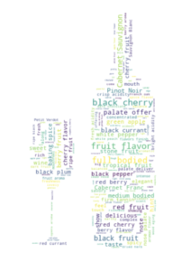
Make a word cloud in the shape of a custom image:
# If using Jupyter Notebook, you need to install the
# wordcloud module like this

import sys
 !{sys.executable} -m pip install wordcloud

# import the libraries needed

from PIL import Image
 import numpy as np
 import pandas as pd
 from wordcloud import WordCloud, STOPWORDS, ImageColorGenerator
 import matplotlib.pyplot as plt

#  import your dataset
prod = pd.read_csv('winemag-data-130k-v2.csv')

# import the image mask
wine_mask = np.array(Image.open("wine_mask.png"))

# generate the word cloud
comment_words = ''

stopwords = set(STOPWORDS)

stopwords.update(["drink", "now", "wine", "flavor", "flavors"])

for val in prod.description.iloc[0:1000]:

    val = str(val)

    tokens = val.split(' ')

for i in range(len(tokens)):
    tokens[i] = tokens[i].lower()
    #print(tokens[i])

for word in tokens:
    comment_words = comment_words + ' ' + word

wordcloud = WordCloud(background_color="floralwhite",

                      max_words=1000,

                      mask=wine_mask,

                      stopwords=stopwords,

                      contour_width=3,

                      contour_color='floralwhite').generate(comment_words)

plt.figure(figsize = (48,48), facecolor = None)

plt.imshow(wordcloud, interpolation="bilinear")

plt.axis('off')

plt.tight_layout(pad=0)

plt.title("Frequent Words from Tasters - Wine Form",fontsize = 40,color='gray')

plt.show()
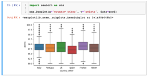
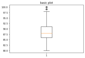
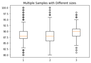
Make a single box and whisker plot with Matplotlib:
# To make side by side box and whisker plots (in this example, get
# points for each country, and then make a list of those lists).
# That is what is passed in to the boxplot function:

u = list(prod[prod['country']=='Italy']['points'])
m = list(prod[prod['country']=='Portugal']['points'])
w = list(prod[prod['country']=='Germany']['points'])
final_list = []
final_list.append(u)
final_list.append(m)
final_list.append(w)

fig7, ax7 = plt.subplots()
ax7.set_title('Multiple Samples with Different sizes')
ax7.boxplot(final_list);
A/B testing (sometimes called split testing) is comparing two
versions of a web page, email newsletter, or some other digital content to see
which one performs better. A company will compare two web pages by
showing the two variants (let’s call them A and B) to similar visitors at the
same time. Typically, the company is trying to see which page leads to more
sales, so the one that gives a better conversion rate wins.
You work for a nonprofit and your organization has two
different webpages designed to solicit donations, we’ll call them page A and
page B. The two pages are trying to accomplish the same result – to get the
viewer of the page to donate, but they both have different looks and feels from
one another. The success of these web pages is measured by the percentage of
people who wind up making a donation (in any amount). For example, if 100
people view page A and 10 purchase, A’s conversion rate is 10%.
The nonprofit wants to test if one page is doing
statistically significantly better than the other (that is, leading to more
donations) and has tasked you with coming up with an answer.
Step 1: Collect Data
The first thing you need to do is choose a period of time.
Let’s say one month. Then, collect your data. In one month, page A had 100,000
views and 20,000 people made a donation. In that same month, Page B had 80,000
views and 15,000 people purchased a product.
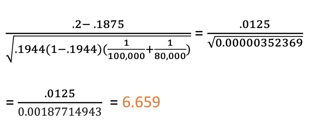
The proportion for success for Page A is pA = 20,000/100,000 = .2 = 20%
The proportion for success for Page B is pB = 15,000/80,000 = .1875 = 18.75%
The difference between these two proportions is .2 – .1875 = .0125 = 1.25 percentage points
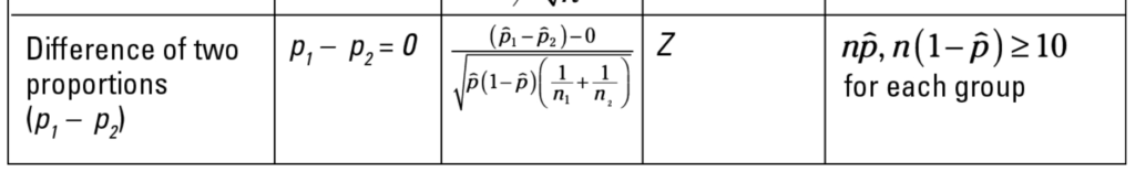
Step 2: Choose a Test
To determine if the conversion rate for page A is significantly
higher than page B, we do a difference
of proportions test. Choosing a test sometimes can be the most difficult
part of a statistical analysis! Different test statistics (T, Z, F, etc.) are
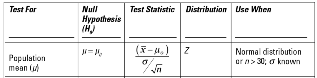
used for different types of data. Use the Statistics Cheat Sheet for Dummies
chart or other related sites like StatTrek to help you choose the right test
based on your sample.
Step 3: Pick a Confidence Level
Almost everyone chooses 95%. If you choose less than that,
people may look at you funny or like you have something to hide! Of course
there may be appropriate uses for confidence levels less than 95% but it’s not
common. If you’re testing something super important, like the safety of
airplane parts, you want a confidence level much higher than 95%! Probably like
99.99999% or more!
In this
case, we’ll stick with 95%.
Step 4: Null and Alternative Hypotheses
As always with hypothesis testing, we need to specify null and alternative hypotheses. In statistics, we’re never talking about an exact match – it will almost never be that way. See Barbara’s Kakes+ example for more on this. In this case, our hypotheses would be:
Null Hypothesis
pA – pB = 0
That there is no difference between the two pages – that is, statistically,
one does not result in more donations than the other. If you subtract two
numbers that are equal, you would get 0, which is why the hypothesis is written
this way. These are all appropriate ways of stating the null hypothesis in
words:
Alternative Hypothesis
You have three options for the alternative hypothesis: pA
– pB > 0, pA – pB < 0, or pA –
pB ≠ 0. In this case, we’ll choose pA – pB > 0 because we
think that page A is performing better than page B, and subtracting a smaller
number from a larger number results in a positive answer.
Step 5: Meeting Assumptions
The assumptions associated with a difference of proportions
test are discussed in the last column of this table (taken from the Statistics
for Dummies Cheat Sheet):
Let’s break down the variables and assumptions into a table:
Page
A
Page
B
N
100,000
80,000
P
20,000/100,000 = .2
15,000/80,000 = .1875
Np
100,000 * .2 = 20,000
80,000 * .1875 = 15,000
N(1-p)
100,000 * (1-.2) = 80,000
80,000 * (1-.1875) = 65,000
Looks like we met the requirements! Np and n(1-p) are well
above 10 for both of these. The reason that they must be above 10 is because
statements cannot be made with enough confidence about small samples. You need
a large enough sample size to do the test.
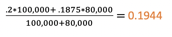
Step 6: Find the Pooled p
This is a special calculation we have to do for a difference
of proportions hypothesis test. It is essentially finding a weighted average of
the two proportions:
0.1944
Step 7: Calculate a Z score
We see from the table above that we are using the Z test
statistic, and the table also provides the formula. So, we just plug in the
numbers!
Step 8: Discuss Results
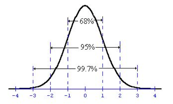
A Z-Score of 6 is huge! Take a look at the normal
distribution:
The area underneath the curve (that is, from the curve to
the x axis) is the probability of getting a result as large as you did if the
null hypothesis is true. To put that in the context of our problem, it means
“the probability of getting a difference of .0125 (1.25%) if the difference of
the two proportions is actually 0%.” The area between the curve and the x axis
at Z = 6 (which is so far to the right it isn’t even on the chart!) is
extremely small – less than 1%. We can get the exact value using a p-value
calculator.
At 95% confidence, we need the Z score to be above 2 (or
equivalently, the p-value to be less than 5%) to reject the null hypothesis.
So, since they are, we can
at 95% confidence reject the null hypothesis that there is no difference between
the two pages in favor of the alternative hypothesis, that page A performs
better than page B. These are some other appropriate ways of stating the
result:
At a 95% confidence level, the proportion of
viewers who donate after viewing page A is statistically significantly greater
than the proportion of viewers who donate after viewing page B.
With 95% confidence, we can state that page A
performs better than page B in number of donations solicited
At 95% confidence, page A has a statistically
significant higher proportion of donors than page B.
Notice that all of these contain “at 95% confidence” or
“with 95% confidence,” etc. Language like this is important in statistics! If
we had chosen another confidence level, our result may be completely different.
The Situation: Kakes+, a Pennsylvania company that makes terribly unhealthy small pies/cakes, believes that their machines are overfilling their blueberry pies. Kakes+ wants to test this statistically, and has recruited you to come up with a data-backed answer. The pies should weigh 8 ounces each.
Step 1: Collect Data
You need to weigh the pies to determine the answer. However, of course it would be absurd to weigh every single Kakes+ pie that leaves the factory! Rarely in life can we test an entire population, which is why hypothesis testing is so important – the whole point of hypothesis testing is using a sample to make a statement at some level of confidence about the entire population.
You need to choose a sample size. It’s important to choose a
sample size that’s large enough to represent the whole population. If you only
weigh 5 pies, it’s not going to be enough data for us to make a confident
statement about the average weight of entire population.
There are two options for choosing a sample size – you could attempt to calculate it using the formula from the Statistics for Dummies cheat sheet.
But that requires a lot of guessing (we need to guess a standard deviation and determine a margin of error (MOE). We know that sample sizes greater than 30 are acceptable because of the Central Limit Theorem (given certain conditions, the arithmetic mean of a sufficiently large number of iterates of independentrandom variables, each with a well-defined expected value and well-defined variance, will be approximately normally distributed, regardless of the underlying distribution.), so let’s sample 100 pies.
You sample 100 pies, and get the following numbers:
8.42
4.20
9.60
4.66
10.04
6.63
7.84
8.61
8.04
6.09
7.09
8.70
5.58
5.76
9.78
6.42
9.57
8.23
11.68
6.63
6.60
7.28
9.31
10.83
7.07
8.86
11.48
7.83
8.43
7.44
8.62
8.15
7.75
11.26
6.49
10.14
10.93
7.26
10.99
11.51
8.84
7.40
8.20
7.51
8.03
8.70
5.98
9.28
6.59
7.71
9.97
8.74
8.04
7.84
8.36
8.48
8.39
6.22
9.02
9.99
9.77
7.60
10.47
5.03
9.09
10.18
8.41
8.39
8.91
4.48
9.52
5.34
7.11
5.67
9.57
9.44
8.74
7.81
6.78
7.25
11.16
7.87
6.13
7.97
5.81
11.15
12.92
8.85
6.04
7.48
7.69
7.36
7.09
5.17
7.25
7.36
8.43
9.87
7.26
9.54
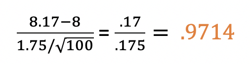
The mean
of this sample is 8.17. The standard deviation is 1.75. These can both
be calculated using formulas in Excel.
Step 2: Choose a Test
We want to estimate the average weight of the pies for the
population, so we would choose the population mean hypothesis test. Use the Statistics Cheat Sheet
for Dummies chart or other related sites like StatTrek to help you choose the
right test based on your sample.
Step 3: Pick a Confidence Level
Almost everyone chooses 95%. If you choose less than that,
people may look at you funny or like you have something to hide! Of course
there may be appropriate uses for confidence levels less than 95% but it’s not
common. If you’re testing something super important, like the safety of
airplane parts, you want a confidence level much higher than 95%! Probably like
99.99999% or more!
In this
case, we’ll stick with 95%.
Step 4: Null and Alternative Hypotheses
The null hypothesis is that the average weight of the population of Kakes+ blueberry pies is 8 ounces. We choose this because we know that’s what it should be.
u = 8
The alternative hypothesis is that the average weight of the population of Kakes+ blueberry pies is greater than 8 ounces. We chose this because that’s what we think is actually happening.
u > 8
Note: our options for the alternative hypothesis were
greater than 8 ounces, less than 8 ounces, or “not equal to” 8 ounces. We’re
never saying how much great or less,
just that it’s statistically significantly greater or less than 8 ounces.
Also note – this isn’t exact and is not meant to be taken
literally. For example, if your sample mean turns out to be 8.00001 ounces, you
will fail to reject the null hypothesis because if your sample mean is that
close to 8, there’s obviously a good chance that it could actually be exactly 8
if you weighed all the pies. In statistics, you can’t be 100% sure of anything,
so you’re always considering an interval with some level of confidence where the
true average weight of the pies may lie. (Or, if you’re testing proportions,
where the true proportion would lie, or difference of proportions, etc.). See
optional step 9 to understand this better.
Step 5: Meeting Assumptions
Take a look at the row for population mean hypothesis
testing from the Statistics for Dummies Cheat sheet:
The last column, “Use when” states the assumptions that need to be in place for the test to work. We meet the normal distribution condition for both of these. However, we don’t have a known population standard deviation – we can only use the calculated standard deviation from our sample. So, we need to choose the t-test instead of the z test.
Step 6: Calculate the Z Score
This test uses the T distribution, and the Cheat Sheet tells us that and also gives us the formula for the t-statistic (test statistic). From here, we just plug in the numbers:
Our t-statistic is .9714.
Step 7: State Results
Check out this graph of the normal
distribution, where the x axis is standard deviations. So, the 1 on the x axis
means 1 standard deviation from the mean. The 0 means 0 standard deviations
from the mean (which is the mean itself!)
When you look at a chart like this for a hypothesis test,
we’re always looking at it with the mean as the null hypothesis. So in this
case, that 0 represents the 8. The 1 is one standard deviation away from the 8
ounces. Our Z score of .9714 falls about at the 1, which means the value 8.17
is about 1 standard deviation away from the mean. At 95% confidence, we can see
from the chart that we need something 2 or more standard deviations away from
the mean to reject the null hypothesis. Since we didn’t reach 2, we fail to reject the null
hypothesis meaning that there is not sufficient evidence at the 95% confidence
level that the average weight of the population is greater than 8 ounces. In
other words, we don’t have enough evidence to conclude that the machines are
overfilling the pies.
Optional Step 8: Calculate a P Value
You’ll hear p value thrown around a lot in statistics! The
formal definition is the probability of getting an answer as extreme as the
observed result if the null hypothesis is true. In other words, what’s the
probability of getting 8.17 if the true average weight of the entire population
of pies is 8 ounces? It’s also represented as the area between the curve and
the x axis on that normal distribution graph above. As you can see, the further
away from the mean (0) we get, the smaller the area between the curve and the
axis, and thus the lower the probability of getting a result way out there.
We need a p-value calculator for to get the exact value. We recommend this one because it checks to see if you are doing a one or two-tailed test, and your confidence level. In our case, we’d type in .971 for the t-statistic and 99 for the DF value. DF stands for degrees of freedom, which is equal to the sample size (100 pies in our case) minus one. The significance level is 0.5 because we specified 95% confidence earlier in the test. And it’s a one-tailed test because our alternative hypothesis is greater than 8. If we chose “not equal to” 8 then it would be two-tailed.
The p-value is .166858 or 16.69%. This isn’t giving us any new information, it’s just another way of considering the t-statistic we got earlier. We need a p-value of less than 5% to reject the null hypothesis, and this is way higher than 5%, so we once again conclude that we fail to reject the null hypothesis at 95% confidence.
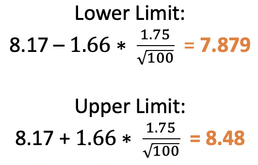
Optional Step 9: Confidence Intervals
As mentioned in my note earlier, these tests aren’t supposed
to be exact, they’re giving a probability of getting a result assuming the null
is true. Another way of thinking about this is that they are providing a range
of values which, at 95% confidence, the true mean could lie within. If 8 is in
that range, we fail to reject the null. If 8 is outside the range, we reject
the null.
For our test, the range would be:
The
number 8 is in this range, so we fail to reject the null at 95% confidence.
Did you forget to put something in quotes? Remember if you didn’t define something as a variable, list, dictionary, etc. previously, and it’s not a number, it needs to be in quotes!
There are several types of indentation errors. These are pretty self-explanatory. You either forgot an indent or have too many. Remember, python considers indents to be four spaces or a tab, exactly.
Typically this means you are trying to access an item in a list that doesn’t exist. For example, :
flowers = ["rose", "tulip", "daisy"]
print("Flowers in my garden are:", flowers[1], flowers[2], flowers[3])
There is no flowers[3]! Remember, lists start at 0, so it should have been flowers[0], flowers[1], flowers[2].
These seem scary, but they are similar to the NameError, only specific to dictionaries. They are raised when a key is not found in the set of existing keys. Check for spelling and case sensitivity!
Tables are one of the most important features of Excel, but are often overlooked. Tables and keeping analyses in Excel connected, will drastically increase your efficiency in Excel. Let’s start by understanding how they work with PivotTables.
We’re going to use an R Dataset called DoctorContacts. Download the .csv file using this link (and save it immediately as .xlsx!). If the file opens in a new window instead of downloading, try right-clicking the link and choosing “Save Link As…”. You can find the data dictionary for this dataset here. Each row represents a unique visit to the doctor.
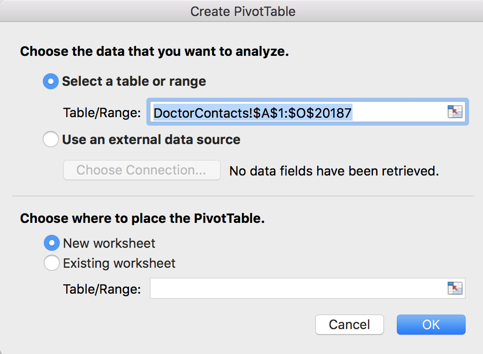
If you click on any non-blank cell, and then go to Insert >> PivotTable, you should see this:
Notice this says DoctorContacts!$A$1:$O$20187. Even if you take away the dollar signs, this range of cells is set in stone. For example, let’s say you actually make this PivotTable, and maybe 10 more PivotTables, and a bunch of charts, and calculations, and perhaps even a whole dashboard. And then after you did all that, your boss comes to you and says “oops, I forgot to give you 100 rows of data.” Or maybe you forgot a calculated column, or data is constantly updating from a server. Depending on what is changing in your dataset, and how you set up your PivotTables, calculations and charts, you may have to re-do everything. But that doesn’t happen if you make a Table first. Click cancel to get out of this PivotTable window, we’re going to make a Table first!
Make a Table
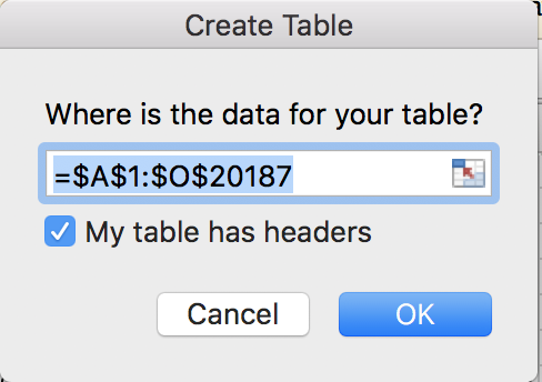
Click on any non-blank cell inside your dataset, and then go to Insert >> Table. Excel will find the dataset for you:
Quick tip: Do not highlight the data before making a Table or PivotTable- if you highlight the data first, you could either 1) get blank cells in your table or 2) miss data. The best and easiest way to select your dataset is to simply click on a non-blank cell inside the dataset, and go to Insert >> Table or Insert >> PivotTable.
When this window appears, verify that it did find your correct dataset, and that “My table has headers” is checked off. This just means that the titles of the columns are in the first row of your dataset, which they are. Then click OK. Your dataset should have turned blue. This is what the whole thing looks like in case you missed a step:
This is a video, hit the play button!
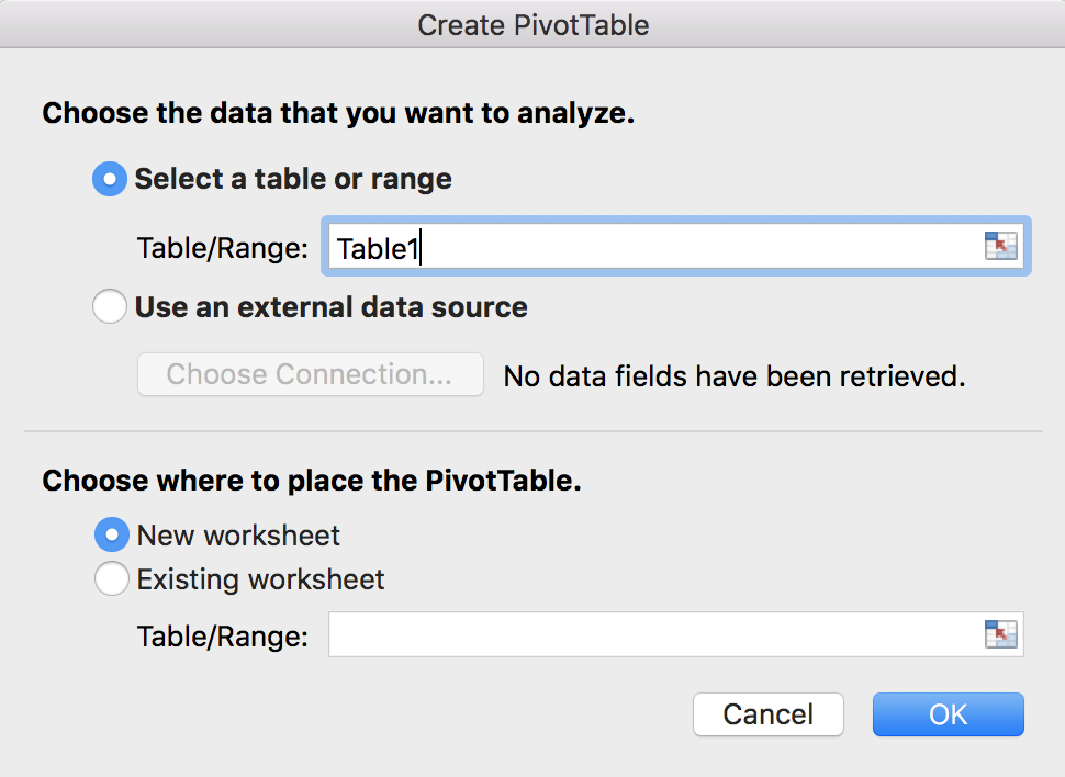
Besides being easier to read, more importantly, this is now a modifiable data structure. Excel now recognizes this as your dataset. Now, go back to Insert >> PivotTabe. Notice anything different?
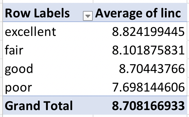
That’s right, now it says “Table1” instaed of “DoctorContacts!$A$1:$O$20187”. You can add or remove rows to Table1, and it’s still Table1. You can add or remove columns from Table1 and it’s still Table1. Now you no longer have to worry about your PivotTable reference if your original dataset changes. Let’s try it out to see it in action. Click OK to make the PivotTable from Table1. Let’s drag health into the rows box, and linc into the Values box. We want the average income by health level, so change linc from a sum to an average. This is what the process looks like:
and the outcome:
Those numbers look odd, right? People don’t have an average income of $8. This is because this variable represents the log of income. (It’s actually unclear if this is the log, natural logarithm, or some other formula. We’re going to assume it’s the natural logarithm for this analysis). We can get this back into regular income by creating a new calculated column. So, we’ll be modifying the original dataset so you can see how tables work to keep your data updated!
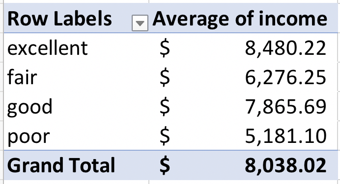
Back in the table, go to the next blank column to the right, and call it “income”. Type “=EXP(” and then click on cell I2. Your final formula should look like this: “=EXP([@linc])”. Notice formulas are easier to read in tables too! This is more like a sentence, and you don’t have to go back and figure out what I2 is later if your columns are named well. Hit enter, and you should see the formula automatically fill down the whole column.
What if I want to freeze part of a cell reference? (Use the $?) There’s a way to do this with the table syntax, involving the @ symbol and brackets []. However, you can also always just revert back to the normal way of referring to a cell (A2 for example) by hand-typing the reference, and then you can use the dollar signs.
Now, go back to your PivotTable. Notice that your new income column isn’t there yet! Don’t worry, all we have to do is go to the PivotTable Analyze menu, and hit the refresh button. Now it’s there! As usual, here’s the whole thing:
Now, we can swap out average of linc for average income and the numbers look a lot better:
I know these values still don’t look like realistic incomes, but remember we assumed that it was a natural logarithm. The point of this example is that we were able to update the PivotTable using Tables.
An Example with Rows
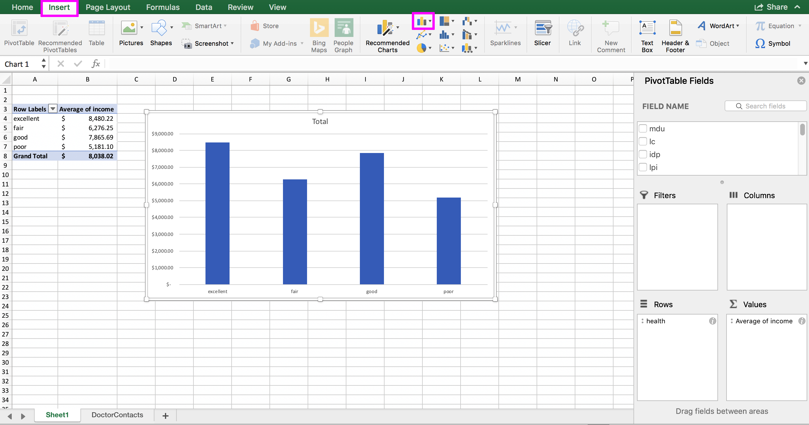
You can also do the same thing with rows – the PivotTable will recalculate the values when you push the refresh button, and any visualizations that are connected to the PivotTable will also update. Start by making a bar chart from our average income by health level PivotTable. To do this, you shouldn’t have to highlight anything (unless you are on an older version of Excel on a Mac). Just click anywhere inside the PivotTable and go to Insert >> Column Chart:
Now, go back to the original dataset and scroll down to the first blank row below the table (should be row 20188). By the way, the keyboard shortcut Command + down arrow key on a Mac will get you to the bottom of the dataset faster. It’s Control + down arrow key on a PC. In that blank row, we’re going to fill in some fake data to see how the update works. Put “poor” in the H (health) column and 1000000 in the P (income) column. You can leave everything else blank. Go back to your PivotTable, and click inside it. Then, in the PivotTable Analyze menu, choose the Refresh button. Notice how the average income for the poor category recalculates, and the bar increases:
No need to re-do the PivotTable or chart. And imagine if you had spent a ton of time formatting the chart (picking out colors, removing borders, etc.) – it would be an absolute nightmare to have to redo that!
Tables are also essential when you have an Excel file that is connected to a server. I’ll cover that in a future post, but if you have data constantly coming in from a server (or being overwritten) then you’ll want a table so that the table expands and contracts with your dataset.
Referencing to Keep Things Connected
What if you can’t make a chart or calculation directly from a PivotTable? For example, most versions of Excel do not allow you to make a bubble plot directly from a PivotTable. No worries, you can still keep things connected with references! Let’s do it together.
In the sheet with your PivotTable, move the chart out of the way, and then click on cell D3. In cell D3, type =A3. Then drag that formula down to D7 and let go. When I say “drag” I mean hover your mouse over the bottom-right corner of the cell until you see the black cross hair (that little square in the bottom-right is called the “fill handle”) and then pull that. Once you’ve got D3 through D7 filled in, keep that range highlighted, and drag it to the right one column. The whole thing looks like this:
This is a way of copying and pasting the PivotTable without breaking the connection, and now the copied cells aren’t a PivotTable anymore. If you build your chart from these references, and something changes in the dataset, the chart will still update. When you hit the refresh button, the PivotTable will change, which will change the references since they just copy whatever is in the PivotTable, and your chart will change when the references change.
We can see it in action by adding a filter to our PivotTable and watching the references and chart update when we change the filter. Add the “physlim” column to the Filters box of the PivotTable. Change the filter from True to False to both and watch how the references change to match whatever is in the PivotTable, and the chart changes too:
Takeaways
Tables are pretty amazing – I make every dataset I get into a table immediately, I’m yet to find a downside. Tables will make your Excel workbook and work flow more efficient, and having to re-do visualizations and calculations when something changes. Make sure all of your future data structures (PivotTables, references, formulas, visualizations etc.) are all ultimately connected to the original table so that your entire workbook will update with the refresh button.
DB Browser for SQLite (it’s also called SQLite Browser for short) is an excellent tool for practicing SQL without having to get connected to a real live server. This post will walk through how to install, open, and use SQLite Browser.
Install SQLite Browser
Go to the SQLite Browser website and choose the download for whichever operating system you are using. Open the file and follow installation instructions.
If you are on a Mac: Don’t forget you need to drag the SQLite icon into your Applications folder.
Step 1: Get Set Up
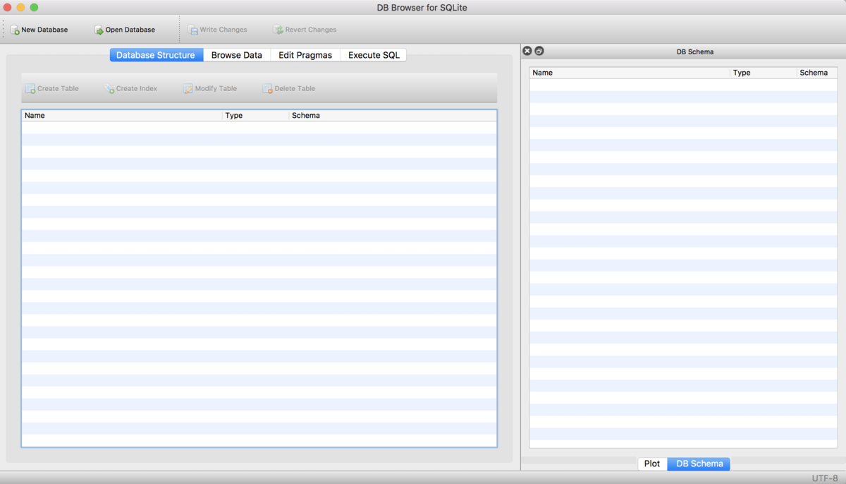
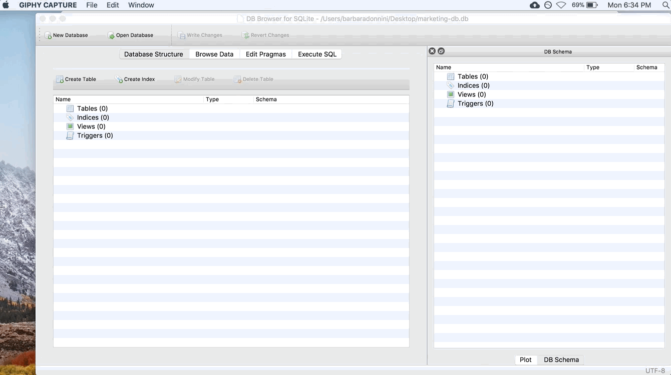
If you want to follow along, download each of these csv files: ad_info.csv, facebook_info.csv, and ad_results.csv. Save them somewhere that you’ll be able to find them (like in a folder dedicated for this example, or your Desktop). We’ll be using them as the tables in our database. Open SQLite Browser the same way you would any other program! You should see a window that looks like this:
Step 2: Make a Database
To do anything in SQLite Browser, you need to be working within a database. That means every time you start SQLite Browser, you need to either create a new database, or open an existing one. For this example, we’ll create a new one using the New Database button in the top-left corner. SQLite Browser will ask you to save your database – do this just like you would any other file. You can call it whatever you’d like, but for this example we’ll name our database “marketing-db”. Make sure you save it in a folder where you’ll be able to easily find it again, like the Desktop. Then click Save.
Step 3: Import our First Table
Once you click save, this window should appear:
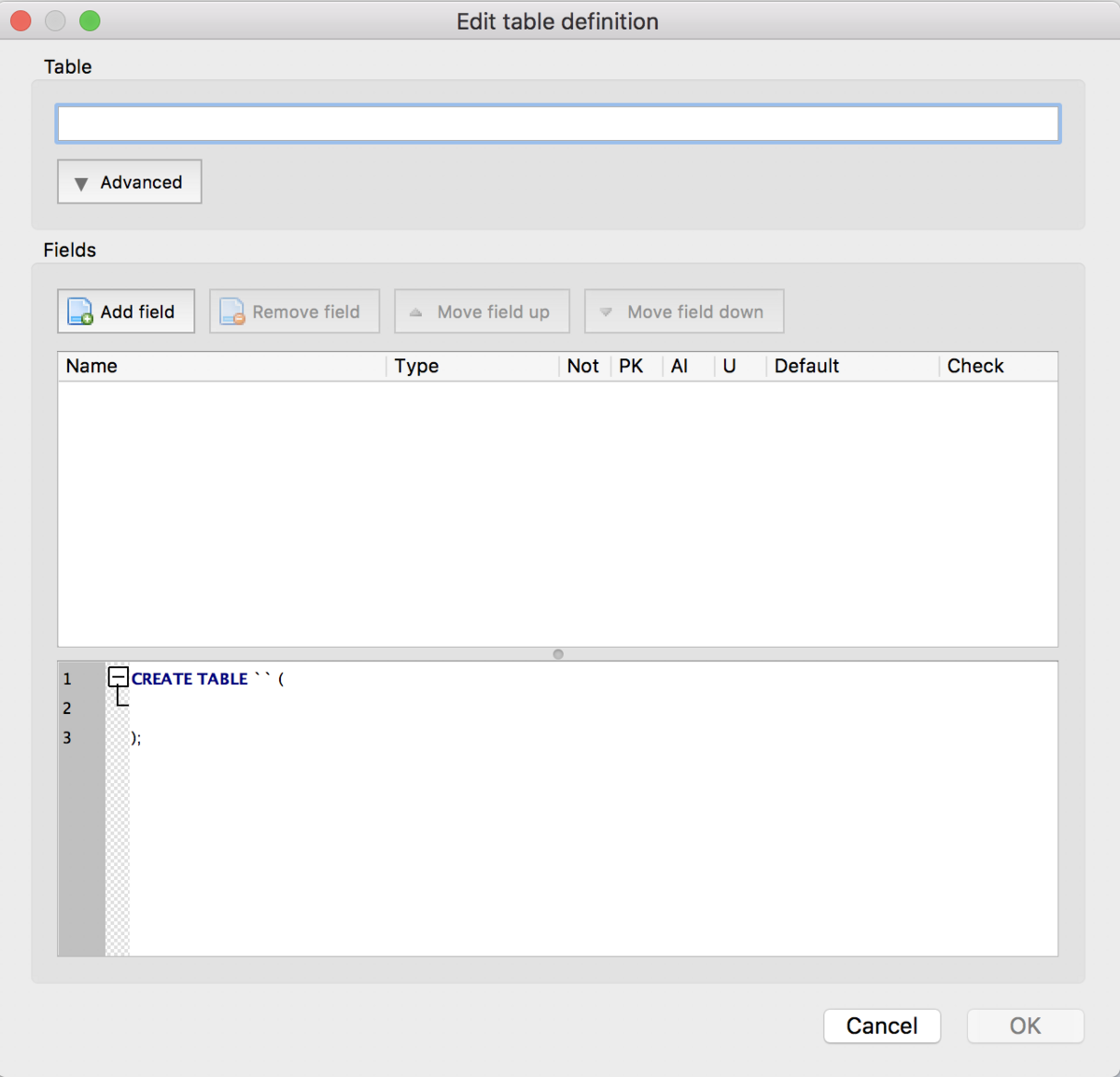
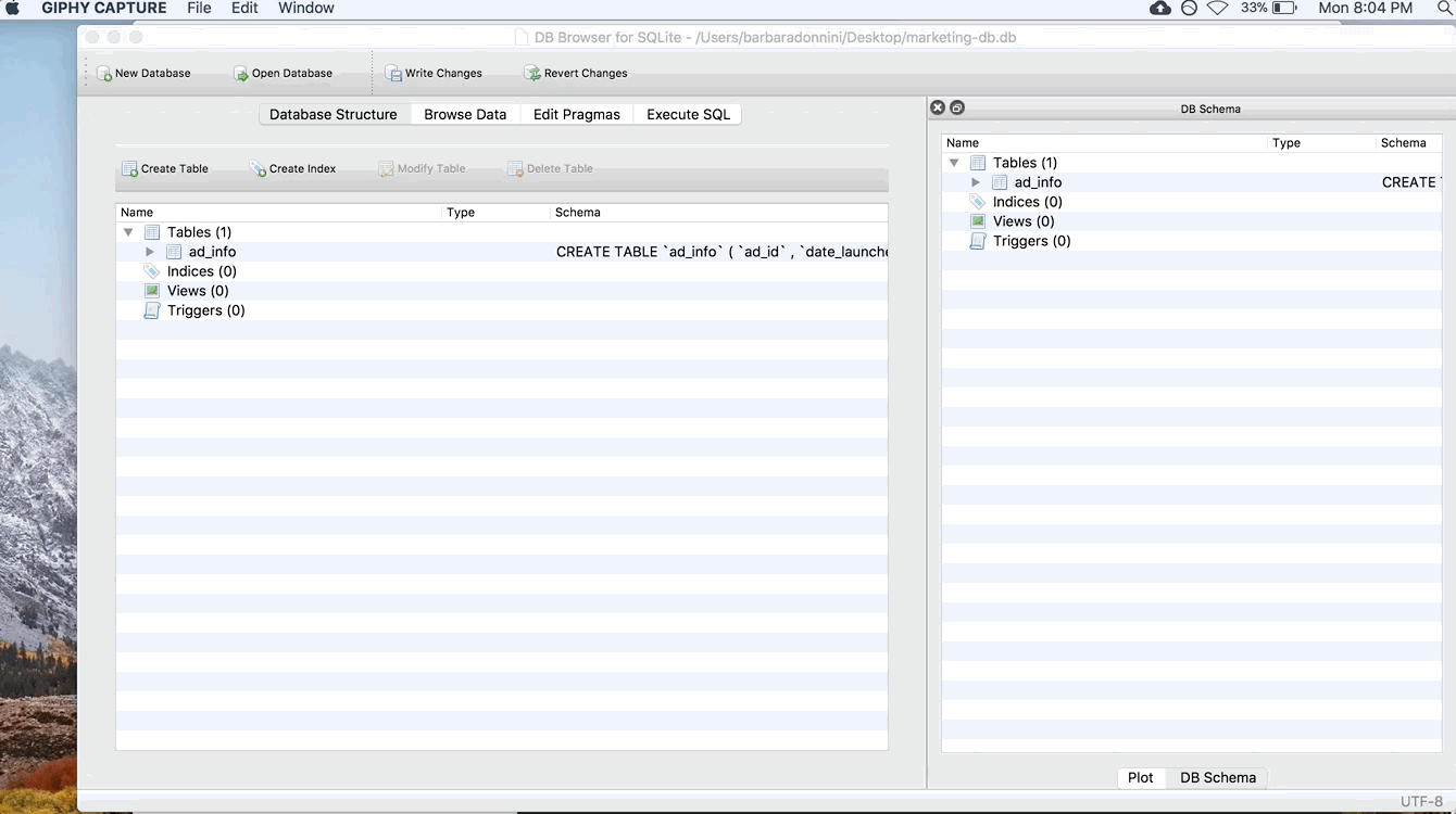
This window is for typing in your data by hand. That’s super tedious and we won’t be doing that, so close this window. Instead, we’re going to go to File > Import > “Table from CSV file…” A file explorer should pop up (just like it would if you were opening any other document). In that window, browse to where you saved the .csv files. Let’s import the ad_info table first. Double click the ad_info.csv file to open it (or select the file and choose “Open”). You should then see this window:
It should have automatically populated the “Table name” box with ad_info. If it didn’t, or you want to change the table name, go ahead and type ad_info. If you’re doing this on your own for a different project, you can rename the table to whatever you’d like in this box. But for this example, let’s keep the name ad_info so it’s easier to follow. Also, make sure “Column names in first line” is checked.
Make sure the checkbox next to “Column names in first line” is checked!! I cannot stress this strongly enough. If you forget to check this box, your queries will not work.
Finally, take a glance at the preview of the import. For our example, you shouldn’t have to touch any of the other options. But sometimes, depending on how your .csv file is saved, DB Browser may try to squish all of your columns into one. In that case, you usually need to change the Field separator option. But again, you shouldn’t have to touch it for this example.
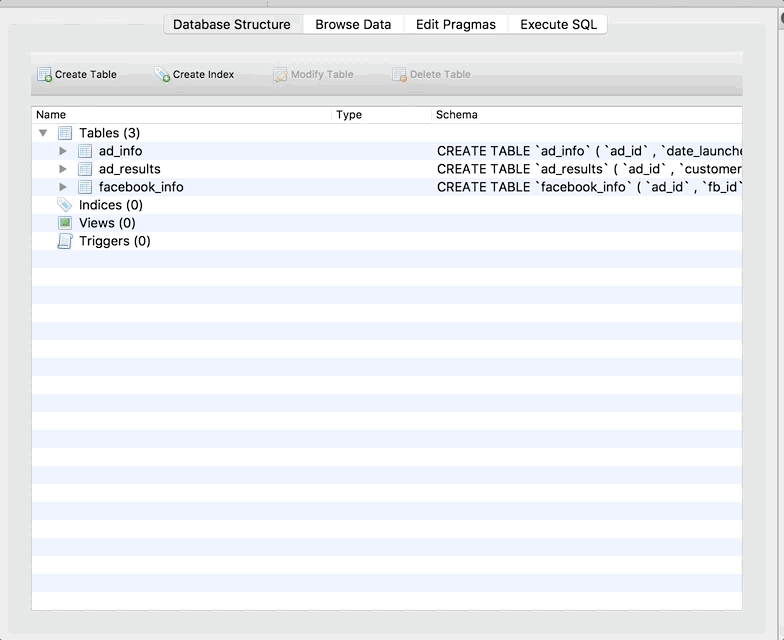
Step 4: Add the Other Tables
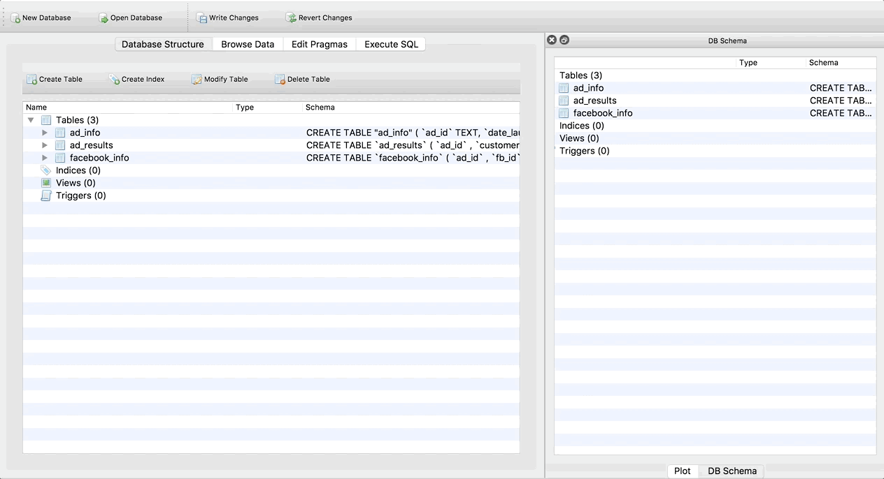
Repeat this process for the facebook_info and ad_results tables. When you’re done, the main screen (Database Structure tab) should look like this:
Step 5: Understand the Interface
Let’s take a second to understand the buttons in SQLite Browser. There are four tabs at the top: Database Structure, Browse Data, Edit Pragmas, and Execute SQL.
The Database Structure tab is like your schema. It tells you about the tables that are in your database, and the columns in each table. We’ll be coming back to this in the next step to modify our tables.
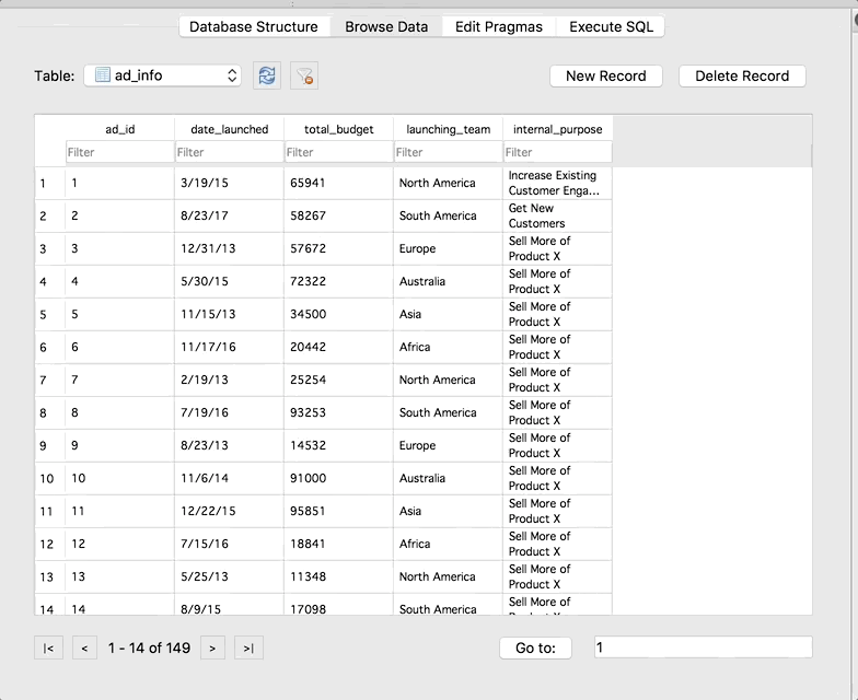
The Browse Data tab allows you to do just that – browse your data. You can check out the data in the tables, and use the drop-down to switch between tables:
The Edit Pragmas tab allows you to set more advanced options. It’s unlikely you’ll need to use this tab often.
Finally, the Execute SQL tab is where you will actually write SQL queries and run them! Which is what we will do in the next step.
Run Your First Query
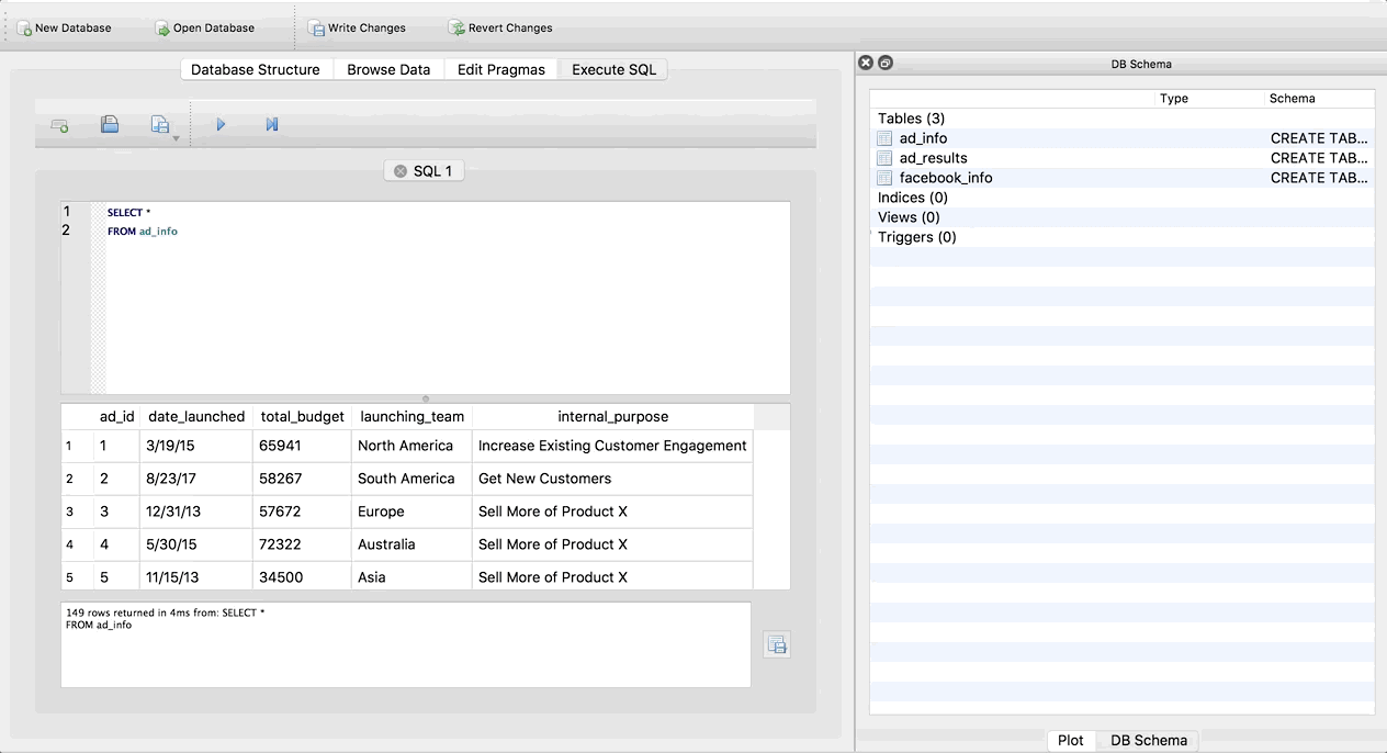
Let’s run a query to see how it works! Copy and paste this query into the top box in the Execute SQL tab:
SELECT *
FROM ad_info
If you aren’t familiar with SQL, don’t worry too much about this query/syntax right now. What it’s doing is selecting all of the columns from the ad_info table. Hit the triangle button to run the query. The whole thing should look like this:
Cool right! We are able to run SQL queries without actually setting up a real live server. Also take note that SQLite Browser gives us some information about the query in the box below the preview of the results. We can see that there are 149 rows total in our result, and how long it took SQLite to run the query.
Let’s run one more query. Copy and paste this SQLite browser next and hit run:
SELECT *
FROM ad_info
WHERE total_budget > 60000
Hmmmm nothing changed. We still go the same number of rows in the result (149), and there are still rows that have a total_budget of greater than $60,000. Why? DB Browser imports all columns as text columns by default. So it isnt’ recognizing total_budget as a number, and therefore doesn’t know how to find values greater than $60,000. Don’t worry, we can fix this!
Modify the Column Types in the Tables
Since SQLite Browser automatically imports all columns in all tables as TEXT, we need to manually change the data type of the non-text columns. Go back to the Database Structure tab, and click on the ad_info table. You can tell you’ve selected it because it should be highlighted in blue. Then click the Modify Table button. Finally, change the Type dropdown for the total_budget column to integer. Once again, a GIF of the whole thing:
Now go back to the Execute SQL tab and try running the query again (just click the triangle again to re-run it).
Notice it now only returns 61 rows! And these are the correct rows – with total budgets over $60,000. It’s important to remember to change the data types as soon as you import data into SQLite Browser.
Takeaways
Congrats! If you made it here, you now have a pretty good idea of how to use SQLite Browser. This page is also a great reference to keep handy in case you forget how to do something like change the data type, or import tables.
Now, take your skills to the next level and check out PostgreSQL!
Grouping in PivotTables is a way of combining data to perform analyses without having to use functions. You can group numeric columns to turn them into categories, you can group date columns by date ranges to get even intervals, and you can group text columns to put together similar values. We’ll go through all three scenarios in this blog post, and also talk a bit at the end about making histograms from grouped PivotTables.
For the following examples, we’ll be using a human resources dataset from Kaggle, download it here if you want to follow along. As usual, first I’ll turn my dataset into a Table (see why in this blog post).
Grouping Categorical Columns
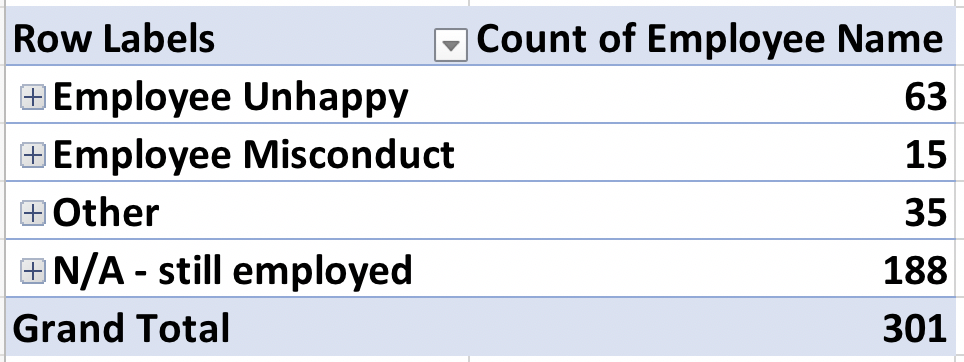
Let’s say you want to analyze the reasons for terminations at your company. Make a new PivotTable, and put the “Reason for Term” column into the Rows box. Put “Employee Name” into the Values box to do a simple count for eaach item in the “Reason for Term” column. In this scenario, you think that this is too many options, and want to group similar items together. When you want to group text, it’s a bit tedious. We have to select the items we want to group individually for each group we want to make. Let’s say we want to group “attendance”, “gross misconduct”, “no-call, no-show”, and “performance” together in a group called “Employee Misconduct”. Select these items (do this by holding down Command on a Mac or Control on a PC and clicking each item individually), then right-click on any item and select “Group…”:
Now, let’s make a group from “Another position”, “career change”, “hours”, “more money” and “unhappy” and we’ll call that group “Employee Unhappy”. We’ll follow the same process as before:
Finally, let’s group everything else except “N/A – still employed” together into a group called “Other”, and then minimize the groups using the small minus signs to the left of the group names:
Notice it aggregates the counts for us when we minimize the groups. So we can interpret this as 63 employees left the company because they were unhappy for some reason or another, 15 were terminated for misconduct, 35 left for other reasons, and 188 are still employed. Your final grouped PivotTable should look like this:
Grouping Dates
Grouping date/time columns is much easier, we don’t have to manually highlight the groups. Make a new PivotTable (I’m going to copy and paste the one we just did and modify it). Remove everything from the rows box and put “Date of Hire” into the rows box. Depending on your version of Excel, Excel might automatically group this for you. That’s what mine did, you can see from the rows box that it automatically grouped the hire dates by year AND quarter (and actually months too as we’ll see in a second, but that’s not as obvious from the rows box):
We can change this grouping by right-clicking anywhere in the first column of the PivotTable. A window now appears! You can see that on my version, it automatically chose to group by Years, Quarters, AND Months because those three options are highlighted. We only want to group by Years, so select only Years and click OK. If yours didn’t automatically group like mine did, you should still be able to follow this same process.
If you want to select multiple items in a list like the one in the dates grouping window, hold down Command on a Mac and click what you want (it’s Control on a PC).
Grouping Numeric Columns
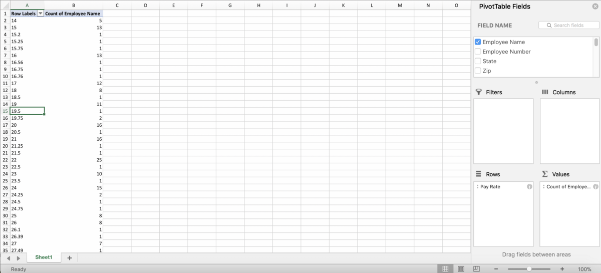
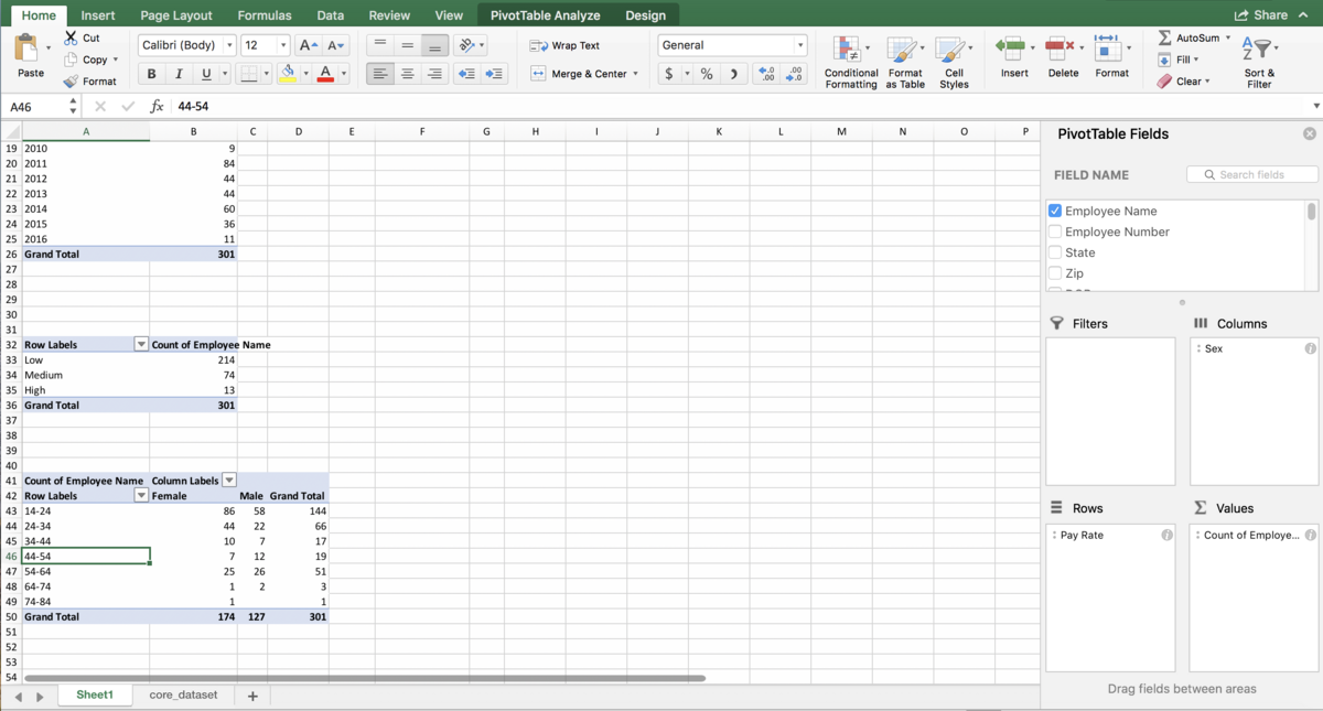
Grouping numeric columns is also much easier, we don’t have to manually highlight the groups as long as we are choosing groups with even intervals. Let’s say we’re interested in grouping our employees in the dataset by pay rate. We want to create a “High” group, a “Medium” group and a “Low” group depending on how they are paid. There are several ways to do this in Excel, not just using grouping, but grouping is usually one of the easiest ways to accomplish this. Make another PivotTable, and put the “Pay Rate” column into the Rows box, and the “Employee Name” column into the Values box to count how many employees have those pay rates:
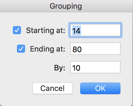
Normally we wouldn’t put a numeric column into the Rows box of a PivotTable, but we’re going to be turning it into a categorical column with the groups. Right click anywhere in the first column of the PivotTable, and choose “Group…”. You should see this window:
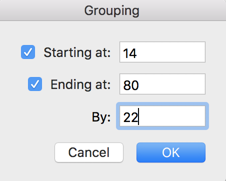
This is telling you that the minimum value is 14, the maximum value is 80, and Excel is suggesting we group by every $10. You can change the minimum and maximum if you want, but we’re going to leave them in this situation. We are going to change the “By” box – instead of grouping by $10, let’s make our groups by $22 so we have three groups that we can then re-name to Low, Medium and High. Put 22 into the “By” box and click OK.
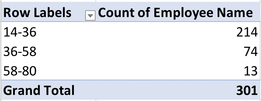
And the result should look like this:
See how the first group is 14-36? 36-14 = 22, so the span is $22. Same for the other two groups. We can re-name these groups by simply clicking on the group title, and using the formula bar to type the name we want:
So what did this accomplish? We can now get a quick count of how many employees fall into each group. Most employees are in the low range (214 out of a total of 301), 74 receive a “medium” rate and only 13 employees receive a high pay rate. Grouping in PivotTables is a quick way to create groups or “bins” of numeric data in Excel without using formulas.
Different Sized Groups In The Same Workbook
Unfortunately, we can’t just change the grouping on the second one. If you do, it will also change the grouping on the first one:
Don’t actually do what’s in this next video, it’s just to show you that it doesn’t work.
As far as I understand, this is because Excel keeps a PivotTable cache. The easiest way I’ve encountered to clear the cache is to copy a grouped PivotTable to an entirely new workbook, ungroup it, re-group it with the new groups, then paste it back in the original workbook. The whole process looks like this:
Make a Histogram
Notice earlier in the post, I said grouping is a quick way to make bins in Excel – bins are what you need for a histogram! There are now many ways to make a histogram in Excel. One is not necessarily better than another, but if you want to customize your bins or make several comparable histograms, grouping will most likely be the fastest way to accomplish this. Let’s see it in action, using the PivotTable we just made with groups of $10. Add the “Sex” column to the Columns box:
We want to make two histograms that can be compared, one for males and one for females. On the old version of Excel, you could probably highlight the first two columns of the PivotTable to get just the females, but on the new version, Excel will pick up the entire PivotTable as part of your chart. So, we need to use references to copy the PivotTable so that it is no longer a PivotTable, but it’s still connected to the data source. For more information about copying using references, see my Tables and Connecting Data Structures post. But, for now, all you need to do is refer to the top-left cell of your PivotTable (in my case, A42, but yours might be different) in another cell that is a column or two away from your PivotTable. Then, drag that reference down and to the right:
Now, let’s highlight the bins column and the female column, and go to Insert >> Column Chart. Then do the same for the men by highlighting the bins column and the male column. (Use Command on a Mac to highlight columns that are not next to each other. It’s Control on a PC). Remove the gaps (characteristic of histograms) and make sure the axes match since we’re comparing them, and you’re done! The whole thing looks like this:
Takeaways
Congrats! You made it to the end and now can group data in PivotTables! It’s pretty handy, right? You can skip all the nested IF statements and approximate-match VLOOKUPs now, the grouping will do that for you.
Go to this download webpage on Anaconda’s site. Choose the correct link for your operating system, and then go through the installation process.
Step 2: Prepare a folder for notebooks
Choose or create a folder on your computer where you will store all Jupyter notebook files. Make sure you choose a place where it will be easy to find them later.
Step 3: Start up Jupyter Notebook
Either on Mac or PC, you should be able to open up Anaconda the way you’d open any other program on your computer. So on a Mac this would be the Applications folder, and on a PC this would be the Start menu. Then, once Anaconda opens, click the “Launch” button underneath Jupyter Notebook.
On a Mac, you can also open up the terminal and type jupyter notebook. This might also work on a PC but there may be a few extra steps, so we recommend going with the option above for PC.
Jupyter notebook should now open in a browser.
You should see the folder structure of your computer – navigate to the folder where you stored the files in step 2.