Tips For Building Likert Surveys
Tips For Building Likert Surveys
by Boxplot Apr 1, 2023
Likert Surveys ―pronounced LICK-ert― are one of the most popular ways of collecting survey data. Their simple design of providing a series of prompts with a discrete scale of responses for each prompt (such as “Strongly Disagree”, “Disagree”, “Neutral”, “Agree”, and “Strongly Agree”; “Poor”, “Fair”, “Average”, “Good”, and “Excellent”, etc.) makes Likert Surveys an extremely popular survey type. But they are also one of the most commonly abused types of survey; this blog post provides a brief tutorial to ensure your Likert Surveys are implemented correctly.
Creating a Likert Survey may seem simple enough, but there are common pitfalls to avoid. When these hazards aren’t avoided, it leads to results that are biased at best and downright deceitful at worst. This is an especially important consideration whether you are designing a Likert Survey or analyzing the results of one; it may seem simple enough to design a Likert Survey, but only if these tips are followed can the survey yield truly fair, unbiased results.
- Make sure options are evenly spaced.
For example, you wouldn’t want the options to be “Poor”, “Good”, “Very Good”, and “Excellent” because moving from “Poor” to “Good” would likely be a much larger improvement than going from “Good” to “Very Good”. To avoid this potential pitfall, it often makes sense to have respondents rank things on a scale from 1 to 10 instead of assigning qualitative descriptors such as “Poor” and “Good” to their responses. - Make sure options are evenly distributed.
For example, you wouldn’t want the options to be “Poor”, “Average”, “Good”, and “Excellent” because there would be more above-average options than below-average options in this case. I recently came across a Likert Survey pertaining to the quality of a new software product, distributed by the firm that sells that product. One of the prompts was, “[product name] has enhanced my ability to automate menial tasks”, and the options were “Disagree”, “Agree Somewhat”, “Agree”, and “Strongly Agree”. Obviously, with more options pointing to the product’s success than the product’s failure, respondents are more likely than otherwise to choose an option that makes the product look successful; thus, the firm in question is trying to use their survey to make their product seem more successful than it actually is. This is an especially egregious example, but it clearly points to how Likert Surveys can be biased and/or can be used to deceive, if not implemented correctly. - Provide some positive prompts and some negative prompts.
For example, if you are asking respondents’ opinions on pizza and tacos, frame the first prompt as “Pizza is delicious” (with the options being strongly disagree, disagree, etc.) and frame the other prompt as “Tacos are overhyped”. Studies such as this one have shown that the practice of framing some prompts negatively and some positively ―known as balanced keying― can reduce what’s known as acquiescence bias in your survey results. Acquiescence bias describes the human tendency to acquiesce (choose the “agree” option) to a statement if respondents are unsure of their true feelings.
Building A Likert Survey In Google Forms
There are a great number of platforms which can be used to build a Likert Survey, but we’ll go over Google Forms because it’s free and allows for seamless response data conversion to spreadsheets.
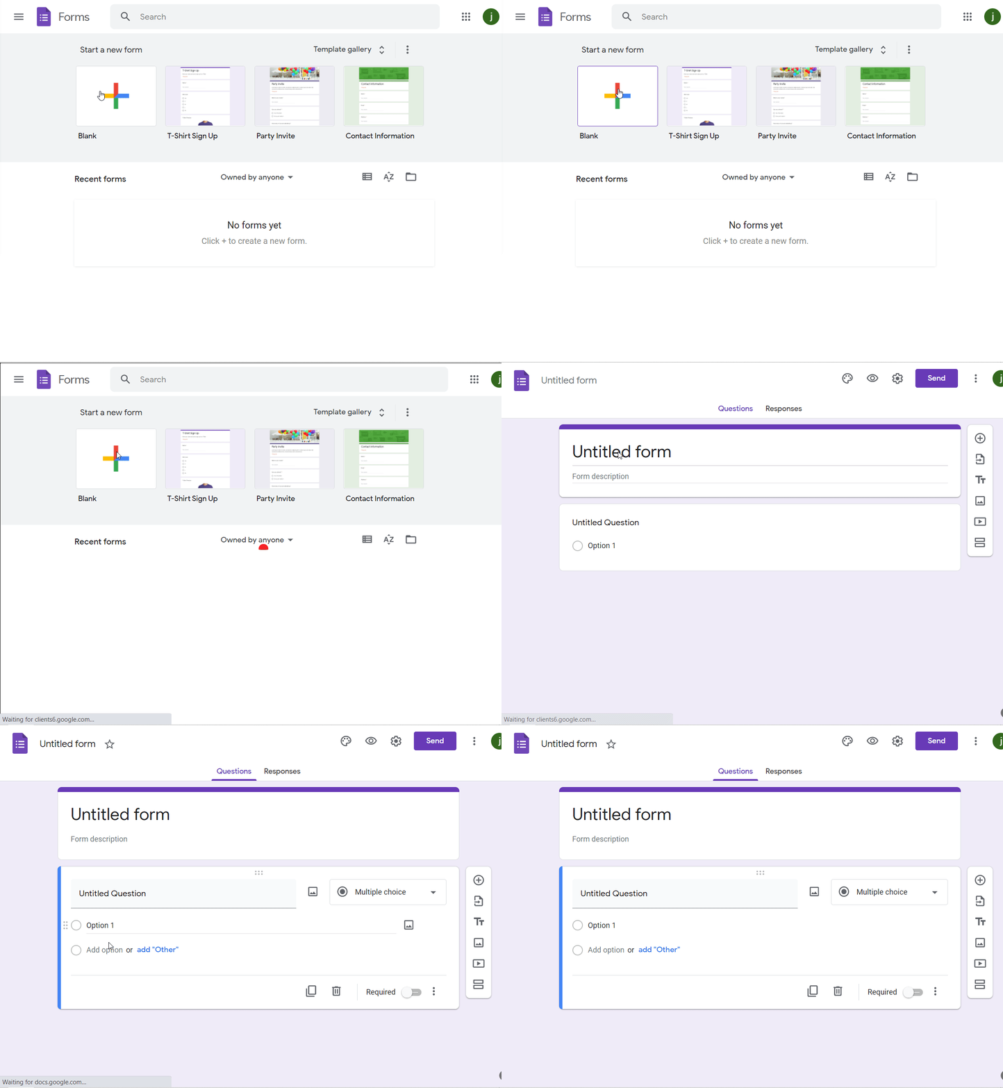
Let’s say I’m trying to set up a Likert Survey on pizza toppings. To do this, I would first navigate to www.google.com/forms, and log into my Google account. On the resulting screen, under Start a new form, click on the plus icon labelled Blank:

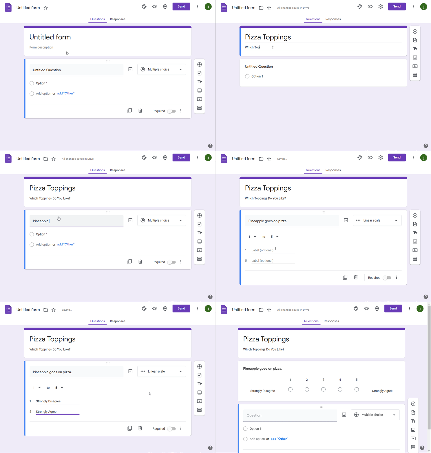
Then, I’m going to fill out the name of my survey where it says Untitled form and provide a description if I want. Now it’s time to start creating the questions/prompts. First and foremost, on the dropdown menu on the right-hand side, I make sure to select either the linear scale option or multiple choice option; these options allow me to turn this survey into a Likert Survey. Next, I choose how many options to provide my respondents for this question (the default is 1 to 5, with customizable option labels). I fill in all of this information according to my survey’s requirements, but I remember to evenly distribute the labels. When I’m finished, I click the plus icon to move on to my next question.
I create the rest of your questions in succession, paying special attention to the aforementioned tips.
A few quick notes on the functionality of the right-hand side toolbar (the toolbar of icons with the plus icon for adding new questions on it): as previously mentioned, the top icon/plus icon allows me to add more questions to the survey, the second icon down allows me to import questions from other Google Forms surveys, the third icon down allows me to add additional titles and descriptions to subsections of the survey, the fourth and fifth icons down allow me to add images and videos, respectively to your survey, and finally the sixth icon down allows me to add a skip logic-enabled subsection. For more on skip logic and other survey technicalities, view our article on survey specifics here.

When I’m finished, I can send out this survey to respondents by clicking the “Send” button. There are three ways of distributing the survey: through email, by copying a link to the survey, or by embedding the survey in another page.
The Responses page will show respondent activity in real time. From that page, I can end the survey by clicking the Accepting responses toggle button; I can also send response data to a Google Sheet by clicking the green Create spreadsheet button, and/or I can send response data to a .csv file by clicking on the three dots in the top right of this page, and then clicking Download responses (.csv).
Analyzing Survey Data
Now that I have data from my respondents, what can I do with it? The answer to this question depends on whether my data are ordinal or interval data. Interval data preserves order and distance; for example, a Likert-like prompt to rate something on a scale from 1 to 10 would be interval data because we know that 2 is greater than 1, that 3 is greater than 2, and so on, but we also know that an improvement from a 1 to a 2 is of the same size as an improvement from a 2 to a 3. Ordinal data, on the other hand, merely preserves order; for example, a scale of (“Poor”, “Fair”, “Good”, and “Excellent”) would yield ordinal data because we cannot be assured that an improvement from “Poor” to “Fair” is of the same size as an improvement from “Fair” to “Good”.
Ordinal data is much more qualitative than interval data, and so it makes much more sense to use a bar chart, column chart, or pie chart to analyze such data. Interval data, on the other hand, can be used to run more advanced statistical tests such as histograms/distribution analysis, means, standard distributions, and hypothesis testing.
If I’m trying to apply Machine Learning to the results of a Likert Survey, my methods for doing so will also depend on whether I have ordinal or interval data. If I’m trying to apply Machine Learning to an ordinal target variable, I’ll be using a classification algorithm such as Decision Trees, Random Forests, Neural Networks etc. because the results of such a survey are discrete; regression analysis would not be a good strategy for ordinal target variables. For an interval target variable, I could opt for a classification model, but regression analysis would also be available to me because I can treat such a variable as continuous.
<< Previous Post
"Interpreting Linear Regression Results"
Next Post >>
"Line Graphs"


