Pie Charts
Pie Charts
by Boxplot Sep 4, 2020
Show/Hide Code
You toggled code blocks on! Code blocks will appear in gray below. Click the button again to turn them off.Introduction
It seems as if people are split on pie charts: either you passionately hate them, or you are indifferent. In this article, we are going to explain why pie charts are problematic and, if you fall into the latter category, what you can do when creating pie charts to avoid upsetting those in the former.
Why are pie charts problematic?
They use size to convey information
A pie chart uses the size of a portion (slice) of a circle (pie) to display a numerical variable. This factor is not an issue in and of itself, as many chart types use size to convey information, including bubble charts and bar charts; however, while bubble charts and bar charts use diameter and height, respectively, to convey information, pie charts rely on the angle describing a slice---and the human eye is not very good at recognizing differences in angles.
Suppose we took a survey on people's favorite kinds of pie. In the chart below, it is difficult to see how the categories relate to each other; individually, Cherry and Rhubarb seem to comprise a smaller portion of the pie than either Apple or Pumpkin, but it may not be obvious (without looking at the data) which is the smaller slice.
#Adjusting plot size and margins
options(repr.plot.width=8, repr.plot.height=4)
par(mfrow=c(1,1), mai = c(0.5, 0, 0.75, 0))

#Data for pie chart
x = c(18, 15, 13, 25, 29)
labels = c("Key Lime", "Cherry", "Rhubarb", "Pumpkin", "Apple")
cols = c("greenyellow", "red", "mediumvioletred", "darkorange", "cornsilk")

#Build the pie chart
pie(x, labels, radius = 1, col=cols)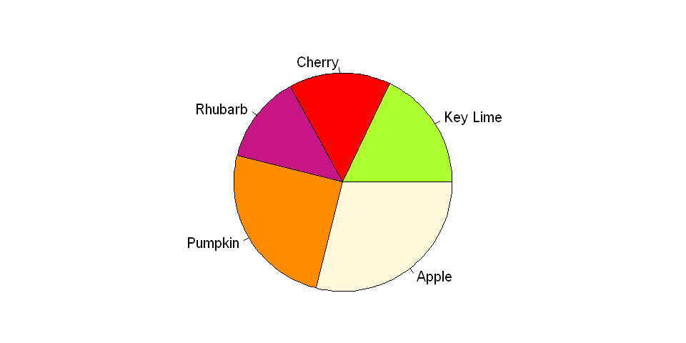
They cannot display many categories well
This issue of conveying size via angle is even more pronounced when many categories are shown in a single pie chart. Furthermore, unlike some charts that are used to display several categories at once, such as bar charts, pie charts depend on differences in color to denote category; therefore, a large palette of colors is necessary, and without proper selection of the palette, the results could be either garish or ambiguous.
#Adjusting plot size and margins
options(repr.plot.width=8, repr.plot.height=4)
par(mfrow=c(1,1), mai = c(0.55, 0, 0.8, 0))

#Data for pie chart
x = c(2, 4, 5, 10, 13, 15, 15, 17, 19)
labels = c("Key Lime", "Pecan", "Cherry", "Blueberry", "Rhubarb", "Lemon Meringue", "Blackberry", "Pumpkin", "Apple")
cols = c("greenyellow", "tan4", "red", "darkblue", "mediumvioletred", "yellow", "black", "darkorange", "cornsilk2")

#Build the pie chart
pie(x, labels, radius = 1, col=cols)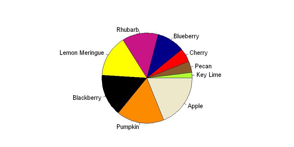
They show parts of a whole
Pie charts represent a whole as its components. Therefore, if your dataset is a subset of a larger dataset (and thus does not represent the whole) or if your dataset consists of independent categories (and thus represents multiple wholes), then a pie chart may not be appropriate.
Pie charts in popular packages
We wouldn't want to assume anyone's opinion on as divisive a topic as the pie chart, but perhaps the disdain for this chart type is best exhibited by the lack of built-in functions for creating them in two very popular data visualization packages: ggplot2 (R) and seaborn (Python). With both packages, a pie chart can be created only through trickery.
Trickery
It is convenient---perhaps a little too convenient---that a pie chart is no more than a single stacked bar displayed in polar coordinates. The code below builds the pie chart shown above, but using ggplot2.
#Adjusting plot size and margins
options(repr.plot.width=8, repr.plot.height=4)
par(mfrow=c(1,1), mai = c(0.55, 0, 0.8, 0))

#Data for the pie chart
values = c(9, 2, 5, 10, 13, 15, 10, 17, 19)
labels = c("Key \nLime", "Pecan", "Cherry", "Blueberry", "Rhubarb",
           "Lemon \nMeringue", "Blackberry", "Pumpkin", "Apple")
cols = c("Key \nLime"="greenyellow", "Pecan"="tan4", "Cherry"="red", "Blueberry"="darkblue",
         "Rhubarb"="mediumvioletred", "Lemon \nMeringue"="yellow", "Blackberry"="black",
         "Pumpkin"="darkorange", "Apple"="cornsilk2")

data = data.frame(labels, values)

#Build the pie chart
ggplot(data, aes(x="", y=values, fill=labels))+
    geom_bar(width = 1, stat = "identity") +
    scale_fill_manual(values=cols) +
    coord_polar("y", start=0) +  #Use polar coordinates
    theme(axis.title=element_blank(),
          axis.text=element_blank(),
          legend.title=element_blank())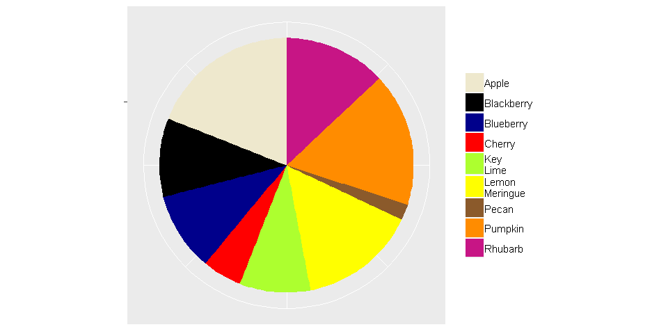
What chart types can be used to replace pie charts?
Bar charts
Similar to pie charts, bar charts use size to convey information; however, for bar charts, the height of a rectangle varies, and differences between the heights of bars are easier to recognize than the differences between the angles of portions of a circle. Furthermore, bar charts can be configured to show absolute numbers, percentages, or both!
#Adjusting plot size and margins
options(repr.plot.width=8, repr.plot.height=4)
par(mfrow=c(1,1), mai = c(0.5, 1, 0.2, 1))

#Data for bar chart
values = c(9, 2, 5, 10, 13, 15, 10, 17, 19)
labels = c("Key \nLime", "Pecan", "Cherry", "Blueberry", "Rhubarb",
           "Lemon \nMeringue", "Blackberry", "Pumpkin", "Apple")

data = data.frame(labels, values)
data = data[order(-values),]

#Build the bar chart
barplot(height=data$values,
        names.arg=data$labels,
        ylab="Votes",
        ylim = c(0, 20),
        cex.names=0.7)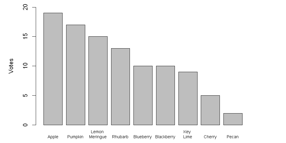
Waffle Charts
Waffle charts, which are growing in popularity, use number rather than size to visualize a numerical dimension. The resulting graph is similar to a stacked bar or tree map; however, because each square is a unit, compared to alternatives that rely solely on size, it is easier for a person to confirm if a perceived difference between categories is real without relying on text.
#Adjusting plot size and margins
options(repr.plot.width=8, repr.plot.height=4)
par(mfrow=c(1,1), mai = c(0.5, 1, 0.2, 1))

# Create data
pies = c("Pecan"=2, "Cherry"=5, "Key Lime"=9, "Blueberry"=10, "Blackberry"=10,
         "Rhubarb"=13, "Lemon Meringue"=15, "Pumpkin"=17, "Apple"=19)

waffle(pies, rows=5, size=1.5,
       colors=c("tan4", "red", "greenyellow", "darkblue", "black",
                "mediumvioletred", "yellow", "darkorange", "cornsilk2"),
       xlab="1 square = 1 vote", legend_pos = "bottom")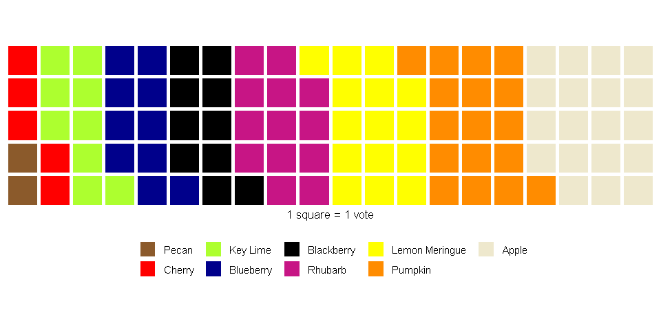
But what if I don't like the alternatives?
Even though there are many alternatives (e.g., bar charts, stacked bars, waffle charts, lollipop charts, tree maps), pie charts are a familiar chart type to most people, and depending on the audience, familiarity may be an important factor that affects interpretability. So if you want to stick with pie charts, consider taking the following advice.
Limit the number of categories via grouping
To avoid visual clutter and to ensure your pie chart is readable, the number of categories should be small. Therefore, it may be useful to group categories that individually comprise a small proportion of the pie into a single category. Note that, when using this approach, it may be helpful to list the items contained in the derived category. Furthermore, it is best to ensure that the new category does not form the majority of the resulting pie.
Show percentages or absolute numbers (or both) as text
Text can be used to prevent misunderstandings due to ambiguity. By including text information, a person can see if there are differences among the categories. However, if it is necessary to include text, then one can argue that the visualization itself is ineffective (so be prepared to defend your choice of chart type).
#Adjusting plot size and margins
options(repr.plot.width=8, repr.plot.height=4)
par(mfrow=c(1,1), mai = c(0.55, 0, 0.8, 0))

#Data for pie chart
x = c(15, 20, 35, 30)
labels = c("Other (15%)", "Cherry (20%)", "Pumpkin (35%)", "Apple (30%)")
cols = c("black", "red", "darkorange", "cornsilk2")

#Build the pie chart
pie(x, labels, radius = 1, col=cols)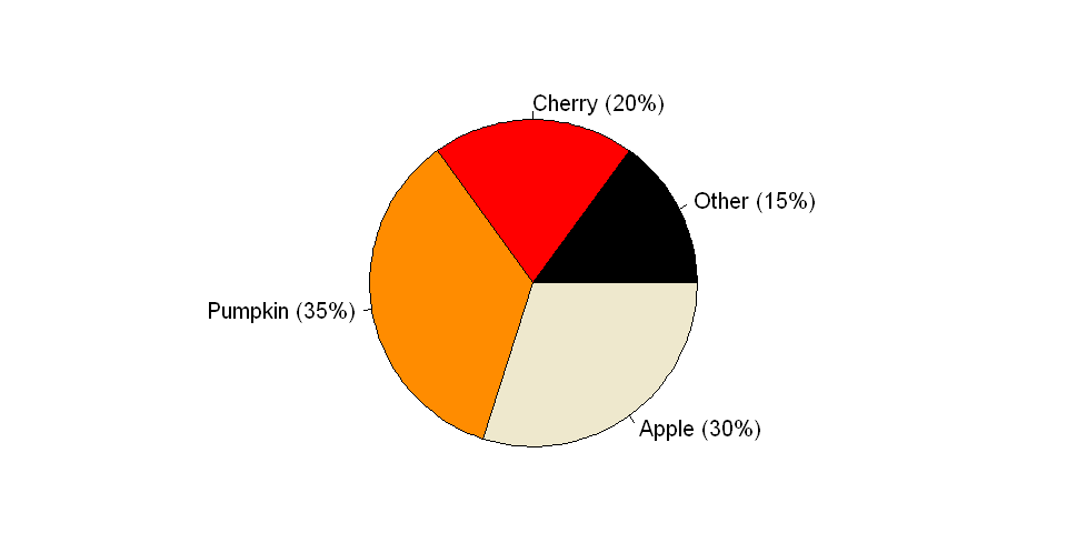
Conclusions
We hope you found our discussion of pie charts informative. While pie charts can be avoided in most cases, they remain a pithy little chart on which many, many people have little to no opinion. However, to avoid a mass uptake of pitchforks and torches, please remember to employ pie charts responsibly and to use caution when including any controversial chart type in your next presentation.
Required libraries
Click the Show/Hide Code button to view the libraries.
library(repr);
library(dplyr);
library(plotly);
library(waffle);
library(ggplot2);
library(RColorBrewer);
<< Previous Post
"Protected: Wording Surveys Well Makes Them More Effective: Part 4"
Next Post >>
"Are Decision-Makers Disempowered by the Modern Data Stack?"


