Data Analytics Blog
Unconventional Visualizations – Network Diagram
April 24th, 2024 by BoxplotSometimes, we need to think outside the box for data visualizations! This is a visualization we did using a little-known tool called Kumu. It was for a nonprofit gardening project – they needed a way to visualize information about companion planting from a book. The book laid out the information linearly – for example, “x […]
Small Business Social Media Metrics
April 23rd, 2023 by BoxplotA superior social media analytics practice is one of the best ways for small businesses to gain an edge over larger competitors. And the growing accessibility of advanced analytical tools makes social media analytics a worthwhile pursuit even if on a tight budget. This blog post covers some of the most useful social media-specific metrics […]
Line Graphs
April 1st, 2023 by BoxplotWhat Is A Line Graph? A line graph is a series of data points on an x–y axis, connected by a line. There are two kinds of line graphs: colored-in (also known as area charts) and standard. While the area under the line of a colored-in line graph is shaded in, the area under a standard line […]
Tips For Building Likert Surveys
April 1st, 2023 by BoxplotLikert Surveys ―pronounced LICK-ert― are one of the most popular ways of collecting survey data. Their simple design of providing a series of prompts with a discrete scale of responses for each prompt (such as “Strongly Disagree”, “Disagree”, “Neutral”, “Agree”, and “Strongly Agree”; “Poor”, “Fair”, “Average”, “Good”, and “Excellent”, etc.) makes Likert Surveys an extremely popular […]
Interpreting Linear Regression Results
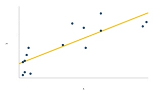
April 1st, 2023 by BoxplotA Brief Introduction To Linear Regression Linear regressions discover relationships between multiple variables by estimating a line or other function of best fit to a set of data. For example, the orange line is what a linear regression’s result would look like for the data shown in blue: This function of best fit (shown here […]
How B2C Businesses Can Use Their Data
March 20th, 2023 by BoxplotIn order to understand your customers fully and correctly, the data and analytics you maintain about those customers are extremely important. For B2C organizations especially ―which sell directly to customers― customer data and analytics are a necessary component of sales, marketing, and managerial strategies for both pre- and post-market decision making. There is a long […]
PivotTables in Excel
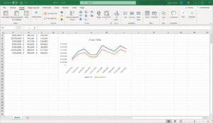
February 1st, 2021 by BoxplotWhat is a PivotTable? A Pivot Table is an analytics tool that can quickly answer key business questions. They are excellent at extracting insights from a vast dataset quickly. PivotTables are one of the most efficient and effective ways to evaluate large quantities of data in Excel. By “pivoting” or aggregating a large data table […]
Are Decision-Makers Disempowered by the Modern Data Stack?
September 23rd, 2020 by BoxplotFuture Data 2020 Many winter moons ago, I (virtually) attended Future Data 2020, a conference about the next generation of data systems. During the conference, I watched an interesting talk given by Tristan Handy, founder and CEO of Fishtown Analytics, called The Modern Data Stack: Past, Present, and Future. During the talk, Tristan discussed a so-called […]
Pie Charts
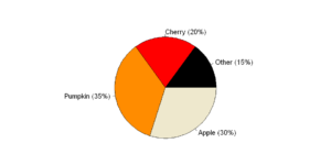
September 4th, 2020 by BoxplotShow/Hide Code Introduction It seems as if people are split on pie charts: either you passionately hate them, or you are indifferent. In this article, we are going to explain why pie charts are problematic and, if you fall into the latter category, what you can do when creating pie charts to avoid upsetting those […]
Useful Python Snippets
October 26th, 2019 by BoxplotThe goal of this blog post is a compilation of little tidbits and code snippets that address common issues when programming for data analysis in Python. General Snippets Difference between JSON and XML This page gives a great example of the difference between data in JSON format and XML format. It shows the exact same […]


