100th Anniversary of Variance
100th Anniversary of Variance
by Boxplot Dec 28, 2018
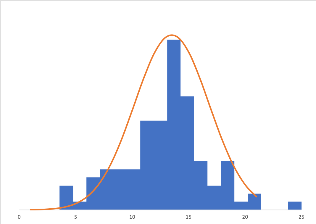
This year (2018) is the 100th anniversary of a paper by R. A. Fisher, which introduced the statistical term “variance”. Variance is one of the toughest concepts in statistics, but it’s crucially important. Variance tells you how spread out your data are (yep, “are”; the word “data” is plural!). First, let’s get some terminology out of the way: Variance – how far a set of (random) numbers are spread out from their average value. Standard Deviation – The square root of the variance. It’s easier to talk about spread using standard deviation because it’s in the actual units of the data being collected. One of the best ways to “see” variance is with a histogram. A histogram plots a single quantitative variable (you can think of that as a single column of numbers in Excel). A histogram always has bins on the x-axis, and frequency on the y-axis. When evaluating a histogram, it’s common to determine its shape (normal, skewed, etc.) and also draw a curved distribution line over it to demonstrate that general shape:

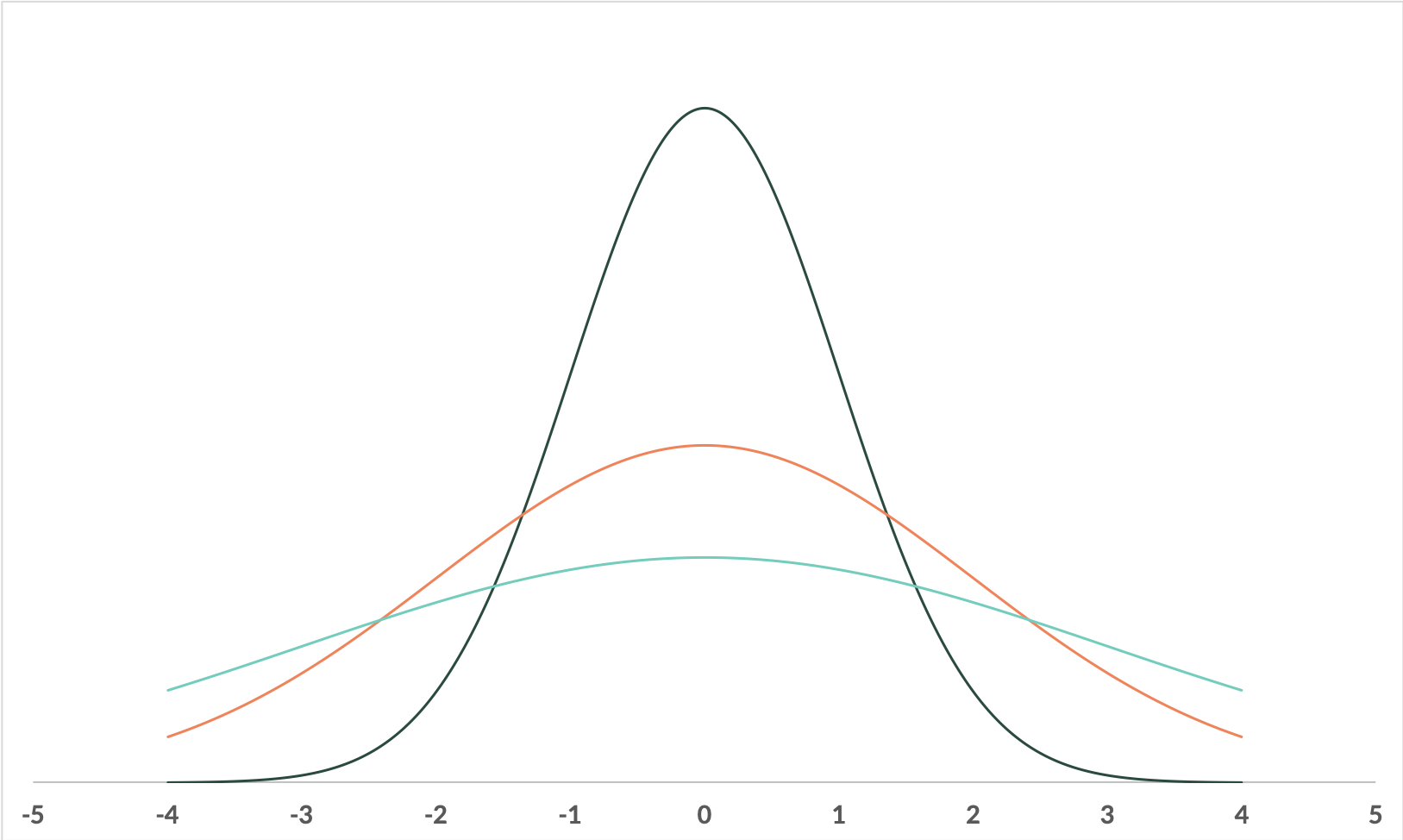
Sometimes, analysts will plot distributions on the same axis too, to compare them. Take a look at these distributions:

They all have the same center, but they have different shapes. The orange is more spread out (wider and fatter) than the dark green, and the light blue is more spread out than both of them. The center (average) of all three distributions is at 0, but the variance of the light green is larger than the orange, which is larger than the dark green. Typically, smaller variation is desired because it means higher predictability. Let’s look at an example.
A Human Resources Example
You work in the HR department of a large firm. Your boss wants to better predict how long employees stay with the company by department. The goal is to create incentive programs targeted for the time frames that employees typically leave, to encourage them to stay.
You collect data for 100 employees in each department, and calculate the average tenure by department:
| Average | |
|---|---|
| IT | 14 |
| Sales | 14 |
| Support | 9 |
You might think: great! That’s it. All done. But is the average really a good measure of the expected time employees will stay? Let’s take a look at the spread the numbers (the variance and standard deviation).
Employees at both the IT department and the Sales department stay an average of 14 years. But if we calculate the standard deviations for each of these departments (which is just the STDEV function if you are using Excel), we’ll see very different numbers:
| Average | Standard Deviation | |
|---|---|---|
| IT | 14 | 3.3 |
| Sales | 14 | 0.25 |
| Support | 9 | 1 |
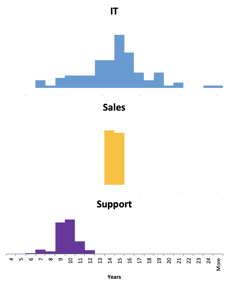
Take note that the standard deviation for the IT department is about 3.3 years, whereas the standard deviation for the Sales department is only about a quarter of a year. If we plot those 100 employees per department as histograms, we’d see this difference visually as well:

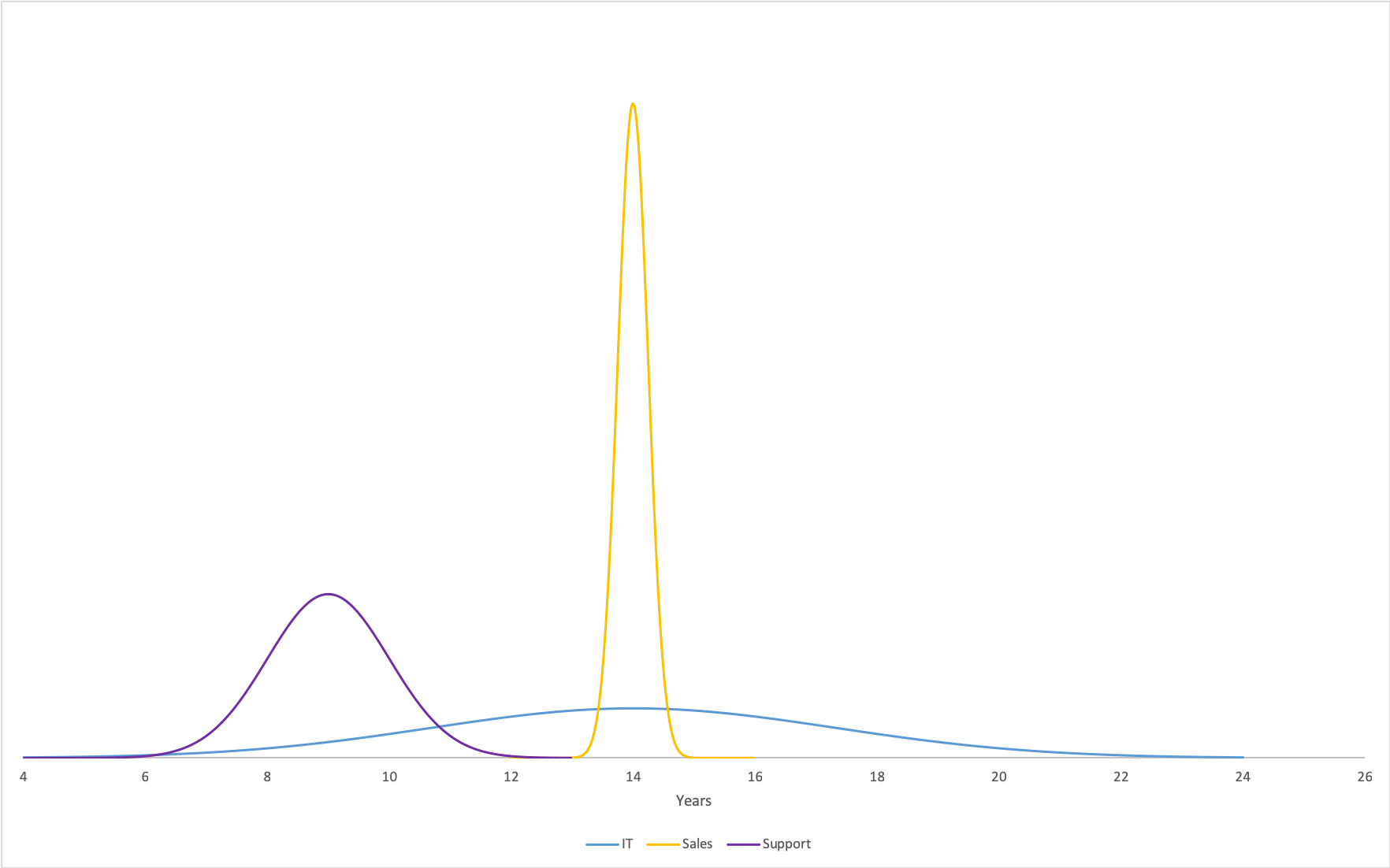
We can also draw out the distributions
for these histograms, which would look (approximately) like this:

Even though IT and Sales both have averages of 14 years, their distributions look really different, don’t they? Sales has a skinnier and taller distribution, and IT has a wider, shorter distribution. The area underneath the curve is the percentage of employees that are leaving within that time frame. For example, if we focus on the area under the Sales curve between 13 and 15 years (that is, between 13 and 15 on the x-axis), it’s pretty much 100% of the curve. That means, nearly all of the sales employees leave between 13 and 15 years. However, if we calculate the area underneath the IT curve between 13 and 15 years, it’s only 24%. That is, only 24% of IT employees leave between 13 and 15 years.
So if you built an incentive program around the 14 year mark for IT and an incentive program around the 14 year mark for Sales, which would reach more people? The one for Sales of course, since it has a lower standard deviation. In other words, more people leave the sales department around the 14 year mark than the IT department – for the IT department, there are a significant number of people leaving as low as 9 or 10 years, or as high as 17 or 18 years.
In addition, we can say that sales is more predictable than IT for average tenure.
Next Post >>
"Data Visualization in Python Lunch + Learn"


